相关热度图标会自动标注重要性
前段时间在写论文绘制相关性热力图时,需要标记显著性,而seaborn却没有这个功能。研究了一下,记录分享给有需要的同学。
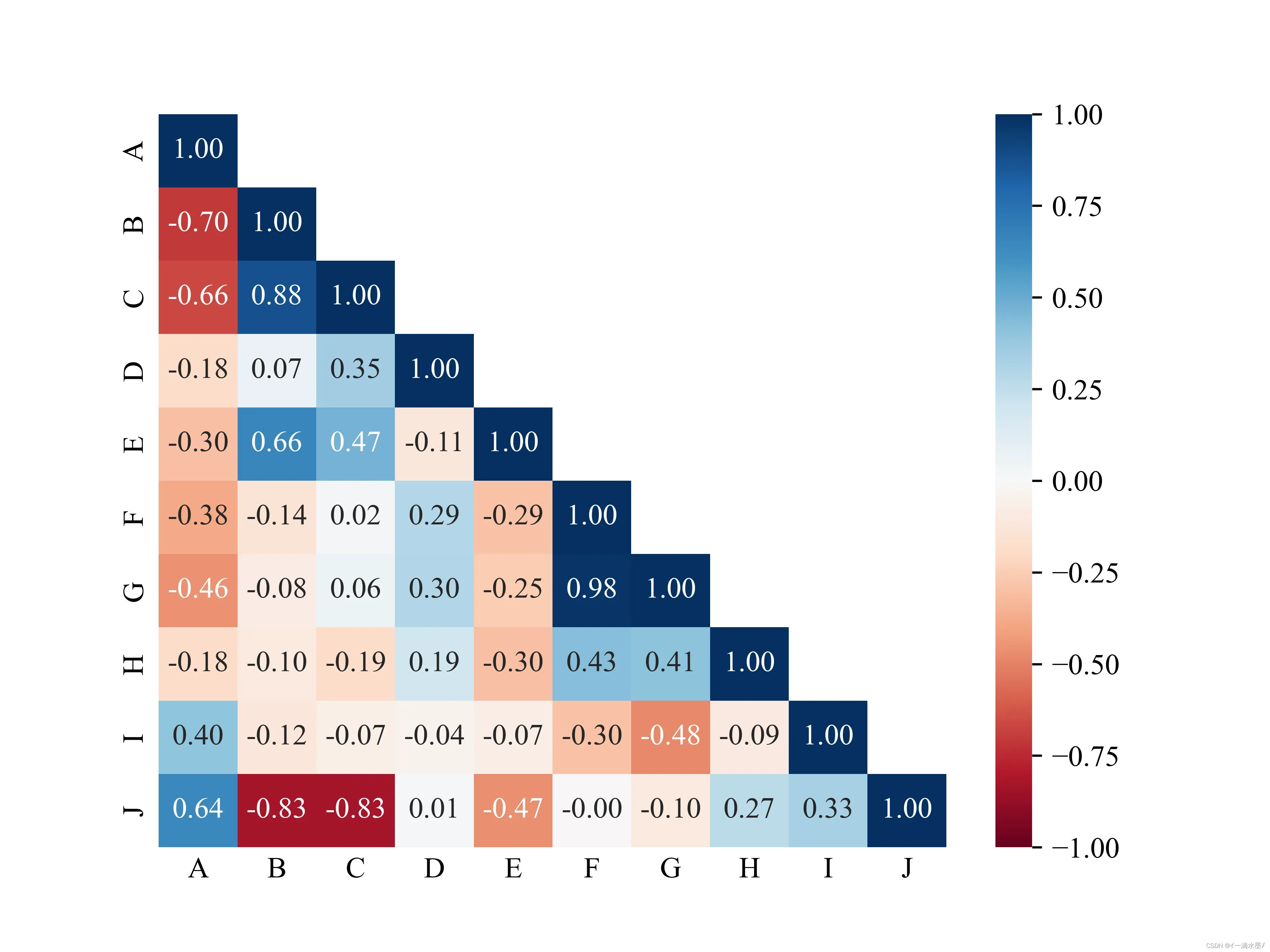
示例演示 – 未显示显着性
# -*- encoding: utf-8 -*-
'''
@File    :   plot_r.py
@Time    :   2022/03/14 22:39:53
@Author  :   HMX
@Version :   1.0
@Contact :   kzdhb8023@163.com
'''

# here put the import lib
import pandas as pd
import seaborn as sns
import matplotlib.pyplot as plt
import numpy as np
from scipy.stats import pearsonr
import matplotlib as mpl

def cm2inch(x,y):
    return x/2.54,y/2.54

size1 = 10.5
mpl.rcParams.update(
{
'text.usetex': False,
'font.family': 'stixgeneral',
'mathtext.fontset': 'stix',
"font.family":'serif',
"font.size": size1,
"font.serif": ['Times New Roman'],
}
)
fontdict = {'weight': 'bold','size':size1,'family':'SimHei'}


fp = r'Z:\GJ\pearsonr\data.xlsx'
df = pd.read_excel(fp,sheet_name='Sheet1',header = 0)
df_coor=df.corr()
fig = plt.figure(figsize=(cm2inch(16,12)))
ax1 = plt.gca()

#构造mask,去除重复数据显示
mask = np.zeros_like(df_coor)
mask[np.triu_indices_from(mask)] = True
mask2 = mask
mask = (np.flipud(mask)-1)*(-1)
mask = np.rot90(mask,k = -1)

im1 = sns.heatmap(df_coor,annot=True,cmap="RdBu"
, mask=mask#构造mask,去除重复数据显示
,vmax=1,vmin=-1
, fmt='.2f',ax = ax1)

ax1.tick_params(axis = 'both', length=0)
plt.savefig(r'Z:\GJ\pearsonr\fig\r_demo.png',dpi=600)
plt.show()
结果表明
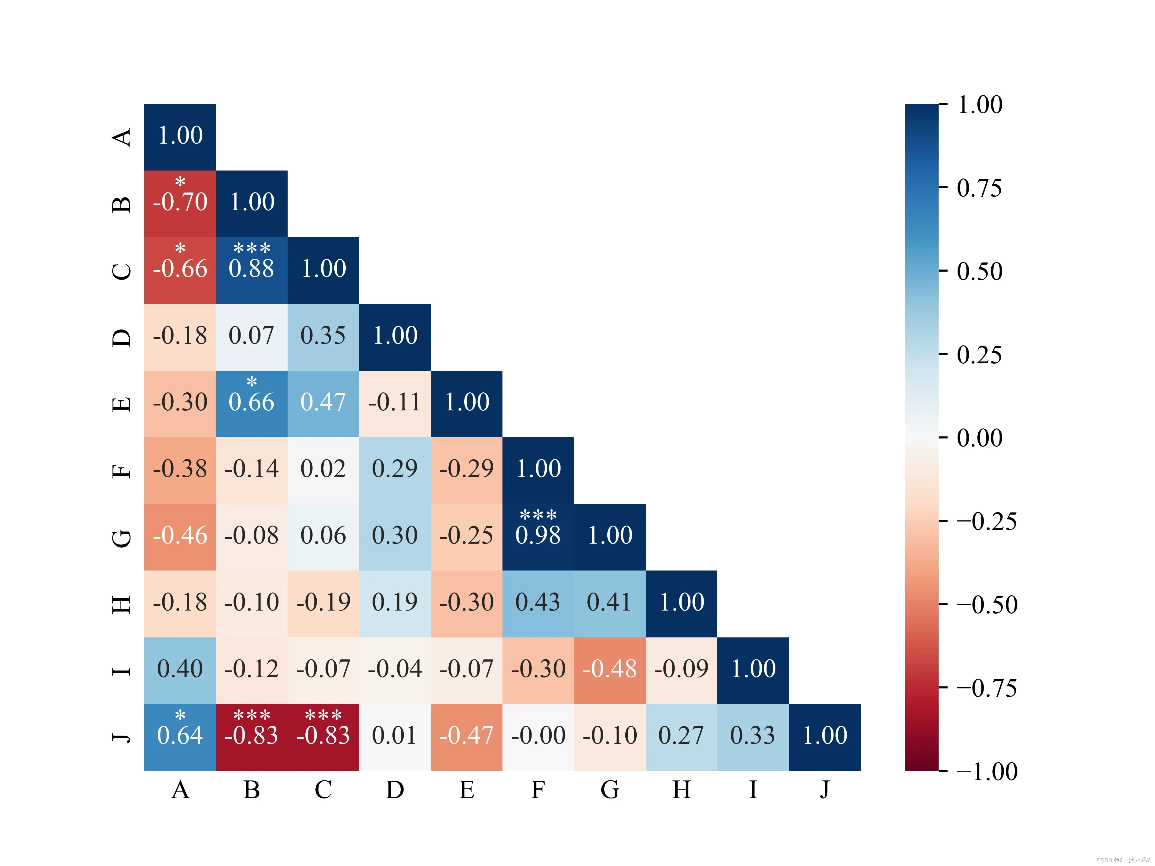
示例演示 – 添加显着性的最终代码
主要的思路就是判断P值然后按等级进行打点。打点前需要依据mask进行判断,其次观察发现字体颜色是依据相关性的绝对是与0.5的关系进行一个判断。
# -*- encoding: utf-8 -*-
'''
@File    :   plot_r.py
@Time    :   2022/03/14 22:39:53
@Author  :   HMX
@Version :   1.0
@Contact :   kzdhb8023@163.com
'''

# here put the import lib
import pandas as pd
import seaborn as sns
import matplotlib.pyplot as plt
import numpy as np
from scipy.stats import pearsonr
import matplotlib as mpl

def cm2inch(x,y):
    return x/2.54,y/2.54

size1 = 10.5
mpl.rcParams.update(
{
'text.usetex': False,
'font.family': 'stixgeneral',
'mathtext.fontset': 'stix',
"font.family":'serif',
"font.size": size1,
"font.serif": ['Times New Roman'],
}
)
fontdict = {'weight': 'bold','size':size1,'family':'SimHei'}


fp = r'Z:\GJ\pearsonr\data.xlsx'
df = pd.read_excel(fp,sheet_name='Sheet1',header = 0)
df_coor=df.corr()
fig = plt.figure(figsize=(cm2inch(16,12)))
ax1 = plt.gca()

#构造mask,去除重复数据显示
mask = np.zeros_like(df_coor)
mask[np.triu_indices_from(mask)] = True
mask2 = mask
mask = (np.flipud(mask)-1)*(-1)
mask = np.rot90(mask,k = -1)

im1 = sns.heatmap(df_coor,annot=True,cmap="RdBu"
, mask=mask#构造mask,去除重复数据显示
,vmax=1,vmin=-1
, fmt='.2f',ax = ax1)

ax1.tick_params(axis = 'both', length=0)

#计算相关性显著性并显示
rlist = []
plist = []
for i in df.columns.values:
    for j in df.columns.values:
        r,p = pearsonr(df[i],df[j])
        rlist.append(r)
        plist.append(p)

rarr = np.asarray(rlist).reshape(len(df.columns.values),len(df.columns.values))
parr = np.asarray(plist).reshape(len(df.columns.values),len(df.columns.values))
xlist = ax1.get_xticks()
ylist = ax1.get_yticks()

widthx = 0
widthy = -0.15

for m in ax1.get_xticks():
    for n in ax1.get_yticks():
        pv = (parr[int(m),int(n)])
        rv = (rarr[int(m),int(n)])
        if mask2[int(m),int(n)]<1.:
            if abs(rv) > 0.5:
                if  pv< 0.05 and pv>= 0.01:
                    ax1.text(n+widthx,m+widthy,'*',ha = 'center',color = 'white')
                if  pv< 0.01 and pv>= 0.001:
                    ax1.text(n+widthx,m+widthy,'**',ha = 'center',color = 'white')
                if  pv< 0.001:
                    print([int(m),int(n)])
                    ax1.text(n+widthx,m+widthy,'***',ha = 'center',color = 'white')
            else:
                if  pv< 0.05 and pv>= 0.01:
                    ax1.text(n+widthx,m+widthy,'*',ha = 'center',color = 'k')
                elif  pv< 0.01 and pv>= 0.001:
                    ax1.text(n+widthx,m+widthy,'**',ha = 'center',color = 'k')
                elif  pv< 0.001:
                    ax1.text(n+widthx,m+widthy,'***',ha = 'center',color = 'k')
plt.savefig(r'Z:\GJ\pearsonr\fig\r_demo.png',dpi=600)
plt.show()
结果如下
热力图的其他设置请参考seaborn官网
这就是今天分享的全部内容。欢迎大家关注我的公众号【森奇笔记】
文章出处登录后可见!
已经登录?立即刷新