目录
(注:每一章节可以为一个py文件,4、5、6、7写在同一个文件中,最好用jupyter notebook)
1. 获取数据集
下面两种方式:UCI、Kaggle
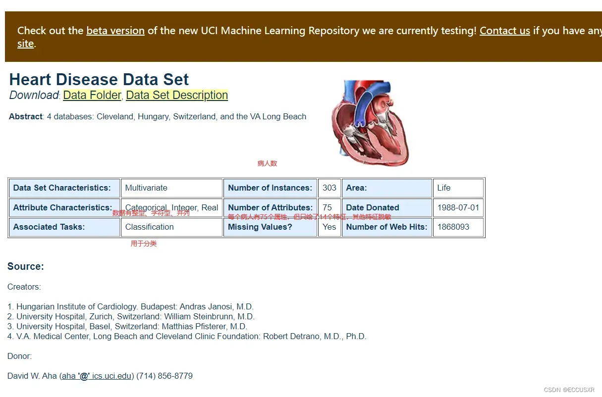
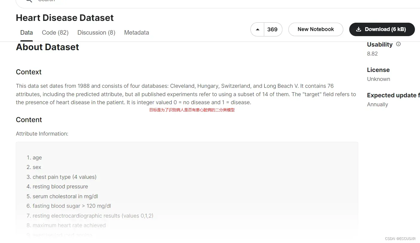
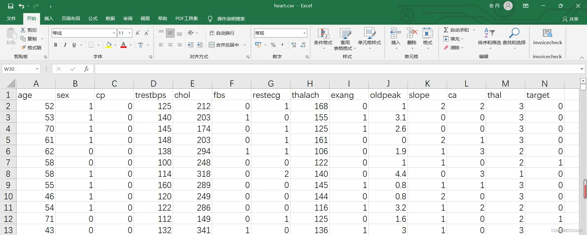
得到的csv文件为:
2. 数据集介绍
数据集有1025行,14列。每行表示一个病人。13列表示特征,1列表示标签(是否患心脏病)
| age | 年龄 |
| sex | 性别,1表示男,0表示女 |
| cp | 心绞痛病史,1:典型心绞痛,2:非典型心绞痛,3:无心绞痛,4:无症状 |
| trestbps | 静息血压,入院时测量得到,单位为毫米汞柱(mm Hg) |
| chol | 胆固醇含量,单位:mgldl |
| fbs | 空腹时是否血糖高,如果空腹血糖大于120 mg/dl,值为1,否则值为0 |
| restecg | 静息时的心电图特征。0:正常。1: ST-T波有异常。2:根据Estes准则,有潜在的左 |
| thalach | 最大心率 |
| exang | 运动是否会导致心绞痛,1表示会,0表示不会 |
| oldpeak | 运动相比于静息状态,心电图中的ST-T波是否会被压平。1表示会,0表示不会 |
| slope | 心电图中ST波峰值的坡度(1:上升,2:平坦,3:下降) |
| ca | 心脏周边大血管的个数(0-3) |
| thal | 是否患有地中海贫血症(3:无,6: fixed defect; 7: reversable defect) |
| target | 标签列。是否有心脏病,0表示没有,1表示有 |
3. 数据预处理
首先要区分好:定类、定序、定距、定比、四种数据的特征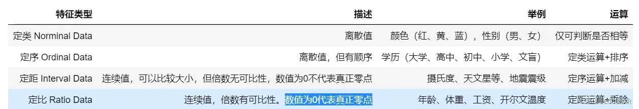
① 我们需要将定类特征由整数转为实际对应的字符串,还原为真实含义。
② 将定类数据扩展为特征
③ 导出预处理后的数据
import pandas as pd
df = pd.read_csv('dataset/heart.csv')
# 将定类特征由整数编码转为实际对应的字符串,还原为真实含义
df['sex'][df['sex'] == 0] = 'female'
df['sex'][df['sex'] == 1] = 'male'
df['cp'][df['cp'] == 0] = 'typical angina'
df['cp'][df['cp'] == 1] = 'atypical angina'
df['cp'][df['cp'] == 2] = 'non-anginal pain'
df['cp'][df['cp'] == 3] = 'asymptomatic'
df['fbs'][df['fbs'] == 0] = 'lower than 120mg/ml'
df['fbs'][df['fbs'] == 1] = 'greater than 120mg ml'
df['restecg'][df['restecg'] == 0] = 'normal'
df['restecg'][df['restecg'] == 1] = 'ST-T wave abnormality'
df['restecg'][df['restecg'] == 1] = 'left ventricular hyper trophy'
df['exang'][df['exang'] == 0] = 'no'
df['exang'][df['exang'] == 1] = 'yes'
df['slope'][df['slope'] == 0] = 'upsloping'
df['slope'][df['slope'] == 1] = 'flat'
df['slope'][df['slope'] == 1] = 'downsloping'
df['thal'][df['thal'] == 0] = 'unknown'
df['thal'][df['thal'] == 1] = 'normal'
df['thal'][df['thal'] == 1] = 'fixed defect'
df['thal'][df['thal'] == 1] = 'reversable defect'
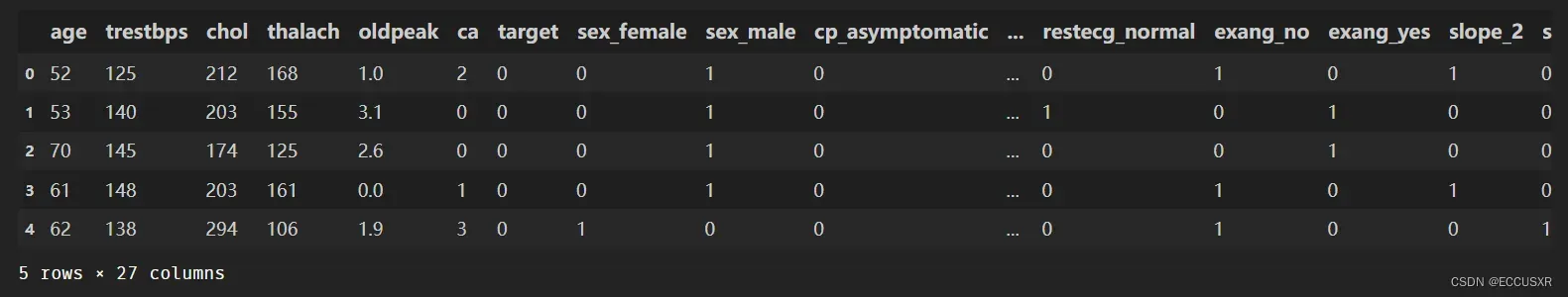
# 将离散的定类和定序特征列转为One-Hot独热编码
# 将定类数据扩展为特征
df = pd.get_dummies(df)
# 导出预处理后的数据
df.to_csv('process_heart.csv',index=False)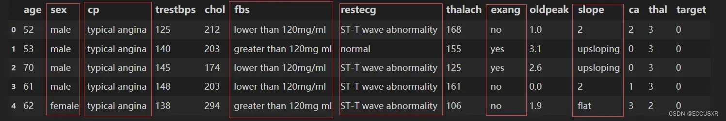
4. 构建随机森林分类模型
第一,要拿数据与处理后的文件。
import numpy as np
import pandas as pd
import matplotlib.pyplot as p1t
%matplotlib inline
# 忽略警告
import warnings
warnings.filterwarnings("ignore")
df = pd.read_csv('process_heart.csv')
第二,将数据分为输入和输出
# 去掉这一列  矩阵用X表示  input
X = df.drop('target',axis=1)

# y向量
y = df['target']
第三,数据划分为测试集和训练集
# 将数据划分为训练集和测试集,20%作为测试集,随机数种子
from sklearn.model_selection import train_test_split
X_train,X_test,y_train,y_test = train_test_split(X,y,test_size=0.2,random_state=10)
第四,构建随机森林分类模型,在训练集上训练模型
# 构建随机森林分类模型,在训练集上训练模型
from sklearn.ensemble import RandomForestClassifier
# 最大深度为5,决策树为100,随机种子数为5
model = RandomForestClassifier(max_depth=5,n_estimators=100,random_state=5)
# fit 拟合
model.fit(X_train,y_train)
# 可以查看第7个决策树
estimator = model.estimators_[7]
第五,将决策树可视化
# 将输出特征值转为字符串
feature_names = X_train.columns
y_train_str = y_train.astype('str')
y_train_str[y_train=='0'] = 'no disease'
y_train_str[y_train=='1'] = 'disease'
y_train_str = y_train_str.values

# 将决策树可视化
from sklearn.tree import export_graphviz
export_graphviz(estimator,out_file='tree.dot',
                feature_names = feature_names,
                class_names = y_train_str,
                rounded = True,proportion = True,
                label='root',
                precision = 2,filled = True)

from subprocess import call
call(['dot','-Tpng','tree.dot','-o','tree.png','-Gdpi=600'],shell=True)
from IPython.display import Image
Image(filename = 'tree.png')
5. 预测测试集数据
#在训练集上训练得到随机森林模型之后,就可以对测试集上的数据进行预测,也可以对新未知数据进行预测。 将预测结果与测试集真正的标签相比#较,可以定量评估模型指标,绘制混淆矩阵,计算Precision、Recall、F1-Score等评估指标,并绘制ROC曲线。混淆矩阵、ROC曲线、F1-#Score
第一,模型准备
# 忽略警告
import warnings
warnings.filterwarnings("ignore")

import numpy as np
import pandas as pd
import matplotlib.pyplot as plt
%matplotlib inline
#导入数据集,划分特征和标签
df = pd.read_csv('process_heart.csv')
X = df.drop('target',axis=1)
y = df['target']
#划分训练集和测试集
from sklearn.model_selection import train_test_split
X_train,X_test,y_train,y_test = train_test_split(X, y, test_size=0.2,random_state=10)

#构建随机森林模型
from sklearn.ensemble import RandomForestClassifier
model = RandomForestClassifier(max_depth=5,n_estimators=100)
model.fit(X_train, y_train)
第二,将其中一个测试样本转成数组的形式
## 对数据进行位置索引,从而在数据表中提取出相应的数据。
X_test.iloc
# 筛选出未知样本
test_sample = X_test.iloc[2]
# 变成二维
test_sample = np.array(test_sample).reshape(1,-1)
第三,预测单个未知样本
#  二分类定性分类结果
model.predict(test_sample)
# 二分类定量分类结果
model.predict_proba(test_sample)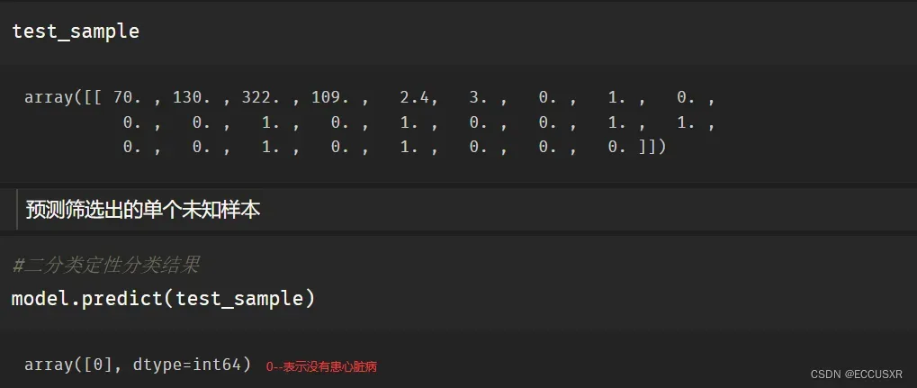
第四,预测整个测试样本
y_pred = model.predict(X_test)
# 得到患心脏病和不患心脏病的置信度
y_pred_proba = model.predict_proba(X_test)
# 切片操作 只获得患心脏病的置信度
model.predict_proba(X_test)[:,1]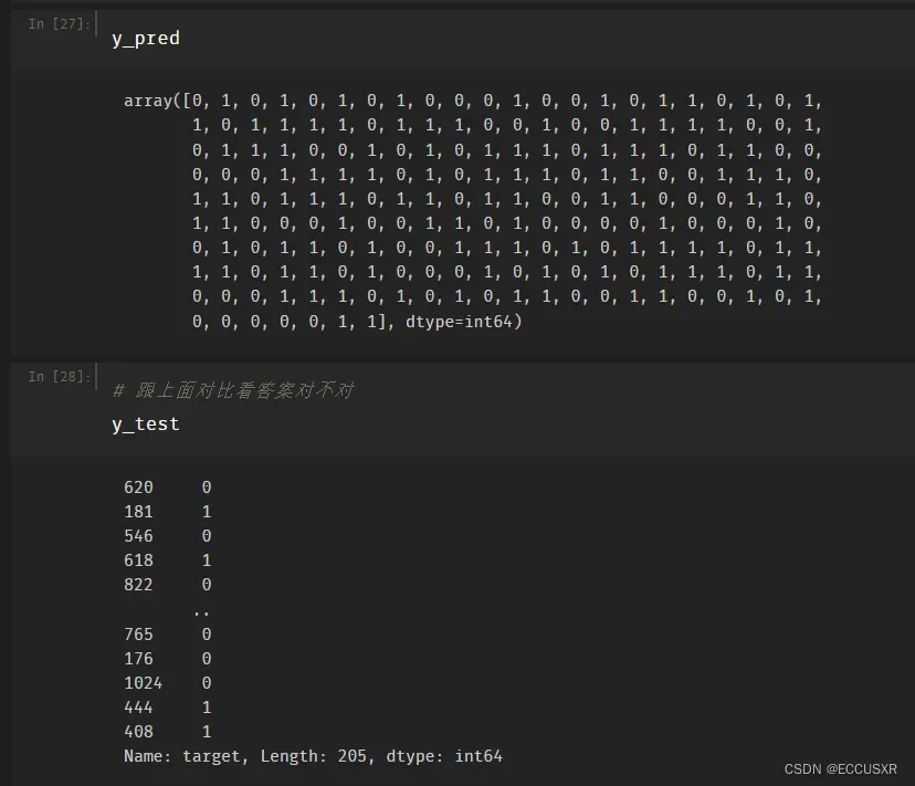
6. 构建混淆矩阵
# 混淆矩阵
from sklearn.metrics import confusion_matrix
confusion_matrix_model = confusion_matrix(y_test, y_pred)
# 将混淆矩阵绘制出来
import itertools
def cnf_matrix_plotter(cm,classes):
    '''
    传入混淆矩阵和标签名称列表,绘制混淆矩阵
    '''
    # plt.imshow (cm, interpolation='nearest', cmap=plt.cm.Greens)
    plt.imshow(cm, interpolation='nearest', cmap=plt.cm.Oranges)
    plt.title('Confusion Matrix')
    plt.colorbar()
    tick_marks = np.arange(len(classes))
    plt.xticks(tick_marks,classes,rotation=45)
    plt.yticks(tick_marks,classes)

    threshold = cm.max() / 2.
    for i, j in itertools.product(range(cm. shape[0]), range(cm.shape[1])):
        plt.text(j, i, cm[i,j],
        horizontalalignment="center",
        color="white" if cm[i,j] > threshold else "black",fontsize=25)
    plt.tight_layout()
    plt.ylabel('True Label')
    plt.xlabel(' Predicted Label')
    plt.show()
  cnf_matrix_plotter(confusion_matrix_model,['Healthy','Disease'])

7. 计算查全率、召回率、调和平均值
# 计算查全率、召回率、调和平均值
from sklearn.metrics import classification_report
print(classification_report(y_test,y_pred,target_names=['Healthy', 'Disease']))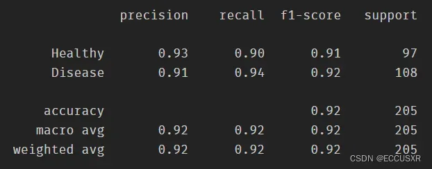
8. ROC曲线、AUC曲线
# ROC曲线
y_pred_quant = model.predict_proba(X_test)[:,1]
from sklearn. metrics import roc_curve,auc
fpr,tpr,thresholds = roc_curve(y_test,y_pred_quant)
plt.plot(fpr,tpr)
plt.plot([0,1],[0,1],ls="--",c=".3")
plt.xlim([0.0,1.0])
plt.ylim([0.0,1.0])
plt.rcParams['font.size'] = 12
plt.title('ROC curve')
plt.xlabel('False Positive Rate (1 - Specificity)')
plt.ylabel('True Positive Rate (Sensitivity)')
plt.grid(True)

# 计算AUC曲线
auc(fpr,tpr)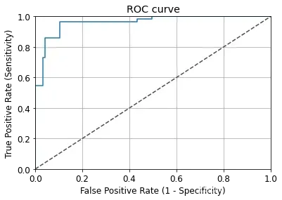
文章出处登录后可见!