1.什么是matplotlib
matplotlib: 最流行的Python底层绘图库,主要做数据可视化图表,名字取材于MATLAB,模仿MATLAB构建
2.样例
2.1折线图
eg:假设一天中每隔两个小时(range(2,26,2))的气温(℃)分别是[15,13,14.5,17,20,25,26,26,27,22,18,15]
matplotlib基本要点

设置图片大小

调整X或者Y轴上的刻度

那么问题来了:
如果列表a表示10点到12点的每一分钟的气温,如何绘制折线图观察每分钟气温的变化情况?
a= [random.randint(20,35) for i in range(120)]

设置中文显示

给图像添加描述信息

最终代码展示
import random
from matplotlib import pyplot as plt
import matplotlib
from matplotlib import font_manager
my_font = font_manager.FontProperties(fname="C:/Windows/Fonts/SimHei.ttf", size=14)
x = range(0, 120)
y = [random.randint(20, 35) for i in range(120)]

plt.figure(figsize=(20, 10), dpi=80)
plt.plot(x, y)
_x = x[::5]
_xtick_labels = ["10点{}分".format(i) for i in range(60)]
_xtick_labels += ["11点{}分".format(i) for i in range(60)]
plt.xticks(_x, _xtick_labels[::5], rotation=45, fontproperties=my_font)  # rotation旋转的度数
# 添加描述信息
plt.xlabel("时间", fontproperties=my_font)
plt.ylabel("温度 单位(℃)", fontproperties=my_font)
plt.title("10点到12点每分钟的气温变化情况", fontproperties=my_font)
plt.show()
最终效果展示

动手一练
假设大家在30岁的时候,根据自己的实际情况,统计出来了你和你同桌各自从11岁到30岁每年交的女(男)朋友的数量如列表a和b,请在一个图中绘制出该数据的折线图,以便比较自己和同桌20年间的差异,同时分析每年交女(男)朋友的数量走势
a = [1,0,1,1,2,4,3,2,3,4,4,5,6,5,4,3,3,1,1,1]
b = [1,0,3,1,2,2,3,3,2,1 ,2,1,1,1,1,1,1,1,1,1]
要求:
y轴表示个数
x轴表示岁数,比如11岁,12岁等
代码展示
from matplotlib import pyplot as plt
from matplotlib import font_manager

my_font = font_manager.FontProperties(fname="C:/Windows/Fonts/SimHei.ttf", size=14)
y1 = [1, 0, 1, 1, 2, 4, 3, 2, 3, 4, 4, 5, 6, 5, 4, 3, 3, 1, 1, 1]
y2 = [1, 2, 4, 3, 1, 1, 2, 1, 2, 4, 4, 3, 3, 6, 4, 5, 4, 2, 3, 2]
x = range(11, 31)

plt.figure(figsize=(20, 10), dpi=80)
plt.plot(x, y1, label="自己")
plt.plot(x, y2, label="同桌")
_xtick = ["{}岁".format(i) for i in x]
plt.xticks(x, _xtick, rotation=45, fontproperties=my_font)

# 绘制网格
plt.grid(alpha=0.4)
plt.legend(prop=my_font)
plt.show()
在上一个案例中如果大家希望自定义绘制图形的风格怎么办?


虽然线条有了不一样的风格,但是读者还是不知道那条线是谁怎么办?
为每条线添加图例

效果展示

总结:前面我们都做了什么?
1.绘制了折线图(plt.plot)
2.设置了图片的大小和分辨率(plt.figure)
3.实现了图片的保存(plt.savefig)
4.设置了xy轴上的刻度和字符串(xticks)
5.解决了刻度稀疏和密集的问题(xticks)
6.设置了标题,xy轴的lable(title,xlable,ylable)
7.设置了字体(font_manager. fontProperties,matplotlib.rc)
8.在一个图上绘制多个图形(plt多次plot即可)
9.为不同的图形添加图例
以上统统很重要
2.2散点图
eg:假设通过爬虫你获取到了北京2016年3,10月份每天白天的最高气温(分别位于列表a,b),那么此时如何寻找出气温和随时间(天)变化的某种规律?
a = [11,17,16,11,12,11,12,6,6,7,8,9,12,15,14,17,18,21,16,17,20,14,15,15,15,19,21,22,22,22,23]
b = [26,26,28,19,21,17,16,19,18,20,20,19,22,23,17,20,21,20,22,15,11,15,5,13,17,10,11,13,12,13,6]
代码展示
from matplotlib import pyplot as plt
from matplotlib import font_manager

my_font = font_manager.FontProperties(fname="C:/Windows/Fonts/SimHei.ttf", size=14)
y_3 = [11, 17, 16, 11, 12, 11, 12, 6, 6, 7, 8, 9, 12, 15, 14, 17, 18, 21, 16, 17, 20, 14, 15, 15, 15, 19, 21, 22, 22,
       22, 23]
y_10 = [26, 26, 28, 19, 21, 17, 16, 19, 18, 20, 20, 19, 22, 23, 17, 20, 21, 20, 22, 15, 11, 15, 5, 13, 17, 10, 11, 13,
        12, 13, 6]
x_3 = range(1, 32)
x_10 = range(41, 72)
x = list(x_3) + list(x_10)
plt.figure(figsize=(20, 10), dpi=80)
plt.scatter(x_3, y_3, label="3月")
plt.scatter(x_10, y_10, label="10月")
_xtick = ["3月{}日".format(i) for i in x_3]
_xtick += ["10月{}日".format(i) for i in x_3]
plt.xticks(x[::3], _xtick[::3], rotation=45, fontproperties=my_font)
plt.xlabel("时间", fontproperties=my_font)
plt.ylabel("温度", fontproperties=my_font)
plt.title("标题", fontproperties=my_font)
plt.legend(loc="upper left", prop=my_font)
plt.show()
效果展示

2.3条形图
eg:假设你获取到了2017年内地电影票房前20的电影(列表a)和电影票房数据(列表b),那么如何更加直观的展示该数据?
a = [“战狼2”,“速度与激情8”,“功夫瑜伽”,“西游伏妖篇”,“变形金刚5:最后的骑士”,“摔跤吧!爸爸”,“加勒比海盗5:死无对证”,“金刚:骷髅岛”,“极限特工:终极回归”,“生化危机6:终章”,“乘风破浪”,“神偷奶爸3”,“智取威虎山”,“大闹天竺”,“金刚狼3:殊死一战”,“蜘蛛侠:英雄归来”,“悟空传”,“银河护卫队2”,“情圣”,“新木乃伊”,]
b=[56.01,26.94,17.53,16.49,15.45,12.96,11.8,11.61,11.28,11.12,10.49,10.3,8.75,7.55,7.32,6.99,6.88,6.86,6.58,6.23] 单位:亿

完整代码展示
from matplotlib import pyplot as plt
from matplotlib import font_manager

my_font = font_manager.FontProperties(fname="C:/Windows/Fonts/SimHei.ttf", size=14)
a = ["战狼2", "速度与激情8", "功夫瑜伽", "西游伏妖篇", "变形金刚5:最后的骑士", "摔跤吧!爸爸", "加勒比海盗5:死无对证", "金刚:骷髅岛", "极限特工:终极回归", "生化危机6:终章",
     "乘风破浪", "神偷奶爸3", "智取威虎山", "大闹天竺", "金刚狼3:殊死一战", "蜘蛛侠:英雄归来", "悟空传", "银河护卫队2", "情圣", "新木乃伊", ]

b = [56.01, 26.94, 17.53, 16.49, 15.45, 12.96, 11.8, 11.61, 11.28, 11.12, 10.49, 10.3, 8.75, 7.55, 7.32, 6.99, 6.88,
     6.86, 6.58, 6.23]
plt.figure(figsize=(20, 15), dpi=80)
plt.bar(range(len(a)), b, width=0.3)
plt.xticks(range(len(a)), a, rotation=90, fontproperties=my_font)
plt.show()
效果展示

动手一练
假设你知道了列表a中电影分别在2017-09-14(b_14), 2017-09-15(b_15), 2017-09-16(b_16)三天的票房,为了展示列表中电影本身的票房以及同其他电影的数据对比情况,应该如何更加直观的呈现该数据?
a = [“猩球崛起3:终极之战”,“敦刻尔克”,“蜘蛛侠:英雄归来”,“战狼2”]
b_16 = [15746,312,4497,319]
b_15 = [12357,156,2045,168]
b_14 = [2358,399,2358,362]
代码展示
from matplotlib import pyplot as plt
from matplotlib import font_manager

my_font = font_manager.FontProperties(fname="C:/Windows/Fonts/SimHei.ttf", size=14)
a = ["猩球崛起3:终极之战", "敦刻尔克", "蜘蛛侠:英雄归来", "战狼2"]
b_16 = [15746, 312, 4497, 319]
b_15 = [12357, 156, 2045, 168]
b_14 = [2358, 399, 2358, 362]
bar_width = 0.2
x_14 = list(range(len(a)))
x_15 = [i + bar_width for i in x_14]
x_16 = [i + bar_width * 2 for i in x_14]

plt.figure(figsize=(20, 10), dpi=80)
plt.bar(range(len(a)), b_14, width=bar_width, label="9月14日")
plt.bar(x_15, b_15, width=bar_width, label="9月15日")
plt.bar(x_16, b_16, width=bar_width, label="9月15日")
plt.legend(prop=my_font)
plt.xticks(x_15, a, fontproperties=my_font)
plt.show()
效果展示

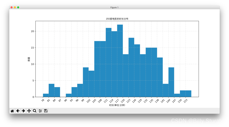
2.4直方图
eg:假设你获取了250部电影的时长(列表a中),希望统计出这些电影时长的分布状态(比如时长为100分钟到120分钟电影的数量,出现的频率)等信息,你应该如何呈现这些数据?
a=[131, 98, 125, 131, 124, 139, 131, 117, 128, 108, 135, 138, 131, 102, 107, 114, 119, 128, 121, 142, 127, 130, 124, 101, 110, 116, 117, 110, 128, 128, 115, 99, 136, 126, 134, 95, 138, 117, 111,78, 132, 124, 113, 150, 110, 117, 86, 95, 144, 105, 126, 130,126, 130, 126, 116, 123, 106, 112, 138, 123, 86, 101, 99, 136,123, 117, 119, 105, 137, 123, 128, 125, 104, 109, 134, 125, 127,105, 120, 107, 129, 116, 108, 132, 103, 136, 118, 102, 120, 114,105, 115, 132, 145, 119, 121, 112, 139, 125, 138, 109, 132, 134,156, 106, 117, 127, 144, 139, 139, 119, 140, 83, 110, 102,123,107, 143, 115, 136, 118, 139, 123, 112, 118, 125, 109, 119, 133,112, 114, 122, 109, 106, 123, 116, 131, 127, 115, 118, 112, 135,115, 146, 137, 116, 103, 144, 83, 123, 111, 110, 111, 100, 154,136, 100, 118, 119, 133, 134, 106, 129, 126, 110, 111, 109, 141,120, 117, 106, 149, 122, 122, 110, 118, 127, 121, 114, 125, 126,114, 140, 103, 130, 141, 117, 106, 114, 121, 114, 133, 137, 92,121, 112, 146, 97, 137, 105, 98, 117, 112, 81, 97, 139, 113,134, 106, 144, 110, 137, 137, 111, 104, 117, 100, 111, 101, 110,105, 129, 137, 112, 120, 113, 133, 112, 83, 94, 146, 133, 101,131, 116, 111, 84, 137, 115, 122, 106, 144, 109, 123, 116, 111,111, 133, 150]

代码展示
from matplotlib import pyplot as plt
from matplotlib import font_manager

my_font = font_manager.FontProperties(fname="C:/Windows/Fonts/SimHei.ttf", size=14)
a = [131, 98, 125, 131, 124, 139, 131, 117, 128, 108, 135, 138, 131, 102, 107, 114, 119, 128, 121, 142, 127, 130, 124,
     101, 110, 116, 117, 110, 128, 128, 115, 99, 136, 126, 134, 95, 138, 117, 111, 78, 132, 124, 113, 150, 110, 117, 86,
     95, 144, 105, 126, 130, 126, 130, 126, 116, 123, 106, 112, 138, 123, 86, 101, 99, 136, 123, 117, 119, 105, 137,
     123, 128, 125, 104, 109, 134, 125, 127, 105, 120, 107, 129, 116, 108, 132, 103, 136, 118, 102, 120, 114, 105, 115,
     132, 145, 119, 121, 112, 139, 125, 138, 109, 132, 134, 156, 106, 117, 127, 144, 139, 139, 119, 140, 83, 110, 102,
     123, 107, 143, 115, 136, 118, 139, 123, 112, 118, 125, 109, 119, 133, 112, 114, 122, 109, 106, 123, 116, 131, 127,
     115, 118, 112, 135, 115, 146, 137, 116, 103, 144, 83, 123, 111, 110, 111, 100, 154, 136, 100, 118, 119, 133, 134,
     106, 129, 126, 110, 111, 109, 141, 120, 117, 106, 149, 122, 122, 110, 118, 127, 121, 114, 125, 126, 114, 140, 103,
     130, 141, 117, 106, 114, 121, 114, 133, 137, 92, 121, 112, 146, 97, 137, 105, 98, 117, 112, 81, 97, 139, 113, 134,
     106, 144, 110, 137, 137, 111, 104, 117, 100, 111, 101, 110, 105, 129, 137, 112, 120, 113, 133, 112, 83, 94, 146,
     133, 101, 131, 116, 111, 84, 137, 115, 122, 106, 144, 109, 123, 116, 111, 111, 133, 150]
# 计算组数
d = 3
num_bins = (max(a) - min(a)) // d
plt.figure(figsize=(20, 15), dpi=80)
plt.hist(a, num_bins, density=True)
plt.xticks(range(min(a), max(a) + d, d))
plt.grid()
plt.show()
效果展示
matplotlib常见问题总结
1.应该选择那种图形来呈现数据
2.matplotlib.plot(x,y)
3.matplotlib.bar(x,y)
4.matplotlib.scatter(x,y)
5.matplotlib.hist(data,bins,normed)
6.xticks和yticks的设置
7.label和titile,grid的设置
8.绘图的大小和保存图片
文章出处登录后可见!