文章目录
专栏导读
🏆🏆作者介绍:Python领域优质创作者、CSDN/华为云/阿里云/掘金/知乎等平台专家博主
- 🔥🔥本文已收录于Python全栈系列专栏:《100天精通Python从入门到就业》
- 📝📝此专栏文章是专门针对Python零基础小白所准备的一套完整教学,从0到100的不断进阶深入的学习,各知识点环环相扣
- 🎉🎉订阅专栏后续可以阅读Python从入门到就业100篇文章;还可私聊进千人Python全栈交流群(手把手教学,问题解答); 进群可领取80GPython全栈教程视频 + 300本计算机书籍:基础、Web、爬虫、数据分析、可视化、机器学习、深度学习、人工智能、算法、面试题等。
- 🚀🚀加入我一起学习进步,一个人可以走的很快,一群人才能走的更远!


一、课程介绍
1、什么是matplotlib
2、matplotlib基本要点
3、matplotlib的折线图、散点图、直方图、柱状图
4、更多的画图工具
为什么要学习matplotlib
1.能将数据进行可视化,更直观的呈现
2.使数据更加客观、更具说服力
什么是matplotlib
Matplotlib 是一个 Python 的 2D绘图库,主要做数据可视化图表,通过 Matplotlib,开发者可以仅需要几行代码,便可以生成绘图,直方图,功率谱,条形图,错误图,散点图等。
-
用于创建出版质量图表的绘图工具库
-
目的是为Python构建一个Matlab式的绘图接口
-
import matplotlib.pyplot as plt -
pyploy模块包含了常用的matplotlib API函数
安装(cmd控制台):
pip install matplotlib
二、绘制折线图
基础绘图
axis轴,指的是x或者y这种坐标轴
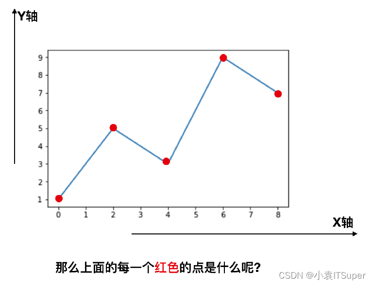
每个红色的点是坐标,把5个点的坐标连接成一条线,组成了一个折线图
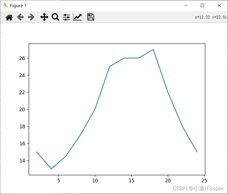
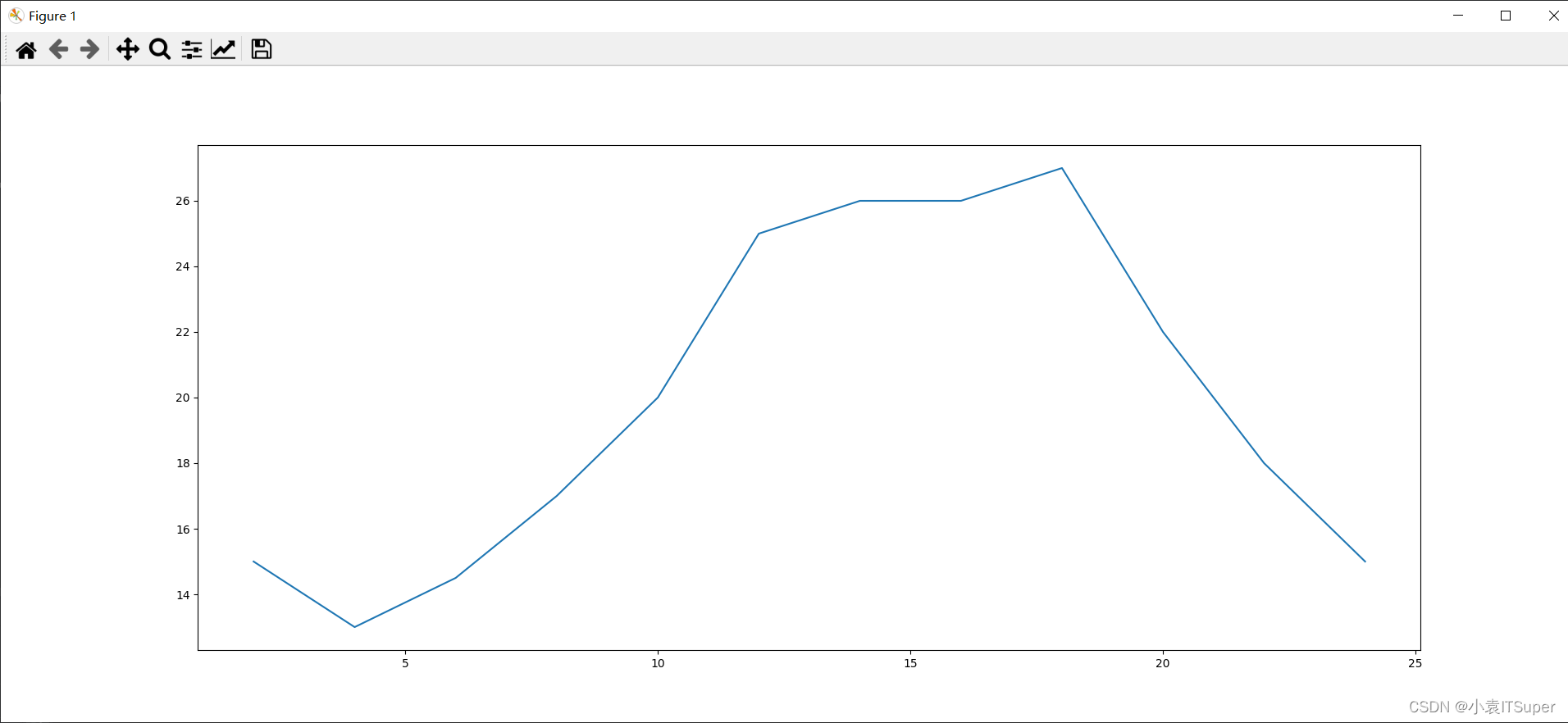
案例:假设一天中每隔两个小时(range(2,26,2))的气温(℃)分别是 [15,13,14.5,17,20,25,26,26,27,22,18,15]
import matplotlib.pyplot as plt

x = range(2, 26, 2)  # 数据在x轴的位置,是一个可迭代对象
y = [15, 13, 14.5, 17, 20, 25, 26, 26, 27, 22, 18, 15]  # 数据在y轴的位置,是一个可迭代对象
"""
x轴和y轴的数据一起组成了所有要绘制出的坐标
分别是(2,15)、(4,13)、(6,14.5)、(8,17)......
"""
plt.plot(x, y)  # 传入x和y,通过plot绘制出折线图
plt.show()  # 在执行程序的时候展示出图形
输出结果:
但是目前存在以下几个问题:
- 1、设置图片大小(想要一个高清无码大图)
- 2、保存到本地
- 3、描述信息,比如x轴和y轴表示什么,这个图表示什么
- 4、调整x或者y的刻度的间距
- 5、线条的样式(比如颜色,透明度等)
- 6、标记出特殊的点(比如告诉别人最高点和最低点在哪里)
- 7、给图片添加一个水印(防伪,防止盗用)
设置图片大小和分辨率
设置大小和清晰度:fig = plt.figure(figsize=(长度, 宽度), dpi=清晰度)
figsize=(20, 8):代表长宽dpi= 80:图片的清晰度
import matplotlib.pyplot as plt

x = range(2, 26, 2)
y = [15, 13, 14.5, 17, 20, 25, 26, 26, 27, 22, 18, 15]

fig = plt.figure(figsize=(20, 8), dpi=80)
"""
figure图形图标的意思,在这里指的是我们画的图
通过实例化一个figure并且传递参数,能够后台自动使用该figure实例
在图形模糊的时候可以传入dpi参数,让图片更加清晰
"""
plt.plot(x, y)
plt.savefig("./1.png")  # 保存图片;可以保存后缀为.svg这种矢量图格式,放大就不会有锯齿
plt.show()
输出结果:
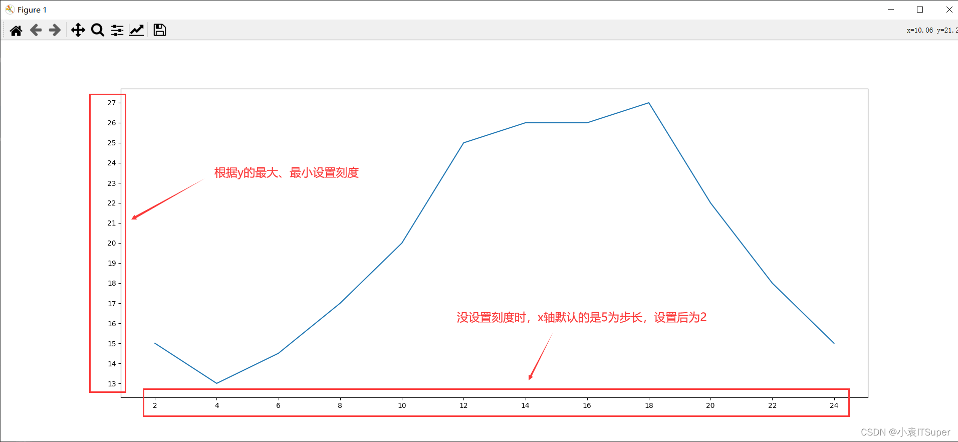
调整X或者Y轴上的刻度
设置x轴刻度:plt.xticks()
设置y轴刻度:plt.yticks()
import matplotlib.pyplot as plt

x = range(2, 26, 2)
y = [15, 13, 14.5, 17, 20, 25, 26, 26, 27, 22, 18, 15]

# 设置图片大小
fig = plt.figure(figsize=(20, 8), dpi=80)

# 设置x轴刻度
plt.xticks(x)
# plt.xticks(x[::2}) # 当刻度太密集时使用列表步长间隔取值来解决
# 设置y轴刻度
plt.yticks(range(min(y), max(y) + 1))

# 绘图
plt.plot(x, y)

# 显示图片
plt.show()
设置中文显示
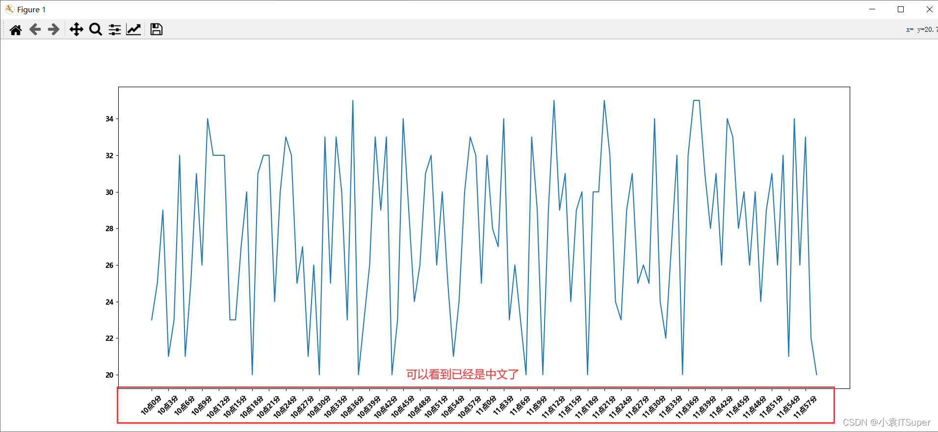
matplotlib默认不支持中文字符,因为默认的英文字体无法显示汉字
修改matplotlib的默认字体的两种方式:
- 通过
matplotlib模块下的matplotlib.rc可以修改,具体方法参见源码(windows/linux) - 通过
matplotlib模块下的font_manager可以解决(windows/linux/mac)
推荐用第一种,设置一次后后续代码就不用设置了
使用第一种方法:
import matplotlib.pyplot as plt
import random
import matplotlib

# 设置字体方法1(设置全局中文字体)
matplotlib.rc("font", family='MicroSoft YaHei', weight='bold')

x = range(0, 120)
y = [random.randint(20, 35) for i in range(120)]

# 设置图片大小
fig = plt.figure(figsize=(20, 8), dpi=80)

# 调整x轴刻度
_xtick_labels = ["10点{}分".format(i) for i in range(60)]
_xtick_labels += ["11点{}分".format(i) for i in range(60)]
# 设置步长,数字和字符串一一对应(数据的长度)
plt.xticks(list(x)[::3], _xtick_labels[::3], rotation=45)  # rotation旋转刻度的度数

# 绘图
plt.plot(x, y)

# 显示图片
plt.show()
输出结果:
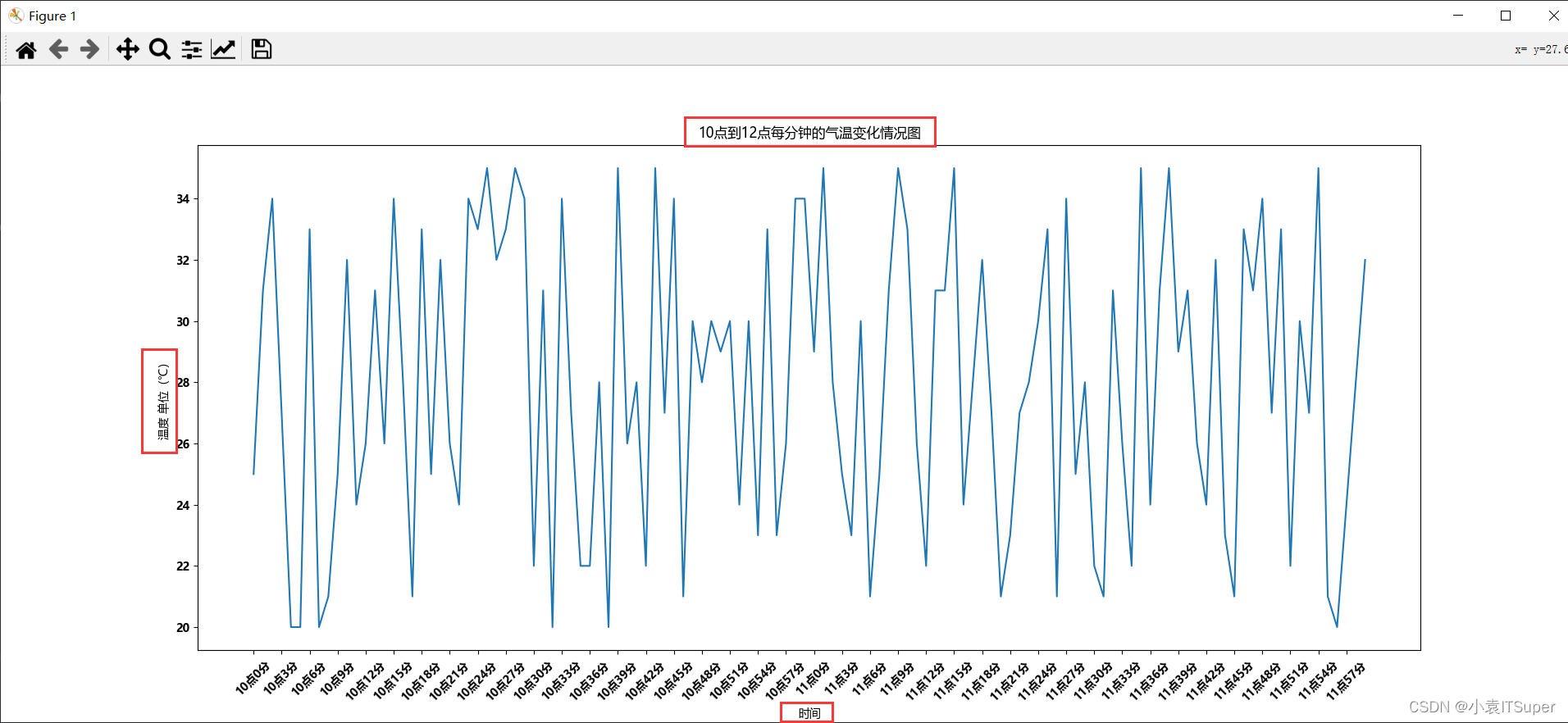
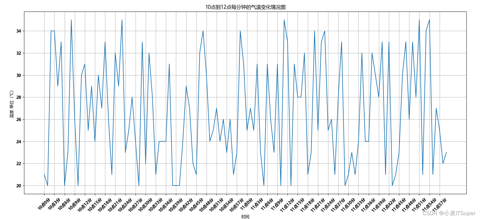
坐标轴添加描述信息
设置标题:plt.title("10点到12点每分钟的气温变化情况图")
设置x轴图例:plt.xlabel("时间")
设置y轴图例:plt.ylabel("温度 单位(℃)")
import matplotlib.pyplot as plt
import random
import matplotlib

# 设置字体方法1
matplotlib.rc("font", family='MicroSoft YaHei', weight='bold')

x = range(0, 120)
y = [random.randint(20, 35) for i in range(120)]

# 设置图片大小
fig = plt.figure(figsize=(20, 8), dpi=80)
# 调整x轴刻度
_xtick_labels = ["10点{}分".format(i) for i in range(60)]
_xtick_labels += ["11点{}分".format(i) for i in range(60)]
# 设置步长
plt.xticks(list(x)[::3], _xtick_labels[::3], rotation=45)  # rotation旋转刻度的度数
#设置图例
plt.xlabel("时间")
plt.ylabel("温度 单位(℃)")
plt.title("10点到12点每分钟的气温变化情况图")

# 绘图
plt.plot(x, y)

# 显示图片
plt.show()
输出结果:
绘制网格
设置网格:plt.grid(alph=0.4)
alph=0.4表示设置透明度,也可以省略不设置
import matplotlib.pyplot as plt
import random
import matplotlib

# 设置字体方法1
matplotlib.rc("font", family='MicroSoft YaHei', weight='bold')

x = range(0, 120)
y = [random.randint(20, 35) for i in range(120)]

# 设置图片大小
fig = plt.figure(figsize=(20, 8), dpi=80)
# 调整x轴刻度
_xtick_labels = ["10点{}分".format(i) for i in range(60)]
_xtick_labels += ["11点{}分".format(i) for i in range(60)]
# 设置步长
plt.xticks(list(x)[::3], _xtick_labels[::3], rotation=45)  # rotation旋转刻度的度数
#设置图例
plt.xlabel("时间")
plt.ylabel("温度 单位(℃)")
plt.title("10点到12点每分钟的气温变化情况图")
# 设置网格
plt.grid()

# 绘图
plt.plot(x, y)
# 显示图片
plt.show()
输出结果:出现x轴y轴密度相对应的网格
双折线图
假设大家在30岁的时候,根据自己的实际情况,统计出来了你和你同桌各自从11岁到30岁每年交的女(男)朋友的数量如列表a和b,请在一个图中绘制出该数据的折线图,以便比较自己和同桌20年间的差异,同时分析每年交女(男)朋友的数量走势
y_1 = [1,0,1,1,2,4,3,2,3,4,4,5,6,5,4,3,3,1,1,1]
y_2 = [1,0,3,1,2,2,3,3,2,1 ,2,1,1,1,1,1,1,1,1,1]
要求:
- y轴表示个数
- x轴表示岁数,比如11岁,12岁等
import matplotlib.pyplot as plt
import matplotlib

y_1 = [1, 0, 1, 1, 2, 4, 3, 2, 3, 4, 4, 5, 6, 5, 4, 3, 3, 1, 1, 1]
y_2 = [1, 0, 3, 1, 2, 2, 3, 3, 2, 1, 2, 1, 1, 1, 1, 1, 1, 1, 1, 1]
x = range(11, 31)

# 设置字体方法1
matplotlib.rc("font", family='MicroSoft YaHei', weight='bold')

# 设置图片大小
fig = plt.figure(figsize=(20, 8), dpi=80)

# 调整x轴
_xtick_labels = ["{}岁".format(i) for i in x]
plt.xticks(x, _xtick_labels)

# 设置y轴
plt.yticks(range(0, 9))

# 设置网格
plt.grid()

# 绘图
plt.plot(x, y_1)
plt.plot(x, y_2)

# 显示图片
plt.show()
输出结果:
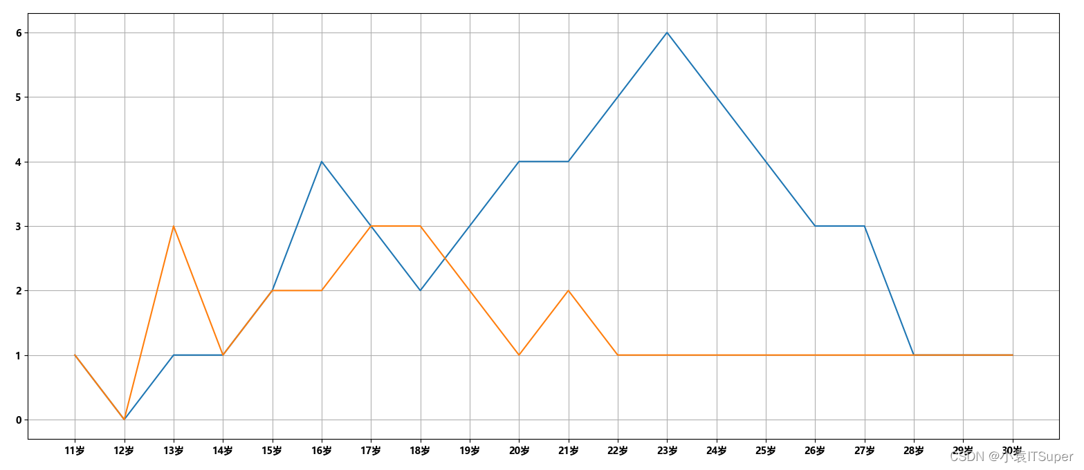
问题:没法区别哪条线是自己,哪条线是同桌;需要添加图例
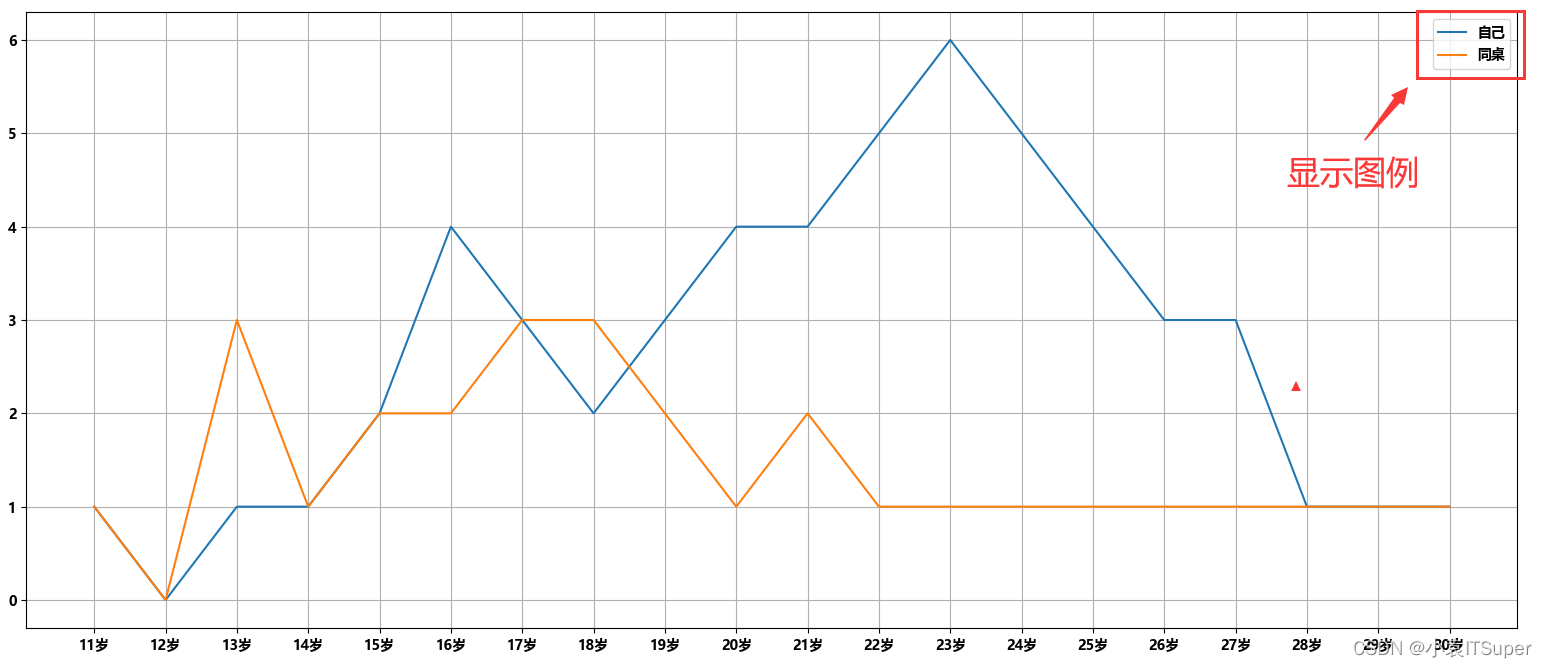
添加图例
绘图时添加 label参数
plt.plot(x, y_1, label="自己")
plt.plot(x, y_2, label="同桌")
绘图下方输入添加图例代码:
plt.legend()
注意:添加图例代码一定是要在添加图例代码下方
import matplotlib.pyplot as plt
import matplotlib

y_1 = [1, 0, 1, 1, 2, 4, 3, 2, 3, 4, 4, 5, 6, 5, 4, 3, 3, 1, 1, 1]
y_2 = [1, 0, 3, 1, 2, 2, 3, 3, 2, 1, 2, 1, 1, 1, 1, 1, 1, 1, 1, 1]
x = range(11, 31)

# 设置字体方法1
matplotlib.rc("font", family='MicroSoft YaHei', weight='bold')

# 设置图片大小
fig = plt.figure(figsize=(20, 8), dpi=80)

# 调整x轴
_xtick_labels = ["{}岁".format(i) for i in x]
plt.xticks(x, _xtick_labels)

# 设置y轴
plt.yticks(range(0, 9))

# 设置网格
plt.grid()

# 绘图
plt.plot(x, y_1, label="自己")
plt.plot(x, y_2, label="同桌")

# 添加图例
plt.legend()

# 显示图片
plt.show()
输出结果:
自定义绘制图形的风格
绘图时添加参数:
plt.plot(
    x,  # x轴
    y,  # y轴
    color='r',  # 线条颜色
    linestyle='--',  # 线条风格
    linewidth=5,  # 线条粗细
    alpha=0.5  # 透明度
)
| 颜色字符 | 风格字符 |
|---|---|
r (红色) | -(实线) |
g (绿色) | -- (虚线) |
b(蓝色) | -.(点划线) |
w(白色) | :(点虚线,虚线) |
c (青色) | '' (留空或空格,无线条) |
m(洋红) | |
y (黄色) | |
k(黑色) | |
#000ff00 (16进制) | |
0.8(灰度值字符串) | |
保存图片
plt.savefig("路径/图片名.png")
当前路径下生成图片文件:

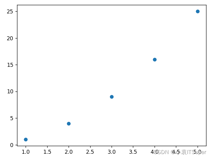
三、绘制散点图
绘制散点图和折线图的唯一区别在于,绘图时使用:
plt.scatter(x, y)
普通绘图
import matplotlib.pyplot as plt

x = [1, 2, 3, 4, 5]
y = [1, 4, 9, 16, 25]

# 使用scatter绘制散点图,和之前绘制折线图的唯一区别
plt.scatter(x, y)

# 显示
plt.show()
运行结果:
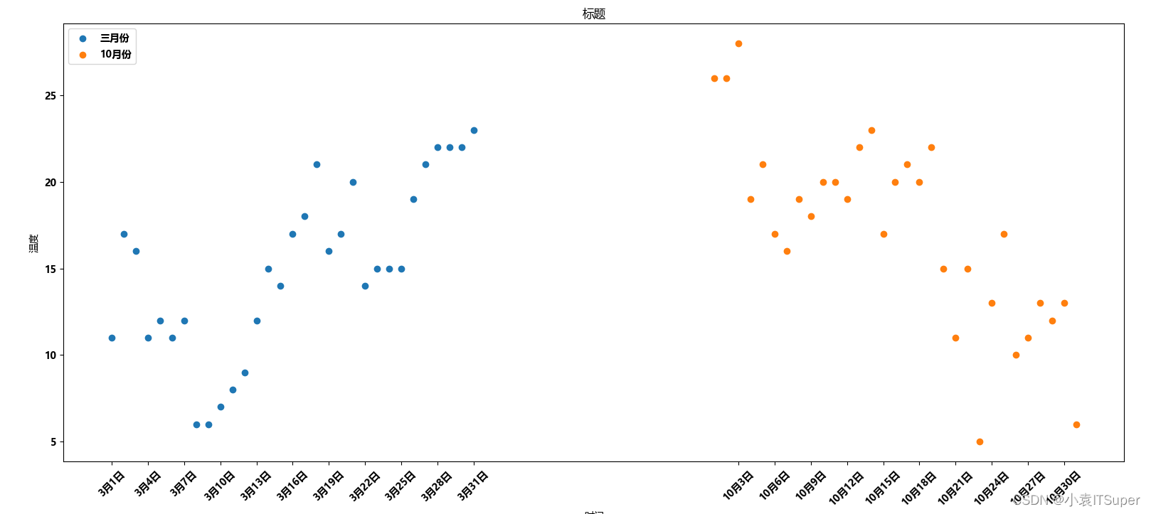
双散点图
假设通过爬虫你获取到了北京2016年3,10月份每天白天的最高气温(分别位于列表a,b),那么此时如何寻找出气温和随时间(天)变化的某种规律?
a = [11,17,16,11,12,11,12,6,6,7,8,9,12,15,14,17,18,21,16,17,20,14,15,15,15,19,21,22,22,22,23]
b = [26,26,28,19,21,17,16,19,18,20,20,19,22,23,17,20,21,20,22,15,11,15,5,13,17,10,11,13,12,13,6]
from matplotlib import pyplot as plt
import matplotlib

# 设置全局中文字体
matplotlib.rc("font", family='MicroSoft YaHei', weight='bold')

y_3 = [11, 17, 16, 11, 12, 11, 12, 6, 6, 7, 8, 9, 12, 15, 14, 17, 18, 21, 16, 17, 20, 14, 15, 15, 15, 19, 21, 22, 22,
       22, 23]
y_10 = [26, 26, 28, 19, 21, 17, 16, 19, 18, 20, 20, 19, 22, 23, 17, 20, 21, 20, 22, 15, 11, 15, 5, 13, 17, 10, 11, 13,
        12, 13, 6]

x_3 = range(1, 32)
x_10 = range(51, 82)

# 设置图形大小
plt.figure(figsize=(20, 8), dpi=80)

# 使用scatter绘制散点图,和之前绘制折线图的唯一区别
plt.scatter(x_3, y_3,label="三月份")
plt.scatter(x_10, y_10,label="10月份")

# 调整x轴的刻度
_x = list(x_3) + list(x_10)
_xtick_labels = ["3月{}日".format(i) for i in x_3]
_xtick_labels += ["10月{}日".format(i - 50) for i in x_10]
plt.xticks(_x[::3], _xtick_labels[::3], rotation=45)

# 添加图例
plt.legend(loc="upper left")

# 添加描述信息
plt.xlabel("时间")
plt.ylabel("温度")
plt.title("标题")

# 显示
plt.show()
运行结果:
四、绘制条形图
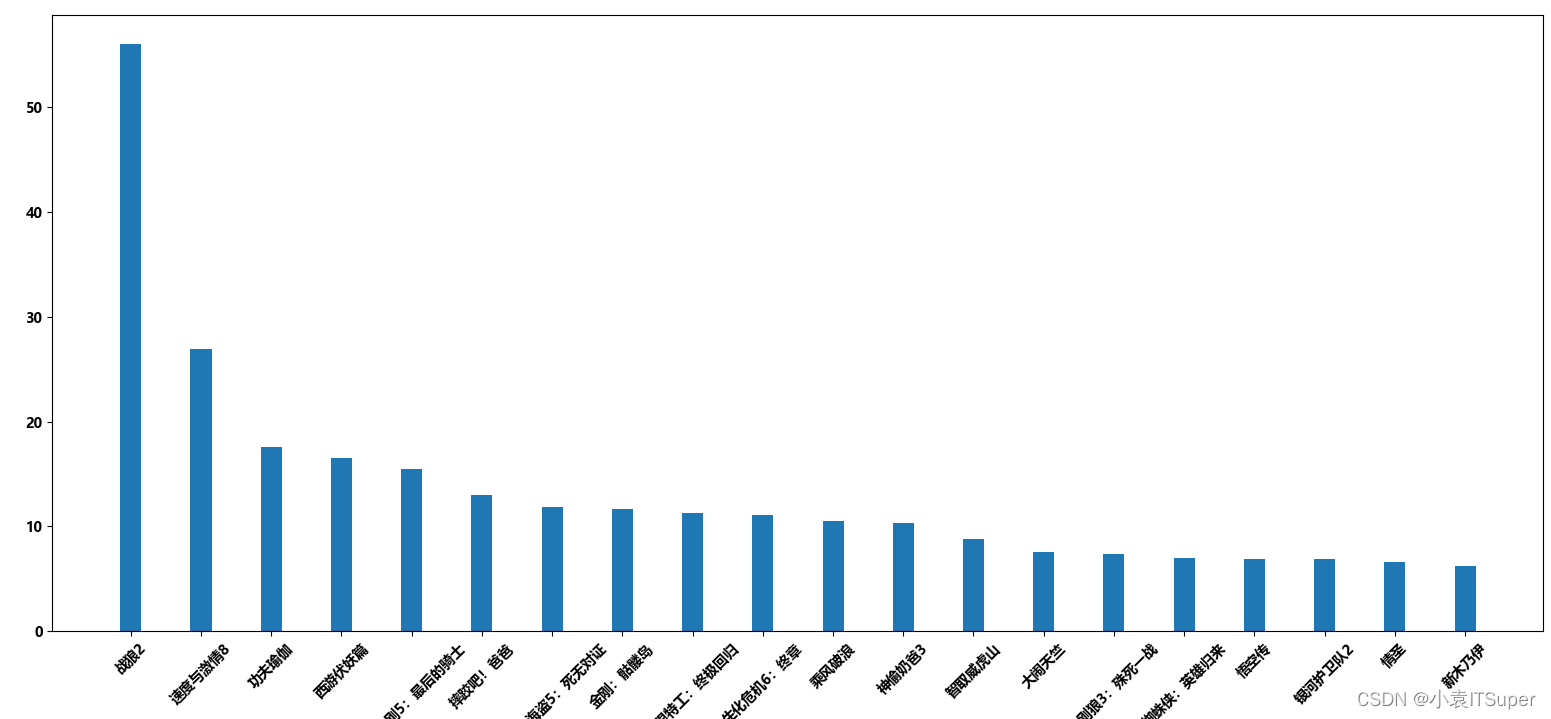
绘制竖着条形图
假设你获取到了2017年内地电影票房前20的电影(列表a)和电影票房数据(列表b),那么如何更加直观的展示该数据?
x = ["战狼2","速度与激情8","功夫瑜伽","西游伏妖篇","变形金刚5:最后的骑士","摔跤吧!爸爸","加勒比海盗5:死无对证","金刚:骷髅岛","极限特工:终极回归","生化危机6:终章","乘风破浪","神偷奶爸3","智取威虎山","大闹天竺","金刚狼3:殊死一战","蜘蛛侠:英雄归来","悟空传","银河护卫队2","情圣","新木乃伊",]
y = [56.01,26.94,17.53,16.49,15.45,12.96,11.8,11.61,11.28,11.12,10.49,10.3,8.75,7.55,7.32,6.99,6.88,6.86,6.58,6.23] # 单位:亿
import matplotlib.pyplot as plt
import matplotlib

x = ["战狼2", "速度与激情8", "功夫瑜伽", "西游伏妖篇", "变形金刚5:最后的骑士", "摔跤吧!爸爸", "加勒比海盗5:死无对证", "金刚:骷髅岛", "极限特工:终极回归", "生化危机6:终章",
     "乘风破浪", "神偷奶爸3", "智取威虎山", "大闹天竺", "金刚狼3:殊死一战", "蜘蛛侠:英雄归来", "悟空传", "银河护卫队2", "情圣", "新木乃伊", ]
y = [56.01, 26.94, 17.53, 16.49, 15.45, 12.96, 11.8, 11.61, 11.28, 11.12, 10.49, 10.3, 8.75, 7.55, 7.32, 6.99, 6.88,
     6.86, 6.58, 6.23]

# 设置全局中文字体
matplotlib.rc("font", family='MicroSoft YaHei', weight='bold')

# 设置图形大小
plt.figure(figsize=(20, 8), dpi=80)
# 绘制条形图
plt.bar(range(len(x)), y, width=0.3)

# 设置字符串到x轴
plt.xticks(range(len(x)), x, rotation=45)

plt.show()
运行结果:
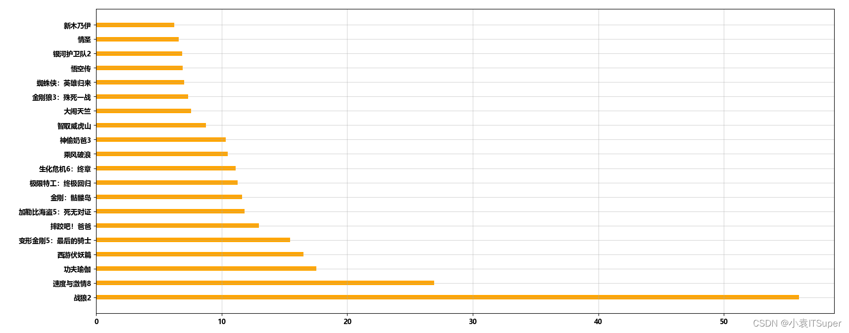
绘制横着条形图
与竖着条形图的区别在于:
- 1、绘图的方法小差别:
plt.barh(x, y) - 2、字符串绘制到y轴:
plt.yticks(range(len(x)), x)
import matplotlib.pyplot as plt
import matplotlib

x = ["战狼2", "速度与激情8", "功夫瑜伽", "西游伏妖篇", "变形金刚5:最后的骑士", "摔跤吧!爸爸", "加勒比海盗5:死无对证", "金刚:骷髅岛", "极限特工:终极回归", "生化危机6:终章",
     "乘风破浪", "神偷奶爸3", "智取威虎山", "大闹天竺", "金刚狼3:殊死一战", "蜘蛛侠:英雄归来", "悟空传", "银河护卫队2", "情圣", "新木乃伊", ]
y = [56.01, 26.94, 17.53, 16.49, 15.45, 12.96, 11.8, 11.61, 11.28, 11.12, 10.49, 10.3, 8.75, 7.55, 7.32, 6.99, 6.88,
     6.86, 6.58, 6.23]

# 设置全局中文字体
matplotlib.rc("font", family='MicroSoft YaHei', weight='bold')

# 设置图形大小
plt.figure(figsize=(20, 8), dpi=80)
# 绘制条形图
plt.barh(range(len(x)), y, color="orange")

# 设置字符串到y轴
plt.yticks(range(len(x)), x)

# 绘制网格
plt.grid(alpha=0.5)

plt.show()
运行结果:
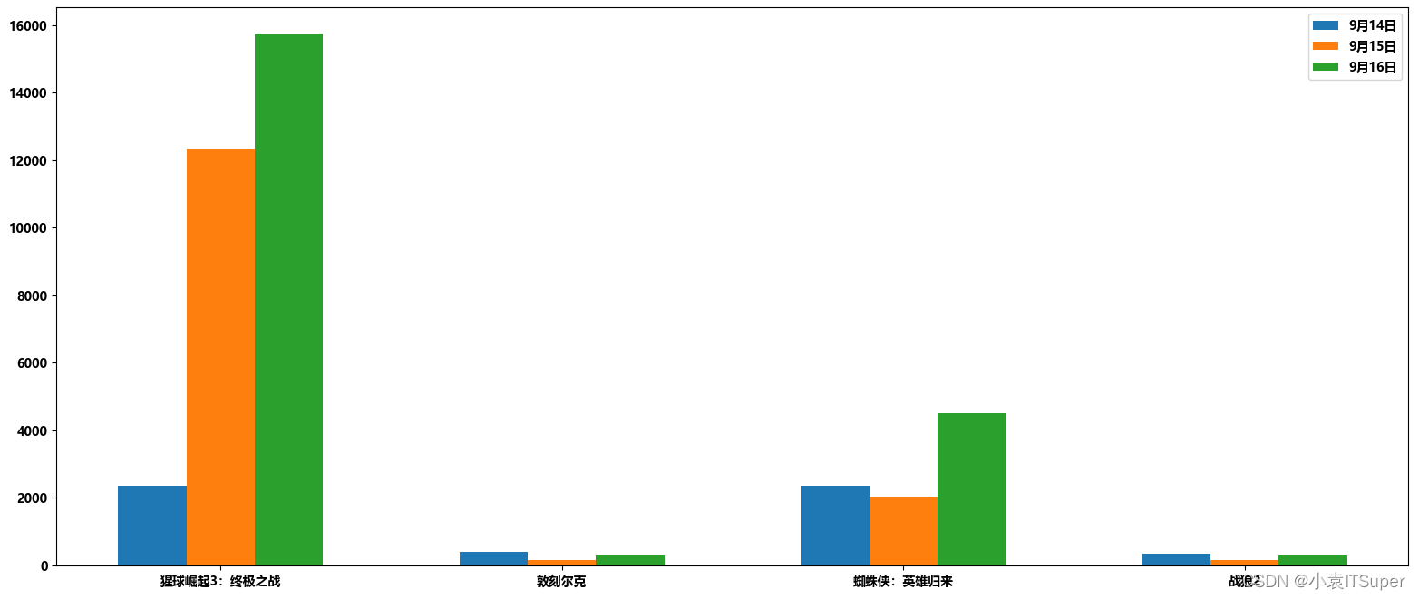
绘制多条形图
假设你知道了列表a中电影分别在2017-09-14(b_14), 2017-09-15(b_15), 2017-09-16(b_16)三天的票房,为了展示列表中电影本身的票房以及同其他电影的数据对比情况,应该如何更加直观的呈现该数据?
x = ["猩球崛起3:终极之战", "敦刻尔克", "蜘蛛侠:英雄归来", "战狼2"]
y_16 = [15746, 312, 4497, 319]
y_15 = [12357, 156, 2045, 168]
y_14 = [2358, 399, 2358, 362]
import matplotlib.pyplot as plt
import matplotlib

x = ["猩球崛起3:终极之战", "敦刻尔克", "蜘蛛侠:英雄归来", "战狼2"]
y_16 = [15746, 312, 4497, 319]
y_15 = [12357, 156, 2045, 168]
y_14 = [2358, 399, 2358, 362]

# 设置全局中文字体
matplotlib.rc("font", family='MicroSoft YaHei', weight='bold')

# 一天画完后,下一天往x轴左移
bar_width = 0.2  # 设置柱状图大小不能超过0.3
x_14 = list(range(len(x)))
x_15 = [i + bar_width for i in x_14]
x_16 = [i + bar_width * 2 for i in x_14]

# 设置图片大小
plt.figure(figsize=(20, 8), dpi=80)

# 绘图
plt.bar(range(len(x)), y_14, width=bar_width, label="9月14日")
plt.bar(x_15, y_15, width=bar_width, label="9月15日")
plt.bar(x_16, y_16, width=bar_width, label="9月16日")

# 设置图例
plt.legend()

# 设置x轴刻度
plt.xticks(x_15, x)

plt.show()
运行结果:
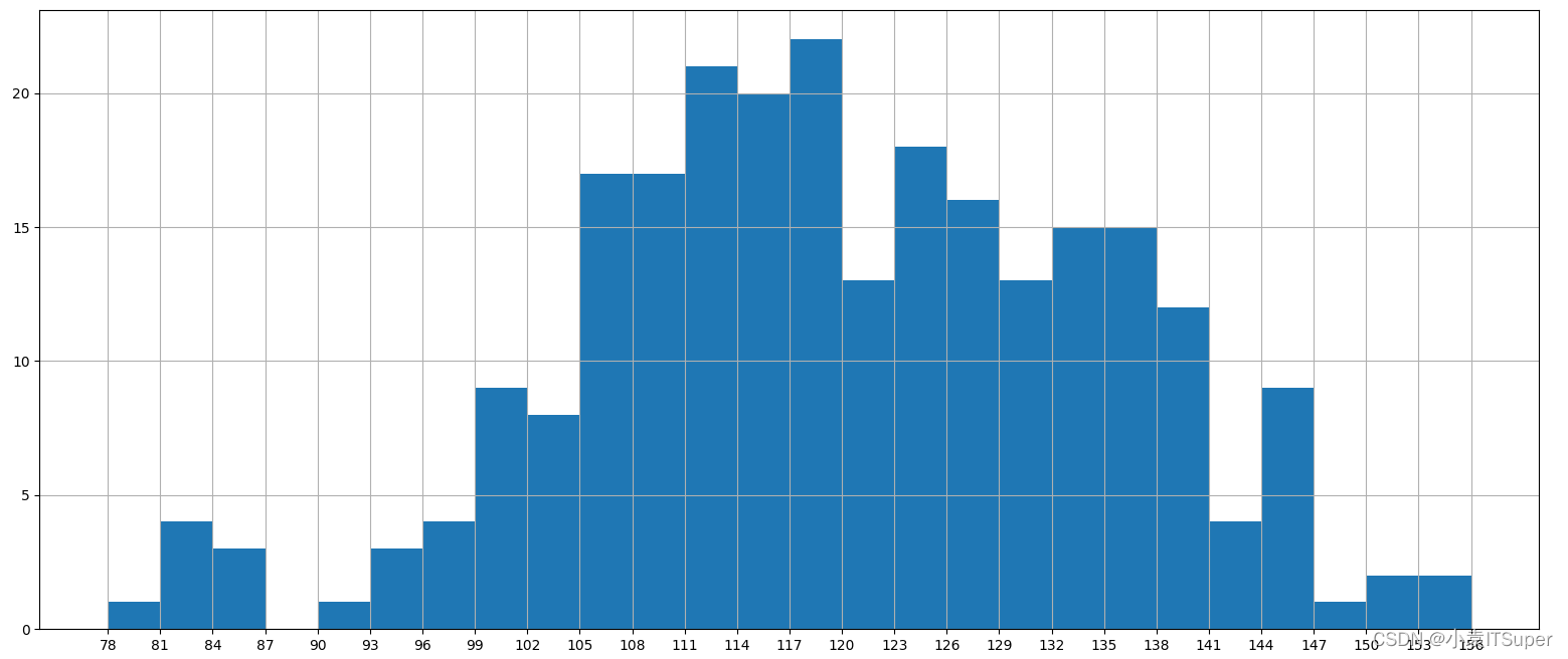
五、直方图:hist
一般来说能够使用plt.hist方法的的是那些没有统计过的数据
频数分布直方图
假设你获取了250部电影的时长(列表a中),希望统计出这些电影时长的分布状态(比如时长为100分钟到120分钟电影的数量,出现的频率)等信息,你应该如何呈现这些数据?
a=[131, 98, 125, 131, 124, 139, 131, 117, 128, 108, 135, 138, 131, 102, 107, 114, 119, 128, 121, 142, 127, 130, 124, 101, 110, 116, 117, 110, 128, 128, 115, 99, 136, 126, 134, 95, 138, 117, 111,78, 132, 124, 113, 150, 110, 117, 86, 95, 144, 105, 126, 130,126, 130, 126, 116, 123, 106, 112, 138, 123, 86, 101, 99, 136,123, 117, 119, 105, 137, 123, 128, 125, 104, 109, 134, 125, 127,105, 120, 107, 129, 116, 108, 132, 103, 136, 118, 102, 120, 114,105, 115, 132, 145, 119, 121, 112, 139, 125, 138, 109, 132, 134,156, 106, 117, 127, 144, 139, 139, 119, 140, 83, 110, 102,123,107, 143, 115, 136, 118, 139, 123, 112, 118, 125, 109, 119, 133,112, 114, 122, 109, 106, 123, 116, 131, 127, 115, 118, 112, 135,115, 146, 137, 116, 103, 144, 83, 123, 111, 110, 111, 100, 154,136, 100, 118, 119, 133, 134, 106, 129, 126, 110, 111, 109, 141,120, 117, 106, 149, 122, 122, 110, 118, 127, 121, 114, 125, 126,114, 140, 103, 130, 141, 117, 106, 114, 121, 114, 133, 137, 92,121, 112, 146, 97, 137, 105, 98, 117, 112, 81, 97, 139, 113,134, 106, 144, 110, 137, 137, 111, 104, 117, 100, 111, 101, 110,105, 129, 137, 112, 120, 113, 133, 112, 83, 94, 146, 133, 101,131, 116, 111, 84, 137, 115, 122, 106, 144, 109, 123, 116, 111,111, 133, 150]
把数据分为多少组进行统计???
组数要适当,太少会有较大的统计误差,大多规律不明显

import matplotlib.pyplot as plt

a = [131, 98, 125, 131, 124, 139, 131, 117, 128, 108, 135, 138, 131, 102, 107, 114, 119, 128, 121, 142, 127, 130, 124,
     101, 110, 116, 117, 110, 128, 128, 115, 99, 136, 126, 134, 95, 138, 117, 111, 78, 132, 124, 113, 150, 110, 117, 86,
     95, 144, 105, 126, 130, 126, 130, 126, 116, 123, 106, 112, 138, 123, 86, 101, 99, 136, 123, 117, 119, 105, 137,
     123, 128, 125, 104, 109, 134, 125, 127, 105, 120, 107, 129, 116, 108, 132, 103, 136, 118, 102, 120, 114, 105, 115,
     132, 145, 119, 121, 112, 139, 125, 138, 109, 132, 134, 156, 106, 117, 127, 144, 139, 139, 119, 140, 83, 110, 102,
     123, 107, 143, 115, 136, 118, 139, 123, 112, 118, 125, 109, 119, 133, 112, 114, 122, 109, 106, 123, 116, 131, 127,
     115, 118, 112, 135, 115, 146, 137, 116, 103, 144, 83, 123, 111, 110, 111, 100, 154, 136, 100, 118, 119, 133, 134,
     106, 129, 126, 110, 111, 109, 141, 120, 117, 106, 149, 122, 122, 110, 118, 127, 121, 114, 125, 126, 114, 140, 103,
     130, 141, 117, 106, 114, 121, 114, 133, 137, 92, 121, 112, 146, 97, 137, 105, 98, 117, 112, 81, 97, 139, 113, 134,
     106, 144, 110, 137, 137, 111, 104, 117, 100, 111, 101, 110, 105, 129, 137, 112, 120, 113, 133, 112, 83, 94, 146,
     133, 101, 131, 116, 111, 84, 137, 115, 122, 106, 144, 109, 123, 116, 111, 111, 133, 150]

# 计算组数
d = 3  # 组距尽可能是能被max,min整除的数
num_bins = (max(a) - min(a)) // d

# 设置图形大小
plt.figure(figsize=(20, 8), dpi=80)

# 绘制直方图
plt.hist(a, num_bins)

# 设置x轴刻度
plt.xticks(range(min(a), max(a) + d, d))

# 设置网格
plt.grid()

plt.show()
运行结果:
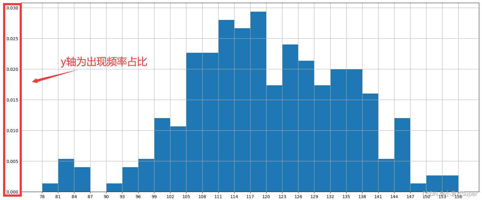
频率分布直方图
只需要修改一处代码plt.hist(a, num_bins, density=True) # density为True表示频率
import matplotlib.pyplot as plt

a = [131, 98, 125, 131, 124, 139, 131, 117, 128, 108, 135, 138, 131, 102, 107, 114, 119, 128, 121, 142, 127, 130, 124,
     101, 110, 116, 117, 110, 128, 128, 115, 99, 136, 126, 134, 95, 138, 117, 111, 78, 132, 124, 113, 150, 110, 117, 86,
     95, 144, 105, 126, 130, 126, 130, 126, 116, 123, 106, 112, 138, 123, 86, 101, 99, 136, 123, 117, 119, 105, 137,
     123, 128, 125, 104, 109, 134, 125, 127, 105, 120, 107, 129, 116, 108, 132, 103, 136, 118, 102, 120, 114, 105, 115,
     132, 145, 119, 121, 112, 139, 125, 138, 109, 132, 134, 156, 106, 117, 127, 144, 139, 139, 119, 140, 83, 110, 102,
     123, 107, 143, 115, 136, 118, 139, 123, 112, 118, 125, 109, 119, 133, 112, 114, 122, 109, 106, 123, 116, 131, 127,
     115, 118, 112, 135, 115, 146, 137, 116, 103, 144, 83, 123, 111, 110, 111, 100, 154, 136, 100, 118, 119, 133, 134,
     106, 129, 126, 110, 111, 109, 141, 120, 117, 106, 149, 122, 122, 110, 118, 127, 121, 114, 125, 126, 114, 140, 103,
     130, 141, 117, 106, 114, 121, 114, 133, 137, 92, 121, 112, 146, 97, 137, 105, 98, 117, 112, 81, 97, 139, 113, 134,
     106, 144, 110, 137, 137, 111, 104, 117, 100, 111, 101, 110, 105, 129, 137, 112, 120, 113, 133, 112, 83, 94, 146,
     133, 101, 131, 116, 111, 84, 137, 115, 122, 106, 144, 109, 123, 116, 111, 111, 133, 150]

# 计算组数
d = 3  # 组距尽可能是能被max,min整除的数
num_bins = (max(a) - min(a)) // d

# 设置图形大小
plt.figure(figsize=(20, 8), dpi=80)

# 绘制直方图
plt.hist(a, num_bins, density=True)  # density为True表示频率

# 设置x轴刻度
plt.xticks(range(min(a), max(a) + d, d))

# 设置网格
plt.grid()

plt.show()
运行结果:
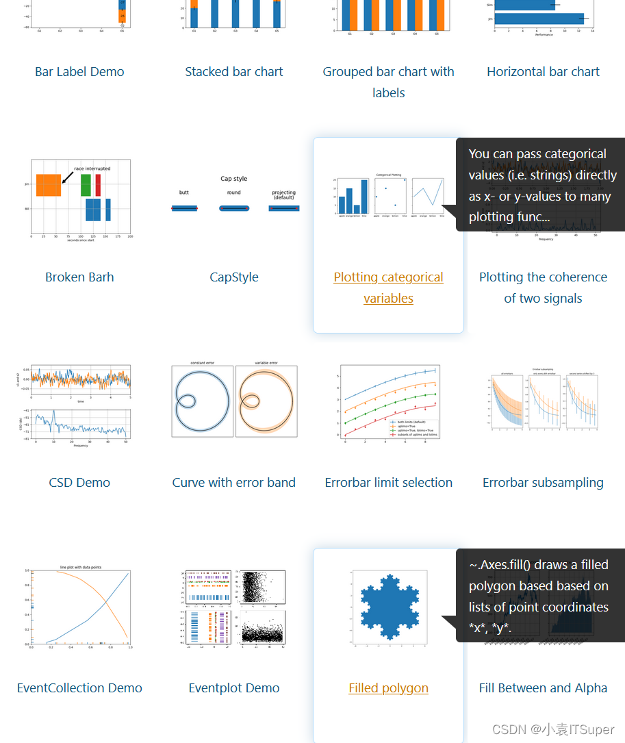
六、更多的图形样式
matplotlib支持的图形是非常多的:http://matplotlib.org/gallery/index.html
七、通用自定义图片方法
设置线条样式颜色:ax.plot(x, y, linestyle=‘--’, color=‘r’)
设置刻度范围:
plt.xlim(), plt.ylim()

ax.set_xlim(), ax.set_ylim()
设置显示的刻度:
plt.xticks(), plt.yticks()

ax.set_xticks(), ax.set_yticks()
设置刻度标签:
ax.set_xticklabels(), ax.set_yticklabels()
设置坐标轴标签:
ax.set_xlabel()
ax.set_ylabel()
设置标题
ax.set_title()
图例
ax.plot(label=‘legend’)

ax.legend()
plt.legend()


loc=‘best’:自动选择放置图例最佳位置
保存图片:
plt.savefig("路径/图片名.png")
文章出处登录后可见!