常用操作
基本
- 设置x/y轴的名字:plt.xlabel,ax.set_xlabel。labelpad可以调整文字和坐标轴的距离
- 设置坐标轴刻度:plt.xticks(x,x_自定义), ax.set_xticks(设置范围)+ax.set_xticklabels(设置刻度展示文字,和xticks搭配使用)一起用。rotation可以调整文字的角度
- 设置title:plt.title(), ax.set_title()
- 设置边框的可见度
- matplotlib.pyplot.axhline(y=0, xmin=0, xmax=1, **kwargs) 画横线# axvline 竖线
ax=plt.gca()  #gca:get current axis得到当前轴
#设置图片的右边框和上边框为不显示
ax.spines['right'].set_color('none')
ax.spines['top'].set_color('none')
- 开始设置图像的大小
plt.figure(figsize=(10, 5), dpi=400)
展示多张图像
https://blog.csdn.net/qwe2508/article/details/88078746
plt.figure()
for i in range(1,32):
    plt.subplot(4,8,i)
    plt.imshow(img_test[i-1])
plt.show()
plt设置文字
参考https://blog.csdn.net/TeFuirnever/article/details/88947248
plt.text(x,
	y,
	string,
	fontsize=15,
	verticalalignment="top",
	horizontalalignment="right"
)
参数:
- x,y:表示坐标值上的值
- string:表示说明文字
- fontsize:表示字体大小
- verticalalignment:垂直对齐方式 ,参数:[ ‘center’ | ‘top’ | ‘bottom’ | ‘baseline’ ]
- horizontalalignment:水平对齐方式 ,参数:[ ‘center’ | ‘right’ | ‘left’ ]
- xycoords选择指定的坐标轴系统:
- figure points:图左下角的点
- figure pixels:图左下角的像素
- figure fraction:图的左下部分
- axes points:坐标轴左下角的点
- axes pixels:坐标轴左下角的像素
- axes fraction:左下轴的分数
- data:使用被注释对象的坐标系统(默认)
- polar(theta,r):if not native ‘data’ coordinates t
- arrowprops #箭头参数,参数类型为字典dict
- width:箭头的宽度(以点为单位)
- headwidth:箭头底部以点为单位的宽度
- headlength:箭头的长度(以点为单位)
- shrink:总长度的一部分,从两端“收缩”
- facecolor:箭头颜色
- bbox给标题增加外框 ,常用参数如下:
- boxstyle:方框外形
- facecolor:(简写fc)背景颜色
- edgecolor:(简写ec)边框线条颜色
- edgewidth:边框线条大小
绘制多个图
fig, axes = plt.subplots(nrows=2, ncols=2,figsize=(11, 7),dpi=400)
# 选择画布
ax = axes[1][1]
或者
plt.subplot(122)
图注设置
- 设置图注:
plt.legend()在画图的时候每个图加一个label就可以
另一种方式
line1, = plt.plot(xxx, label='女生购物欲望')
line2, = plt.plot(xxx, label='男生购物欲望')
# 或者这样进行修改
plt.legend(handles=[line1, line2], labels=['girl购物欲望','boy购物欲望'], loc='best',title="图例标题")
如果没有line的话,通过这种方式获得,参考https://www.cnblogs.com/MTandHJ/p/10850415.html
handles, labels = ax.get_legend_handles_labels()
ax.legend(handles, labels)
可选loc参数
best
upper right
upper left
lower left
lower right
right
center left
center right
lower center
upper center
center
保存图片
ax.get_figure().savefig('name',dpi=400)
# 或者
plt.savefig('name',dpi=400)
设置背景透明
参考https://blog.csdn.net/hfut_jf/article/details/52648033
# 设置图例透明
legend = ax.legend()
frame = legend.get_frame()
frame.set_alpha(1)
frame.set_facecolor('none') # 设置图例legend背景透明

# 给每个数据矩形标注数值
plt.savefig('{路径}', format='png', bbox_inches='tight', transparent=True, dpi=600) # bbox_inches='tight' 图片边界空白紧致, 背景透明
显示中文
检查字体
import matplotlib as mpl
mpl.font_manager.fontManager.ttflist
根据字体的名字修改设置
import matplotlib.pyplot as plt
# 支持中文
plt.rcParams['font.sans-serif'] = ['SimHei']  # 用来正常显示中文,这个字体和上述的ttflist中出现的名字一致
plt.rcParams['axes.unicode_minus'] = False  # 用来正常显示负号
color bar设置刻度和坐标值
参考官方文档https://matplotlib.org/2.0.2/examples/pylab_examples/colorbar_tick_labelling_demo.html
import matplotlib.pyplot as plt

# 随机设置 10*10 的矩阵
x = np.random.random([10, 10])

# 初始化出图设置
fig = plt.figure()
ax = fig.gca()
im = ax.imshow(x)

# 这里设定在colorbar上的位置,一个是horizontal(底部横着),另一个是vertical(右侧竖着)
quater = (x.max()+x.min())/4
cbar =fig.colorbar(im, ticks=[x.min(), quater ,quater*2, quater*3, x.max()], orientation='horizontal',
fraction=0.04, pad = 0.01,# fraction表示这个条的长度比例, pad表示这个条和图的距离
)
# cbar =fig.colorbar(im, ticks=[x.min(), (x.max()+x.min())/2, x.max()], orientation='vertical')

# 和上面的位置一一对应的字符串
cbar.ax.set_xticklabels(['Low', '123','Medium', '哈哈哈','High'])  # horizontal colorbar
# cbar.ax.set_yticklabels(['Low', 'Medium', 'High'])  # vertical colorbar

plt.show()
colorbar适配主图
详见https://blog.csdn.net/sinat_32570141/article/details/105226330
渐变
sns.color_palette("Blues", 10)
颜色 colormap 自定义渐变
参考https://blog.csdn.net/qq_23044461/article/details/117703854
import matplotlib as mpl

color_normal = mpl.colors.LinearSegmentedColormap.from_list('自定义的颜色名字',
                                             [(0,    '#F0DD72'),
                                              (0.5,  '#FFD1A8'),
                                              (1,    '#F0A090'),], N=3) # N用来定义颜色被拆分成多少份
red_color_normal
各种图
饼状图
参考https://blog.csdn.net/weixin_46649052/article/details/115321326
import matplotlib.pyplot as plt

labels = 'Frogs', 'Hogs', 'Dogs', 'Logs'  # 定义标签
sizes = [15, 30, 45, 10]  # 每一块的比例
colors = ['yellowgreen', 'gold', 'lightskyblue', 'lightcoral']  # 每一块的颜色
explode = (0, 0.1, 0, 0)  # 突出显示,这里仅仅突出显示第二块(即'Hogs')

plt.pie(sizes, explode=explode, labels=labels, colors=colors, autopct='%1.1f%%', shadow=True, startangle=90)
plt.axis('equal')  # 显示为圆(避免比例压缩为椭圆)
plt.show()
折线图
参考https://zhuanlan.zhihu.com/p/110656183
import matplotlib.pyplot as plt
n = [0, 1, 2, 3, 4]
m = [2, 3, -1, 1, -2]
plt.plot(n, m,
         color = 'k',
         linestyle = '-.',
         linewidth = 3,
         marker = 'p',
         markersize = 15,
         markeredgecolor = 'b',
         markerfacecolor = 'r')
plt.show()
柱状图
参考https://zhuanlan.zhihu.com/p/25128216
import numpy as np
import matplotlib.pyplot as plt

size = 5
x = np.arange(size)
a = np.random.random(size)
b = np.random.random(size)
c = np.random.random(size)

total_width, n = 0.8, 3
width = total_width / n
x = x - (total_width - width) / 2

plt.bar(x, a,  width=width, label='a')
plt.bar(x + width, b, width=width, label='b')
plt.bar(x + 2 * width, c, width=width, label='c')
plt.legend()
plt.show()
横过来的柱状图
import numpy as np
import matplotlib.pyplot as plt

a = np.array([5, 20, 15, 25, 10])
b = np.array([10, 15, 20, 15, 5])

plt.barh(range(len(a)), a)
plt.barh(range(len(b)), -b)
plt.show()
极坐标柱状图
import numpy as np
import matplotlib.pyplot as plt

N = 8 # 分成8份
theta = np.linspace(0.0, 2 * np.pi, N, endpoint=False)
radii = np.random.randint(3,15,size = N)
width = np.pi / 4
colors = np.random.rand(8,3) # 随机⽣成颜⾊
ax = plt.subplot(111, projection='polar') # polar表示极坐标
ax.bar(
    x=theta,       # 柱子的位置
    height=radii, # 柱子的高度
    width=width,    # 柱子的宽度
    bottom=bottom,  # 开始画的位置
    linewidth=2,    # 线段宽度
    edgecolor='white',# 用白色分开
    color=colors      # 每个柱子的颜色
)
面积图
参考https://blog.csdn.net/weixin_45880844/article/details/121649879
#导入模块
import matplotlib
import pandas as pd
#准备数据
df = pd.DataFrame({
    'han': [30, 20, 20, 10, 20, 10],
    'shu': [7, 9, 6, 8, 1, 7],
    'huan': [11, 12, 18, 16, 17, 15],
}, index=pd.date_range(start='2021/12/01', end='2022/06/01', freq='M'))
colorDic = dict(han='DarkGreen', shu='DarkOrange', huan='DarkBlue')
ax = df.plot.area(stacked=False,color=colorDic,figsize=(20,10))
matplotlib.pyplot.show()
箱线图
别人博客学的骚操作
参考https://www.cnblogs.com/Big-Big-Watermelon/p/14052165.html
marker
普通marker
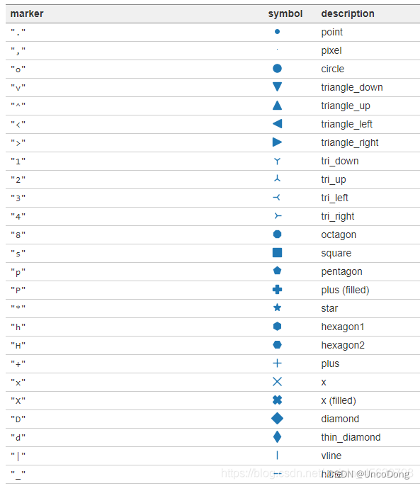
数学符号marker
可以显示的形状    marker名称
ϖ   \varpi
ϱ   \varrho
ς   \varsigma
ϑ   \vartheta
ξ   \xi
ζ   \zeta
Δ   \Delta
Γ   \Gamma
Λ   \Lambda
Ω   \Omega
Φ   \Phi
Π   \Pi
Ψ   \Psi
Σ   \Sigma
Θ   \Theta
Υ   \Upsilon
Ξ   \Xi
℧   \mho
∇   \nabla
ℵ   \aleph
ℶ   \beth
ℸ   \daleth
ℷ   \gimel
/   /
[   [
⇓   \Downarrow
⇑   \Uparrow
‖   \Vert
↓   \downarrow
⟨   \langle
⌈   \lceil
⌊   \lfloor
⌞   \llcorner
⌟   \lrcorner
⟩   \rangle
⌉   \rceil
⌋   \rfloor
⌜   \ulcorner
↑   \uparrow
⌝   \urcorner
\vert
{   \{
\|
}   \}
]   ]
|
⋂   \bigcap
⋃   \bigcup
⨀   \bigodot
⨁   \bigoplus
⨂   \bigotimes
⨄   \biguplus
⋁   \bigvee
⋀   \bigwedge
∐   \coprod
∫   \int
∮   \oint
∏   \prod
∑   \sum
自定义marker
import matplotlib.pyplot as plt
plt.rcParams['font.sans-serif']=['SimHei']  # 用于显示中文
plt.rcParams['axes.unicode_minus'] = False  # 用于显示中文
plt.figure(dpi=200)
#常规marker使用
plt.plot([1,2,3],[1,2,3],marker=4, markersize=15, color='lightblue',label='常规marker')
plt.plot([1.8,2.8,3.8],[1,2,3],marker='2', markersize=15, color='#ec2d7a',label='常规marker')

#非常规marker使用
#注意使用两个$符号包围名称
plt.plot([1,2,3],[4,5,6],marker='$\circledR$', markersize=15, color='r', alpha = 0.5 ,label='非常规marker')
plt.plot([1.5,2.5,3.5],[1.25,2.1,6.5],marker='$\heartsuit$', markersize=15, color='#f19790', alpha=0.5,label='非常规marker')
plt.plot([1,2,3],[2.5,6.2,8],marker='$\clubsuit$', markersize=15, color='g', alpha=0.5,label='非常规marker')

#自定义marker
plt.plot([1.2,2.2,3.2],[1,2,3],marker='$666$', markersize=15, color='#2d0c13',label='自定义marker')
plt.legend(loc='upper left')
for i in ['top','right']:
    plt.gca().spines[i].set_visible(False)
线的形状
字符型linestyle
linestyle_str = [
('solid', 'solid'), # Same as (0, ()) or '-';solid’, (0, ()) , '-'三种都代表实线。
('dotted', 'dotted'), # Same as (0, (1, 1)) or '.'
('dashed', 'dashed'), # Same as '--'
('dashdot', 'dashdot')] # Same as '-.'
元组型linestyle
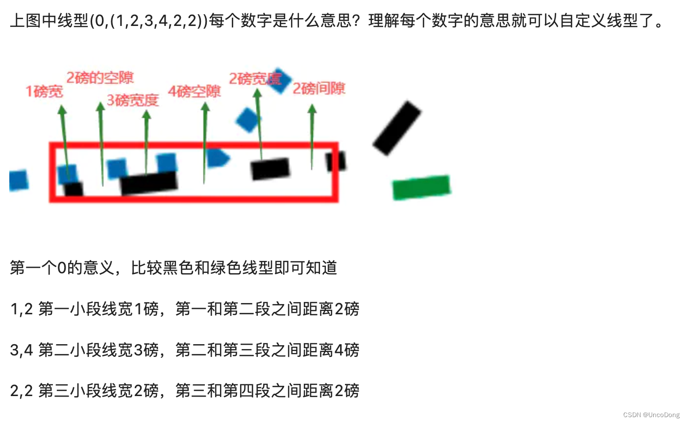
可以通过修改元组中的数字来呈现出不同的线型,因此可以构造出无数种线型。
linestyle_tuple = [
('loosely dotted', (0, (1, 10))),
('dotted', (0, (1, 1))),
('densely dotted', (0, (1, 2))), ('loosely dashed', (0, (5, 10))),
('dashed', (0, (5, 5))),
('densely dashed', (0, (5, 1))), ('loosely dashdotted', (0, (3, 10, 1, 10))),
('dashdotted', (0, (3, 5, 1, 5))),
('densely dashdotted', (0, (3, 1, 1, 1))), ('dashdotdotted', (0, (3, 5, 1, 5, 1, 5))),
('loosely dashdotdotted', (0, (3, 10, 1, 10, 1, 10))),
('densely dashdotdotted', (0, (3, 1, 1, 1, 1, 1)))]
线型使用代码:
import matplotlib.pyplot as plt
plt.figure(dpi=120)
#字符型linestyle使用方法
plt.plot([1,2,3],[1,2,13],linestyle='dotted', color='#1661ab', linewidth=5, label='字符型线型:dotted')

#元组型lintstyle使用方法
plt.plot([0.8,0.9,1.5],[0.8,0.9,21.5],linestyle=(0,(3, 1, 1, 1, 1, 1)), color='#ec2d7a', linewidth=5, label='元组型线型:(0,(3, 1, 1, 1, 1, 1)')

for i in ['top','right']:
    plt.gca().spines[i].set_visible(False)

#自定义inestyle
plt.plot([1.5,2.5,3.5],[1,2,13],linestyle=(0,(1,2,3,4,2,2)), color='black', linewidth=5, label='自定义线型:(0,(1,2,3,4,2,2)))')
plt.plot([2.5,3.5,4.5],[1,2,13],linestyle=(2,(1,2,3,4,2,2)), color='g', linewidth=5, label='自定义线型:(1,(1,2,3,4,2,2)))')
plt.legend()
不得不说这哥们写的真好
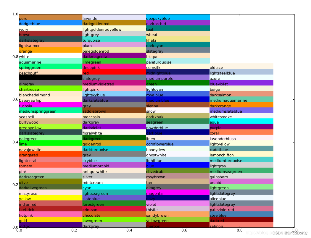
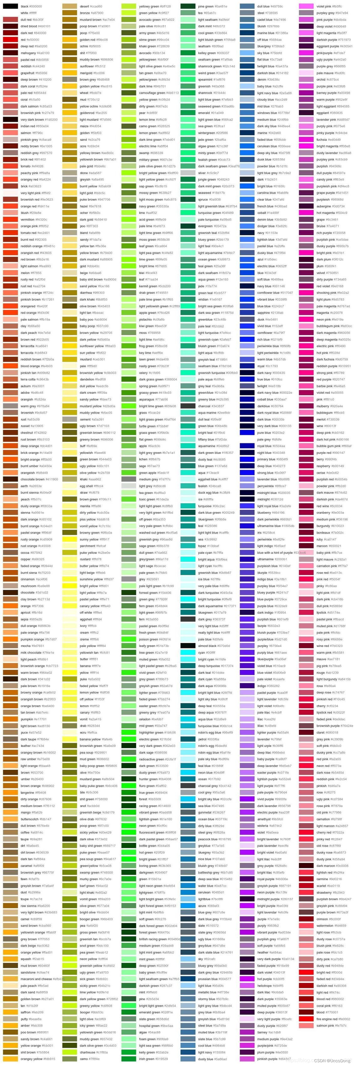
常用颜色
图片都是我从人家博客复制来的,csdn这个beyond自己打了水印


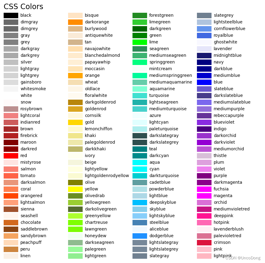
装了seaborn扩展的话,在字典seaborn.xkcd_rgb中包含所有的xkcd crowdsourced color names。
文章出处登录后可见!