本小节内容
今天这一小节主要是学Matplotlib绘制折线图、时序数据,以及如何更改图表的某些参数属性。
基础代码
首先,看看基础的Matplotlib的画图代码。一个是单个数据指标画图,还有一个是多个数据指标画图。
# 单个数据输出
# Import the matplotlib.pyplot submodule and name it plt
import matplotlib.pyplot as plt
# Create a Figure and an Axes with plt.subplots
plt.plots(y = xxx, x = xxx, kind = {'bar', 'scatter', ....})
# Call the show function to show the result
plt.show()

# 多个数据指标画图
# Import the matplotlib.pyplot submodule and name it plt
import matplotlib.pyplot as plt
# Create a Figure and an Axes with plt.subplots
fig, ax = plt.subplots()
ax.plot()
# Call the show function to show the result
plt.show()
实例讲解
在本练习中,我们将使用绘图方法添加两个美国城市的降雨数据:西雅图,华盛顿州和奥斯汀,德克萨斯州。
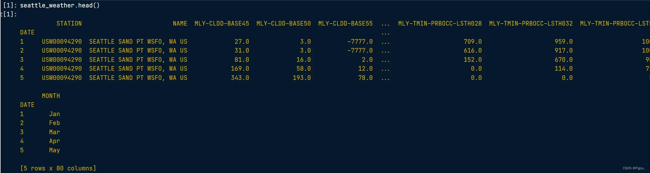
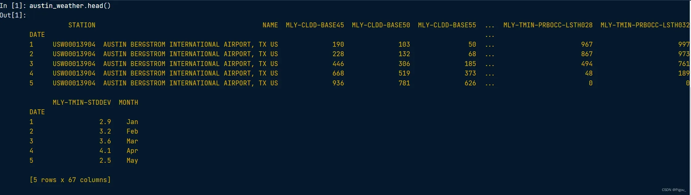
seattle_weather 存储有关西雅图天气的信息,而 austin_weather 存储有关奥斯汀天气的信息。每个 DataFrame 都有一个“MONTH”列,用于存储月份的三个字母名称。每个还有一个名为“MLY-PRCP-NORMAL”的列,用于存储十年期间每个月的平均降雨量。
关于该数据集的任务如下:
- 通过调用 plt.subplots 创建一个 Figure 和一个 Axes 对象。
- 通过调用 Axes plot 方法从 seattle_weather DataFrame 添加数据。
- 以类似的方式从 austin_weather DataFrame 添加数据并调用 plt.show 以显示结果。
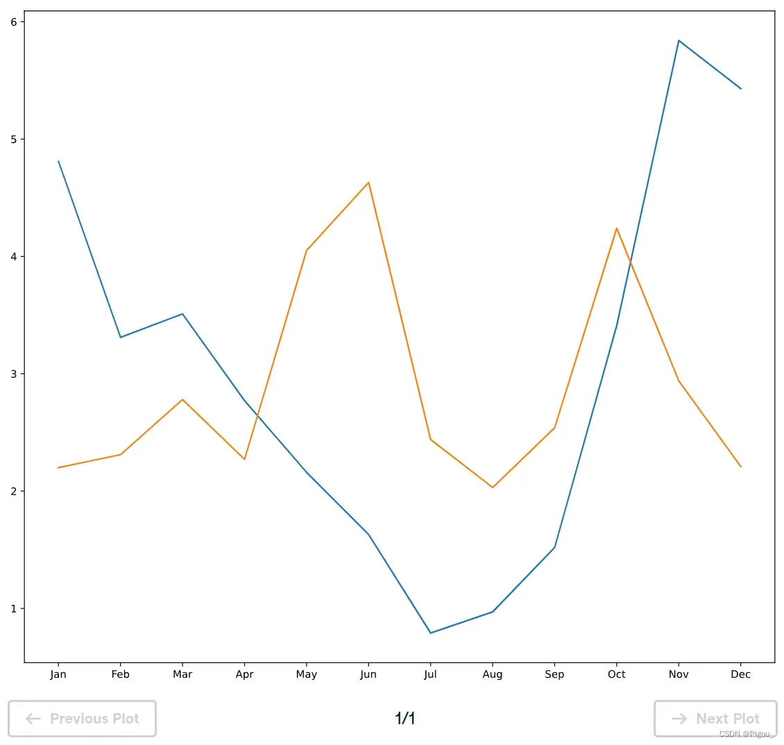
# Import the matplotlib.pyplot submodule and name it plt
import matplotlib.pyplot as plt

# Create a Figure and an Axes with plt.subplots
fig, ax = plt.subplots()
# Plot MLY-PRCP-NORMAL from seattle_weather against the MONTH
ax.plot(seattle_weather["MONTH"], seattle_weather['MLY-PRCP-NORMAL'])
# Plot MLY-PRCP-NORMAL from austin_weather against MONTH
ax.plot(austin_weather['MONTH'], austin_weather['MLY-PRCP-NORMAL'])

# Call the show function
plt.show()
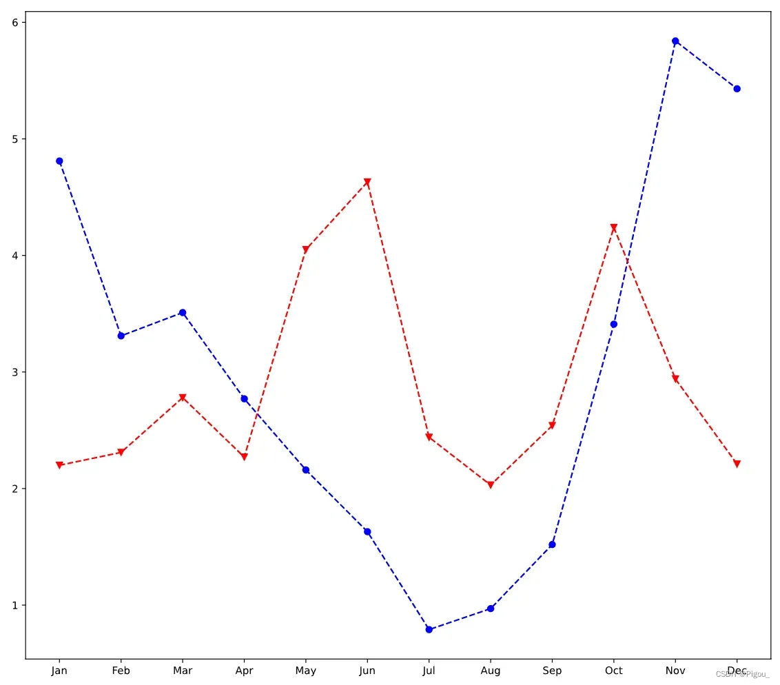
当然,ax不止这一个功能,可以更改标记每个数据点,并更改形状。能改变线条颜色以及线条的风格。代码如下
# Plot Seattle data, setting data appearance
ax.plot(seattle_weather["MONTH"], seattle_weather["MLY-PRCP-NORMAL"], color = 'b', marker = 'o', linestyle = '--')

# Plot Austin data, setting data appearance
ax.plot(austin_weather["MONTH"], austin_weather["MLY-PRCP-NORMAL"], color = 'r', marker = 'v', linestyle = '--')

# Call show to display the resulting plot
plt.show()
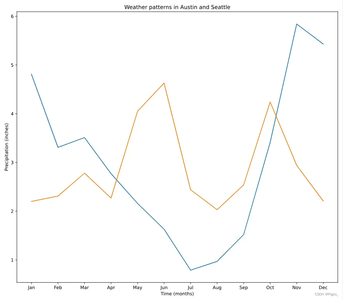
如果想自定义x轴、y轴以及标题,可以这么做。
- x轴:ax.set_xlabel(’xxx’)
- y轴:ax.set_ylabel(’xxx’)
- 标题:ax.set_title(’xxx’)
ax.plot(seattle_weather["MONTH"], seattle_weather["MLY-PRCP-NORMAL"])
ax.plot(austin_weather["MONTH"], austin_weather["MLY-PRCP-NORMAL"])

# Customize the x-axis label
ax.set_xlabel('Time (months)')

# Customize the y-axis label
ax.set_ylabel('Precipitation (inches)')

# Add the title
ax.set_title('Weather patterns in Austin and Seattle')

# Display the figure
plt.show()
具体的数据点样例更改及线条形状更改可以参考下官网给出的参数。
如何多图绘制
接上个例子,如果我们要输入2个城市的多个数据在一个图中,会显得非常的乱。因此,我们可以用matplotlib里ax的小图功能。
比如,我们需要去创建一个3行2列的对象,也就是3*2 = 6,有6个axes
fig, ax = plt.subplots(3, 2)
这就意味着,subplots(a1, a2)里的a1, a2 就是整个对象的shape,即3 x 2,3行2列。然后接下来我们就可以针对每个axes去绘图。
多行多列的情况
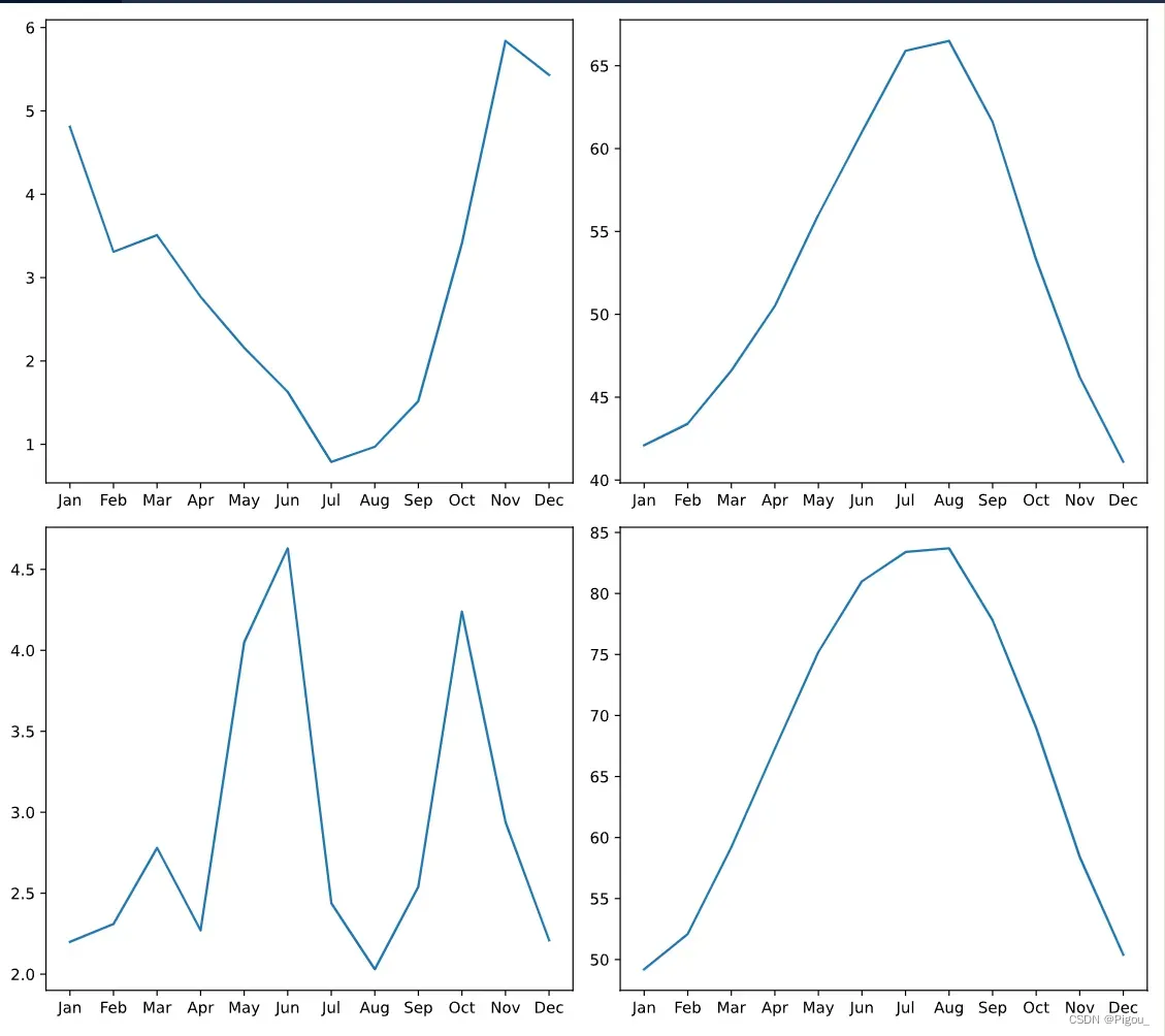
假如,我们要去绘制上面2个城市的数据。它们每个都有一个“MONTH”列和“MLY-PRCP-NORMAL”(用于平均降水),以及“MLY-TAVG-NORMAL”(用于平均温度)列。在本练习中,您将在单独的子图中绘制每个城市的月平均降水量和平均气温。
# Create a Figure and an array of subplots with 2 rows and 2 columns
fig, ax = plt.subplots(2, 2)

# Addressing the top left Axes as index 0, 0, plot month and Seattle precipitation
ax[0, 0].plot(seattle_weather['MONTH'], seattle_weather['MLY-PRCP-NORMAL'])

# In the top right (index 0,1), plot month and Seattle temperatures
ax[0, 1].plot(seattle_weather['MONTH'], seattle_weather['MLY-TAVG-NORMAL'])

# In the bottom left (1, 0) plot month and Austin precipitations
ax[1, 0].plot(austin_weather['MONTH'], austin_weather['MLY-PRCP-NORMAL'])

# In the bottom right (1, 1) plot month and Austin temperatures
ax[1, 1].plot(austin_weather['MONTH'], austin_weather['MLY-TAVG-NORMAL'])
plt.show()
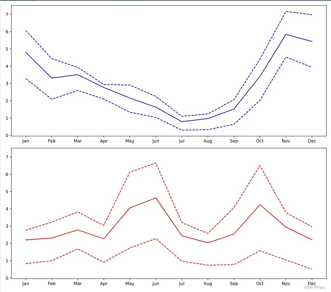
多行单列的情况
也就是subplots(2, 1) 只有1列的情况下,我们就可以不用ax[0, 0] 之类的。可以直接ax[0]表示第一行的图,ax[1]表示第二行的图
# Create a figure and an array of axes: 2 rows, 1 column with shared y axis
fig, ax = plt.subplots(2, 1, sharey=True)

# Plot Seattle precipitation data in the top axes
ax[0].plot(seattle_weather['MONTH'], seattle_weather['MLY-PRCP-NORMAL'], color = 'b')
ax[0].plot(seattle_weather['MONTH'], seattle_weather['MLY-PRCP-25PCTL'], color = 'b', linestyle = '--')
ax[0].plot(seattle_weather['MONTH'], seattle_weather['MLY-PRCP-75PCTL'], color = 'b', linestyle = '--')

# Plot Austin precipitation data in the bottom axes
ax[1].plot(austin_weather['MONTH'], austin_weather['MLY-PRCP-NORMAL'], color = 'r')
ax[1].plot(austin_weather['MONTH'], austin_weather['MLY-PRCP-25PCTL'], color = 'r', linestyle = '--')
ax[1].plot(austin_weather['MONTH'], austin_weather['MLY-PRCP-75PCTL'], color = 'r', linestyle = '--')

plt.show()
Matplotlib 绘制时序数据
首先,我们需要利用pandas去导入我们的数据。时序数据其实就是以时间那列为索引的数据,在导入之前,我们需要用parse_date去解析我们的时序数据,并将时间数据那一列定义为index列。
# Import pandas as pd
import pandas as pd

# Read the data from file using read_csv
climate_change = pd.read_csv('climate_change.csv',
															parse_dates = ['date'],
															index_col = 'date')
处理好时间数据之后呢,就可以开始画图了。因为我们前面这一步已经将时间数据作为了索引,所以在下面的代码中,直接调用index就好
import matplotlib.pyplot as plt
fig, ax = plt.subplots()

# Add the time-series for "relative_temp" to the plot
ax.plot(climate_change.index, climate_change['relative_temp'])

# Set the x-axis label
ax.set_xlabel('Time')

# Set the y-axis label
ax.set_ylabel('Relative temperature (Celsius)')

# Show the figure
plt.show()
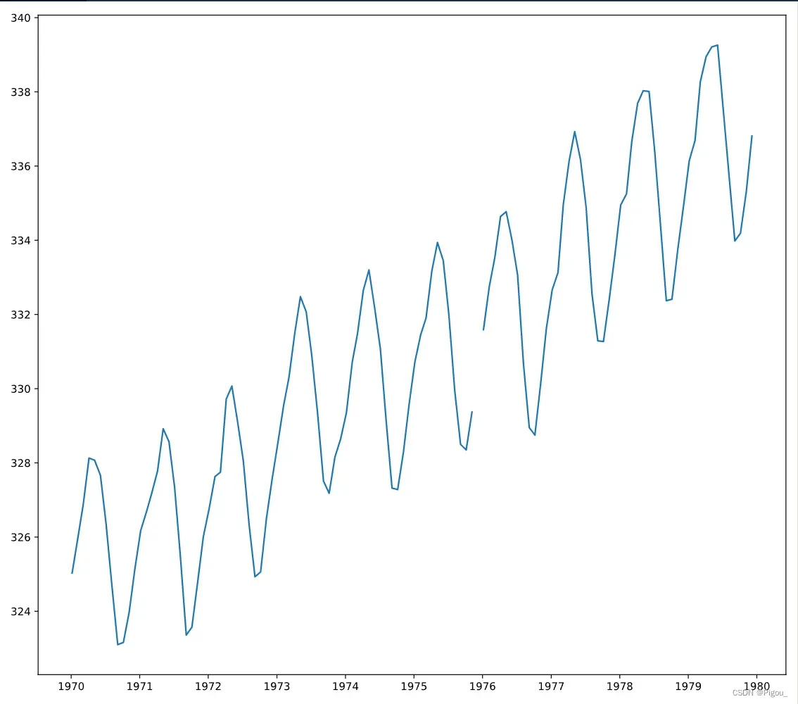
上图为1960-2010年 50年的折线图,那如果我们想看某10内的,要怎么看呢?首先,取10年的数据出来,因为我们在一开始就把时间作为了索引,因此,我们只需要去’1970-01-01’:’1979-12-31’即可
import matplotlib.pyplot as plt

# Use plt.subplots to create fig and ax
fig, ax = plt.subplots()

# Create variable seventies with data from "1970-01-01" to "1979-12-31"
seventies = climate_change['1970-01-01':'1979-12-31']
print(seventies.head())
# Add the time-series for "co2" data from seventies to the plot
ax.plot(seventies.index, seventies["co2"])

# Show the figure
plt.show()
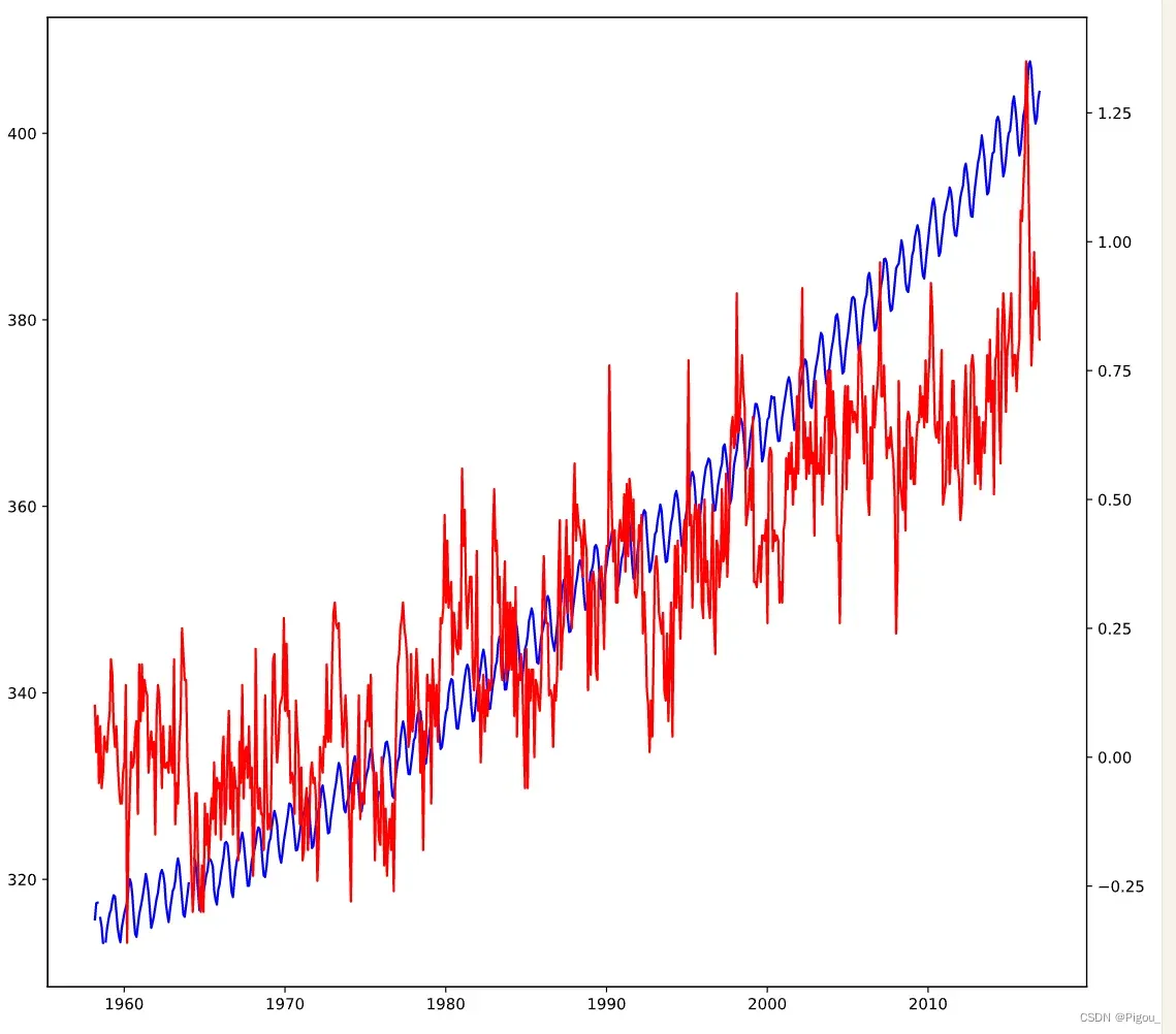
多时序变量绘图
前面学习了如何将单变量绘制,以及学习了多个单变量绘制。现在学习的是如何将多变量放在同一个图中并且有多个y轴刻度线。这种情况只适用于,x轴刻度相同,而y不相同的情况下
ax2 = ax.twinx()
这个代码可以让2号曲线的y轴放在右侧。例子如下,
import matplotlib.pyplot as plt

# Initalize a Figure and Axes
fig, ax = plt.subplots()

# Plot the CO2 variable in blue
ax.plot(climate_change.index, climate_change['co2'], color= 'b')

# Create a twin Axes that shares the x-axis
ax2 = ax.twinx()

# Plot the relative temperature in red
ax2.plot(climate_change.index, climate_change['relative_temp'], color= 'r')

plt.show()
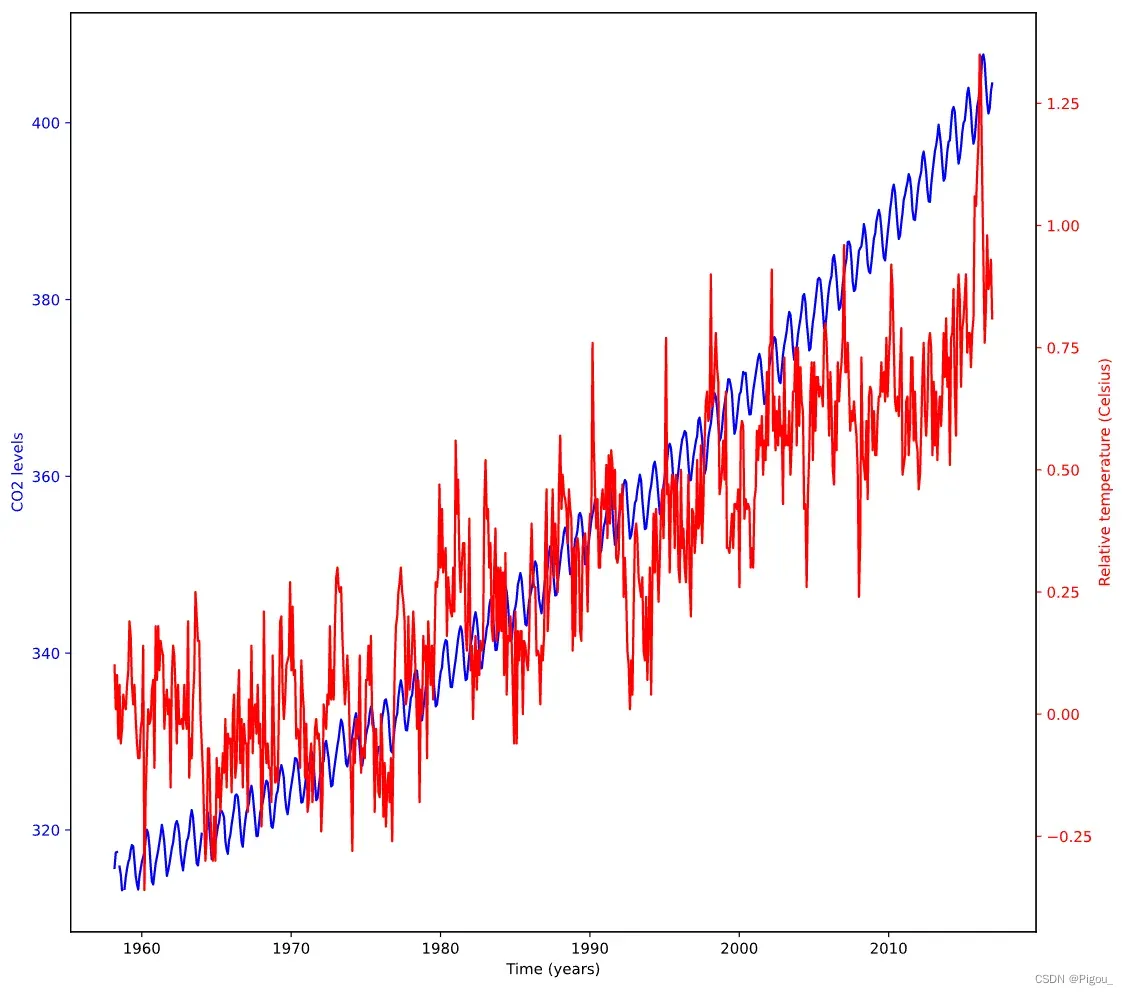
为了更好地区分,我们可以对刻度轴的颜色,曲线颜色和y轴标签颜色进行更改。下面是封装好的绘图function,它可以将每个变量以一个颜色进行绘图。面对多个变量的时候
# Define a function called plot_timeseries
def plot_timeseries(axes, x, y, color, xlabel, ylabel):

  # Plot the inputs x,y in the provided color
  axes.plot(x, y, color=color)

  # Set the x-axis label
  axes.set_xlabel(xlabel)

  # Set the y-axis label
  axes.set_ylabel(ylabel, color=color)

  # Set the colors tick params for y-axis
	# tick_params 用于更改刻度颜色
  axes.tick_params('y', colors = color)
接下来我们可以试验一下。先用上面的function绘制第一个图,然后再用ax.twinx()去增加第二个y轴的刻度。然后再用function绘制第二条曲线。最后plt.show()
fig, ax = plt.subplots()

# Plot the CO2 levels time-series in blue
plot_timeseries(ax, climate_change.index, climate_change['co2'], "blue", "Time (years)", "CO2 levels")

# Create a twin Axes object that shares the x-axis
ax2 = ax.twinx()

# Plot the relative temperature data in red
plot_timeseries(ax2, climate_change.index, climate_change['relative_temp'], "red", "Time (years)", "Relative temperature (Celsius)")

plt.show()
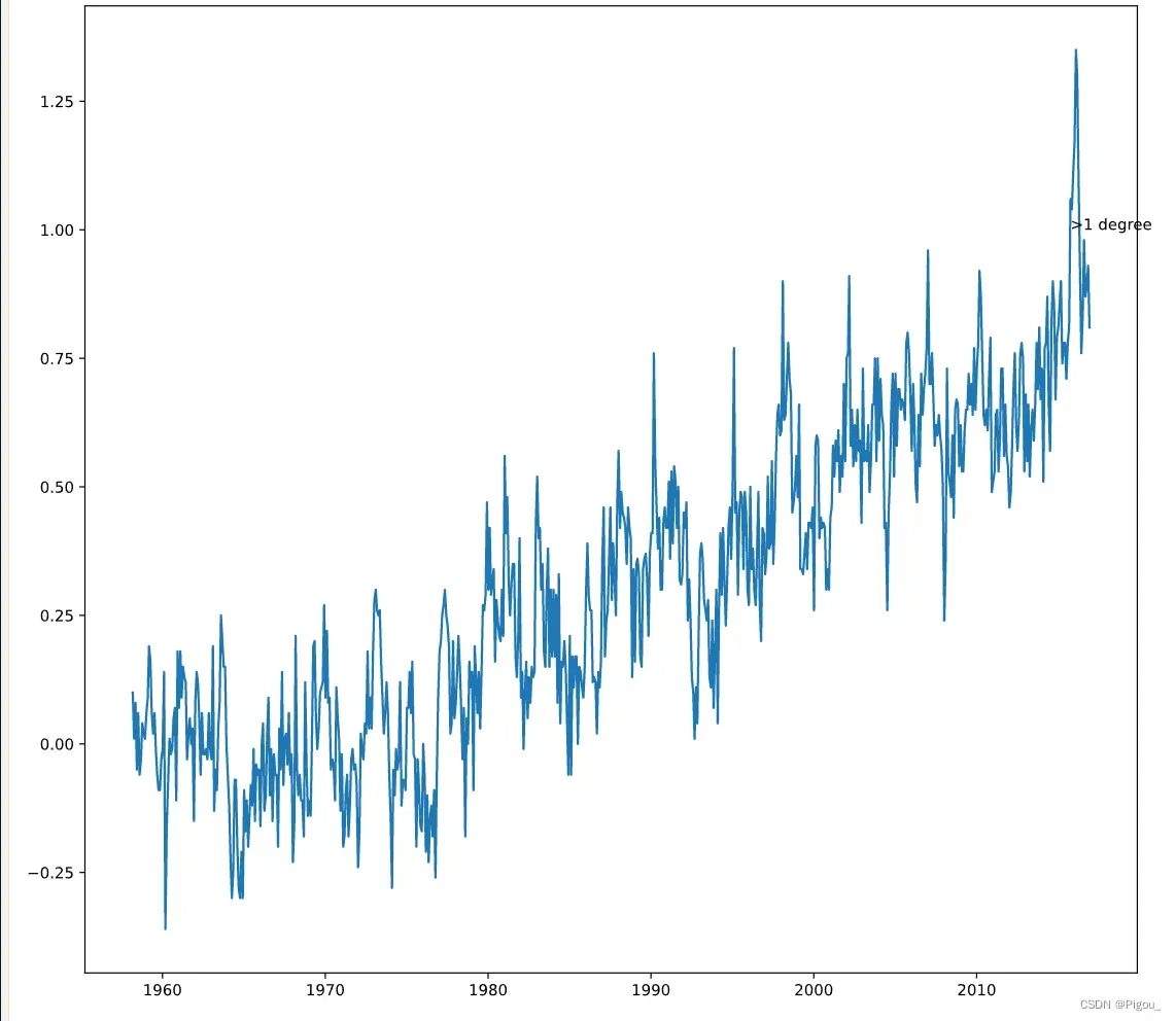
如何给数据添加注释
添加注释的最大作用就是,突出某一个数据的重要性。那么就可以在axes中使用如下的代码
ax.annotate('注释内容', xy = (pd.Timestamp('YYYY-MM-DD'), 1))
这里我解释下后面的xy是什么意思,分别对应逗号的前后,x就是pd.Timestamp(’xxxx’),即该数据所在x轴的位置,y同样对应的就是y轴坐标位置。也就是说假如
ax.annotate('> 1 degree', xy = (pd.Timestamp('2022-04-22'), 1))
那么图中将会显示出点(pd.Timestamp(‘2022-04-22’), 1)的坐标,并将注释 ‘> 1 degree’ 放该坐标的旁边。
此时呢,如果数据太杂乱,我们还可以自定义这个注释的位置并添加箭头,只需要用到如下的代码。
ax.annotate('> 1 degree', xy = (pd.Timestamp('2022-04-22'), 1),
						# 修改注释位置
						xytext = (pd.Timestamp('yyyy-mm-dd', y),
						# 绘制箭头
						arrowprops = {}
						)
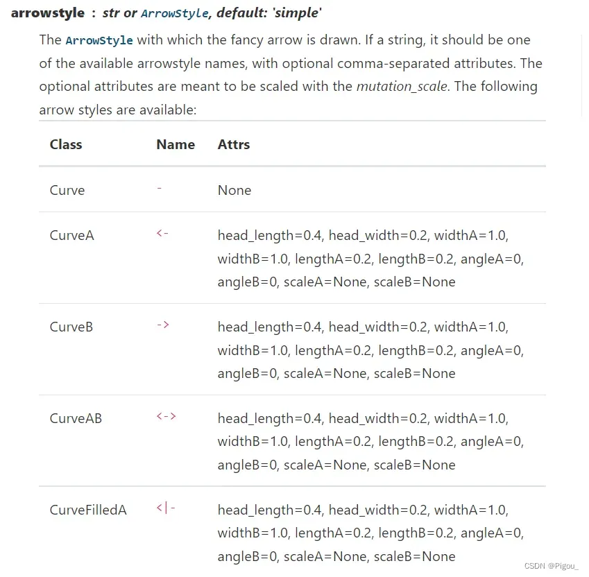
然后这个arrowprops里面可以自定义箭头的形状,颜色等。官网给出的有这些样式:
剩下的可以自行官网查看,里面还有其他参数,先暂不研究啦
完整的例子,代码如下
fig, ax = plt.subplots()

# Plot the CO2 levels time-series in blue
plot_timeseries(ax, climate_change.index, climate_change['co2'], 'blue', "Time (years)", "CO2 levels")

# Create an Axes object that shares the x-axis
ax2 = ax.twinx()

# Plot the relative temperature data in red
plot_timeseries(ax2, climate_change.index, climate_change['relative_temp'], 'red', "Time (years)", "Relative temp (Celsius)")

# Annotate point with relative temperature >1 degree
ax2.annotate(">1 degree", xy = (pd.Timestamp('2015-10-06'), 1),
							xytext = (pd.Timestamp('2008-10-06'), -0.2),
							arrowprops = {'arrowstyle': '->', 'color':'grey'})

plt.show()
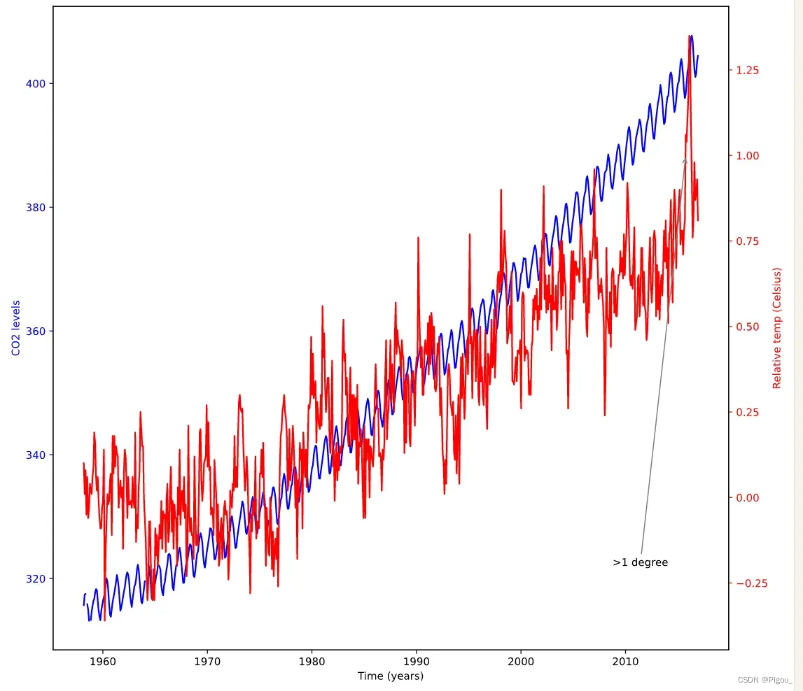
这样就能看到,我们利用xytext将文本替换了位置,同时利用了arrowprops添加了箭头及其颜色。这里要注意的是,arrowprops在官网是一个字典的格式。你可以像我这么写,也可以写为
arrowprops = dict(arrowstyle = '->', color = 'grey')
下一节将记录一下定量数据可视化的内容。
Reference
DataCamp: https://campus.datacamp.com/courses/introduction-to-data-visualization-with-matplotlib/
文章出处登录后可见!