效果展示:
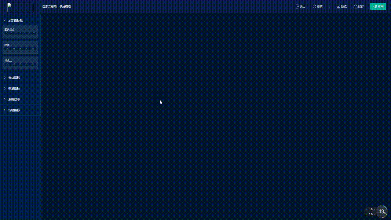
前言:随着各公司定制化需求的不断攀升,公司对低代码、组态化的开发需求日渐迫切。也许是研发任务节点将至,也许是为顺应时代潮流,我也是去学习并实践了一番。如图所示。
功能简介:
左侧组件区域特意做了选中态,小眼睛预览浮框态等交互,右侧内容区域支持增加、删除、退出、重置、预览 、保存、应用等操作,以及组态化最重要的功能点–随意拖拽换位,后期考虑增加属性面板支持对拖拽进来的组件进行宽高、颜色等的二次编辑修饰。
具体实现:
1、实现流程依据
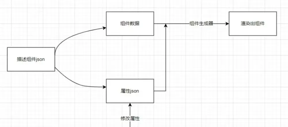
通过json实现,预先定义好描述组件的json,json包含了当前组件数据和当前组件的样式属性数据等,并通过组件生成器将将描述组件的json结合起来渲染出实际组件,当修改样式属性时,组件样式同步更新;
示例json:
json:{
  fieldid:"",
  name:"Input",
  label:"单行文本",
  icon:"input01",
  placeholder:"请输入",
  value:"",
  rules:{},
  style:{},//组件的样式
  setting:{},//组件的其他属性,比如:row:2
实现原理思维导图:
2、实现详情介绍
此需求基于开源的vue.draggable ^2.24.3,Vue项目首先需要去npm i -S vuedraggable下载vue.draggable相关依赖,并导入注册draggable组件。如果是原生js直接CDN形式引用vuedraggable压缩文件即可。建议没看过我初阶版本博客的小伙伴去看一下上篇文章再来,沿袭上篇代码还是分组件区跟内容区两个group,group要名称一致才可以建立拖拽关系,那么假设我们内容区域group起名module,那么组件内区域应该也命module,结合展开面板组件使用那么json结构如下:
componentsList:[
	{
		key: "1",
		name: "顶部指标栏",
		group: { name: "module", pull: "clone", put: false },
		child: [
			{
				id: 1,
				type: 0,
				col: 24,
				name: "默认样式",
				imgSrc: "TopIndicator",
				componentName: "TopIndicator",
				activeKey: true
			},
			{
				id: 2,
				type: 1,
				col: 24,
				name: "样式一",
				imgSrc: "TopIndicatorOne",
				componentName: "TopIndicator",
				activeKey: false
			},
			{
				id: 3,
				type: 2,
				col: 24,
				name: "样式二",
				imgSrc: "TopIndicatorTwo",
				componentName: "TopIndicator",
				activeKey: false
			}
		]
	},
    ......
]
组件区域代码
<div class="left-components beautify-scroll">
					<a-collapse v-model="activeKey">
						<a-collapse-panel
							:key="item.key"
							:header="item.name"
							v-for="item in componentsList"
						>
							<draggable
								v-model="item.child"
								draggable=".li"
								v-bind="dragOptions"
								:options="{ sort: false, group: item.group }"
							>
								<div
									v-for="d in item.child"
									:key="d.id + 'item'"
									:class="[
										'li',
										d.componentName,
										d.col == 12 ? 'w5' : null,
										d.activeKey ? 'active' : null
									]"
								>
									<div class="txt">{{ d.name }}</div>
									<img
										class="img"
										:src="
											require(`@/assets/images/configuration/${d.imgSrc}.png`)
										"
										alt=""
									/>
									<div
										class="eyes"
										@mouseover="panelShow($event, d, item)"
										@mouseout="panelHide"
									></div>
								</div>
								<div
									:class="[
										'amplifier-img-box',
										panelComponentName
									]"
									:style="{ top: panelTop, left: panelLeft }"
									v-show="
										panelFlag && panelParentKey == item.key
									"
								>
									<div class="panel-title">
										{{ panelName }}
									</div>
									<img
										class="panel-img"
										:src="panelImgSrc"
										alt=""
									/>
								</div>
							</draggable>
						</a-collapse-panel>
					</a-collapse>
				</div>
内容区json
contentList:[
	{
		id: 1,
		type: 0,
		col: 24,
		name: "默认样式",
		imgSrc: "TopIndicator",
		componentName: "TopIndicator",
		activeKey: false
	},
	{
		id: 4,
		type: 0,
		col: 24,
		name: "默认样式",
		imgSrc: "IncomeIndicators",
		componentName: "IncomeIndicators",
		activeKey: false
	},
  ......
]
内容区代码,实现思路是用:is=”item.componentName”去对应组件名注册写好的组件,这样就可以在draggable的渲染布局里面渲染具体组件
		<draggable
					class="content beautify-scroll"
					group="module"
					v-bind="dragOptions"
					:list="contentList"
					@change="toChange"
				>
					<div
						v-for="(item, index) in contentList"
						:key="'r' + index"
						:class="[
							'item',
							item.componentName,
							item.col == 12 ? 'w5' : null
						]"
					>
							<component
								:key="'c' + item.componentName + item.type"
								:is="item.componentName"
								:isEdit="true"
								:type="Number(item.type)"
								@click.native="selectContentItem(item)"
								:class="[
									item.id == contentActiveId ? 'active' : null
								]"
							></component>
							<div
								v-show="item.id == contentActiveId"
								class="delbtn"
								@click="del(item, index)"
							></div>
					</div>
		  </draggable>
小眼睛显示预览图浮框不建议用hover去做,因为这里样式涉及overflow: hidden;如下图用鼠标事件去做会更好。
methods:
// 鼠标移入显示浮态框
		panelShow(e, d, item) {
			console.log(e, d, item);
			this.panelName = item.name + " - " + d.name;
			this.panelComponentName = d.componentName;
			this.panelImgSrc = require(`@/assets/images/configuration/${d.imgSrc}.png`);
			// 获取窗口宽度
			let windowHeight =
				window.innerHeight ||
				document.documentElement.clientHeight ||
				document.body.clientHeight;
			// 判断当前鼠标位置加上面板位置大于窗口宽度,表示超出不足以显示,定位向上进行定位
			if (e.clientY + 276 > windowHeight) {
				this.panelTop = e.clientY - 296 + "px";
			} else {
				this.panelTop = e.clientY - 40 + "px";
			}

			this.panelLeft = e.clientX + 26 + "px";
			this.panelParentKey = item.key;
			this.panelFlag = true;
		},
		// 鼠标移出隐藏浮态框
		panelHide() {
			this.panelFlag = false;
			this.panelName = "";
			this.panelImgSrc = undefined;
		},
最后再补上一个组件的删除函数,因为内容区删除要联动把组件区选中态去除,所以这里的删除里面要多一些逻辑控制
	del(el, idx) {
			this.contentList.splice(idx, 1);
			// 删除 取消框选态
			this.componentsList.map((item) => {
				item.child.map((i) => {
					if (i.id == el.id) {
						i.activeKey = false;
					}
				});
			});
		},
创作不易,点赞支持!!!
版权声明:本文为博主作者:码上行动-IT鑫原创文章,版权归属原作者,如果侵权,请联系我们删除!
原文链接:https://blog.csdn.net/weixin_43200068/article/details/135909584