最近小编认真整理了20+个基于python的实战案例,主要包含:数据分析、可视化、机器学习/深度学习、时序预测等,案例的主要特点:
-
提供源码:代码都是基于jupyter notebook,附带一定的注释,运行即可
-
数据齐全:大部分案例都有提供数据,部分案例使用内置数据集
数据统计分析
基于python和第三方库进行数据处理和分析,主要使用pandas、plotly、matplotlib等库,具体案例:
电子产品(手机)销售分析:
(1)不同内存下的销量(代码片段)
nei_cun = color_size["Number_GB"].value_counts().reset_index()
nei_cun.columns = ["Number_of_GB","Count"]  # 重命名
nei_cun["Number_of_GB"] = nei_cun["Number_of_GB"].apply(lambda x: str(x) + "GB")

fig = px.pie(nei_cun,
             values="Count",
             names="Number_of_GB")

fig.show()

(2)不同闪存Ram下的价格分布(代码片段)
fig = px.box(df, y="Sale Price",color="Ram")

fig.update_layout(height=600, width=800, showlegend=False)

fig.update_layout(
    title={ "text":'不同<b>闪存</b>下的价格分布',
            "y":0.96,
            "x":0.5,
            "xanchor":"center",
            "yanchor":"top"
          },

    xaxis_tickfont_size=12,
    yaxis=dict(
        title='Distribution',
        titlefont_size=16,
        tickfont_size=12,
    ),
    legend=dict(
        x=0,
        y=1,
        bgcolor='rgba(255, 255, 255, 0)',
        bordercolor='rgba(2, 255, 255, 0)'
    )
)

fig.show()

7万条餐饮数据分析
fig = px.bar(df2_top3,x="行政区",y="店铺数量",color="类别",text="店铺数量")
fig.update_layout(title="不同行政区下不同类别的店铺数量对比")
fig.show()

不同店铺下的点评数量对比:
4个指标的关系:口味、环境、服务和人均消费

基于python实现RFM模型(用户画像)
RFM模型是客户关系管理(CRM)中的一种重要分析模型,用于衡量客户价值和客户创利能力。该模型通过以下三个指标来评估客户的价值和发展潜力:
-
近期购买行为(R):指的是客户最近一次购买的时间间隔。这个指标可以反映客户的活跃程度和购买意向,进而判断客户的质量和潜在价值。
-
购买的总体频率(F):指的是客户在一定时间内购买商品的次数。这个指标可以反映客户对品牌的忠诚度和消费习惯,进而判断客户的潜力和价值。
-
花了多少钱(M):指的是客户在一定时间内购买商品的总金额。这个指标可以反映客户的消费能力和对品牌的认可度,进而判断客户的价值和潜力。
计算R、F、M三个指标值:
data['Recency'] = (datetime.now().date() - data['PurchaseDate'].dt.date).dt.days

frequency_data = data.groupby('CustomerID')['OrderID'].count().reset_index()
# 重命名
frequency_data.rename(columns={'OrderID': 'Frequency'}, inplace=True)

monetary_data = data.groupby('CustomerID')['TransactionAmount'].sum().reset_index()
monetary_data.rename(columns={'TransactionAmount': 'MonetaryValue'}, inplace=True)
可视化
可视化主要是讲解了matplotlib的3D图和统计相关图形的绘制和plotly_express的入门:
(1) matplotlib的3D图形绘制
plt.style.use('fivethirtyeight')
fig = plt.figure(figsize=(8,6))

ax = fig.gca(projection='3d')

z = np.linspace(0, 20, 1000)
x = np.sin(z)
y = np.cos(z)

surf=ax.plot3D(x,y,z)

z = 15 * np.random.random(200)
x = np.sin(z) + 0.1 * np.random.randn(200)
y = np.cos(z) + 0.1 * np.random.randn(200)
ax.scatter3D(x, y, z, c=z, cmap='Greens')

plt.show()

plt.style.use('fivethirtyeight')
fig = plt.figure(figsize=(14,8))

ax = plt.axes(projection='3d')
ax.plot_surface(x,
                y,
                z,
                rstride=1,
                cstride=1,
                cmap='viridis',
                edgecolor='none')

ax.set_title('surface')

# ax.set(xticklabels=[],  # 隐藏刻度
#        yticklabels=[],
#        zticklabels=[])

plt.show()

(2) 统计图形绘制
绘制箱型图:
np.random.seed(10)
D = np.random.normal((3, 5, 4), (1.25, 1.00, 1.25), (100, 3))

fig, ax = plt.subplots(2, 2, figsize=(9,6), constrained_layout=True)

ax[0,0].boxplot(D, positions=[1, 2, 3])
ax[0,0].set_title('positions=[1, 2, 3]')

ax[0,1].boxplot(D, positions=[1, 2, 3], notch=True)  # 凹槽显示
ax[0,1].set_title('notch=True')

ax[1,0].boxplot(D, positions=[1, 2, 3], sym='+')  # 设置标记符号
ax[1,0].set_title("sym='+'")

ax[1,1].boxplot(D, positions=[1, 2, 3],
                patch_artist=True,
                showmeans=False,
                showfliers=False,
                medianprops={"color": "white", "linewidth": 0.5},
                boxprops={"facecolor": "C0", "edgecolor": "white", "linewidth": 0.5},
                whiskerprops={"color": "C0", "linewidth": 1.5},
                capprops={"color": "C0", "linewidth": 1.5})
ax[1,1].set_title("patch_artist=True")

# 设置每个子图的x-y轴的刻度范围
for i in np.arange(2):
    for j in np.arange(2):
        ax[i,j].set(xlim=(0, 4), xticks=[1,2,3],
                    ylim=(0, 8), yticks=np.arange(0, 9))

plt.show()

绘制栅格图:
np.random.seed(1)
x = [2, 4, 6]
D = np.random.gamma(4, size=(3, 50))

# plt.style.use('fivethirtyeight')

fig, ax = plt.subplots(2, 2, figsize=(9,6), constrained_layout=True)

# 默认栅格图-水平方向
ax[0,0].eventplot(D)
ax[0,0].set_title('default')

# 垂直方向
ax[0,1].eventplot(D,
                  orientation='vertical',
                  lineoffsets=[1,2,3])
ax[0,1].set_title("orientation='vertical', lineoffsets=[1,2,3]")

ax[1,0].eventplot(D,
                  orientation='vertical',
                  lineoffsets=[1,2,3],
                  linelengths=0.5) # 线条长度
ax[1,0].set_title('linelengths=0.5')

ax[1,1].eventplot(D,
                  orientation='vertical',
                  lineoffsets=[1,2,3],
                  linelengths=0.5,
                 colors='orange')
ax[1,1].set_title("colors='orange'")


plt.show()

(3) plotly_express入门 使用plotly_express如何快速绘制散点图、散点矩阵图、气泡图、箱型图、小提琴图、经验累积分布图、旭日图等


机器学习
基于机器学习的Titanic生存预测
目标变量分析:


相关性分析:

基于树模型的特征重要性排序代码:
f,ax=plt.subplots(2,2,figsize=(15,12))

# 1、模型
rf=RandomForestClassifier(n_estimators=500,random_state=0)
# 2、训练
rf.fit(X,Y)
# 3、重要性排序
pd.Series(rf.feature_importances_, X.columns).sort_values(ascending=True).plot.barh(width=0.8,ax=ax[0,0])
# 4、添加标题
ax[0,0].set_title('Feature Importance in Random Forests')

ada=AdaBoostClassifier(n_estimators=200,learning_rate=0.05,random_state=0)
ada.fit(X,Y)
pd.Series(ada.feature_importances_, X.columns).sort_values(ascending=True).plot.barh(width=0.8,ax=ax[0,1],color='#9dff11')
ax[0,1].set_title('Feature Importance in AdaBoost')

gbc=GradientBoostingClassifier(n_estimators=500,learning_rate=0.1,random_state=0)
gbc.fit(X,Y)
pd.Series(gbc.feature_importances_, X.columns).sort_values(ascending=True).plot.barh(width=0.8,ax=ax[1,0],cmap='RdYlGn_r')
ax[1,0].set_title('Feature Importance in Gradient Boosting')

xgbc=xg.XGBClassifier(n_estimators=900,learning_rate=0.1)
xgbc.fit(X,Y)
pd.Series(xgbc.feature_importances_, X.columns).sort_values(ascending=True).plot.barh(width=0.8,ax=ax[1,1],color='#FD0F00')
ax[1,1].set_title('Feature Importance in XgBoost')

plt.show()
不同模型对比:

基于KNN算法的iris数据集分类
特征分布情况:
pd.plotting.scatter_matrix(X_train,
                           c=y_train,
                           figsize=(15, 15),
                           marker='o',
                           hist_kwds={'bins': 20},
                           s=60,
                           alpha=.8
                          )

plt.show()

混淆矩阵:
from sklearn.metrics import classification_report,f1_score,accuracy_score,confusion_matrix
sns.heatmap(confusion_matrix(y_pred, y_test), annot=True)
plt.show()

对新数据预测:
x_new = np.array([[5, 2.9, 1, 0.2]])

prediction = knn.predict(x_new)
基于随机森林算法的员工流失预测
不同教育背景下的人群对比:
fig = go.Figure(data=[go.Pie(
    labels=attrition_by['EducationField'],
    values=attrition_by['Count'],
    hole=0.4,
    marker=dict(colors=['#3CAEA3', '#F6D55C']),
    textposition='inside'
)])


fig.update_layout(title='Attrition by Educational Field',
                  font=dict(size=12),
                  legend=dict(
                      orientation="h",
                      yanchor="bottom",
                      y=1.02,
                      xanchor="right",
                      x=1
))

fig.show()

年龄和月收入关系:

类型编码:
from sklearn.preprocessing import LabelEncoder
le = LabelEncoder()

df['Attrition'] = le.fit_transform(df['Attrition'])
df['BusinessTravel'] = le.fit_transform(df['BusinessTravel'])
df['Department'] = le.fit_transform(df['Department'])
df['EducationField'] = le.fit_transform(df['EducationField'])
df['Gender'] = le.fit_transform(df['Gender'])
df['JobRole'] = le.fit_transform(df['JobRole'])
df['MaritalStatus'] = le.fit_transform(df['MaritalStatus'])
df['Over18'] = le.fit_transform(df['Over18'])
df['OverTime'] = le.fit_transform(df['OverTime'])
相关性分析:

基于LSTM的股价预测
LSTM网络模型搭建:
from keras.models import Sequential
from keras.layers import Dense, LSTM

model = Sequential()
# 输入层
model.add(LSTM(128, return_sequences=True, input_shape= (xtrain.shape[1], 1)))
# 隐藏层
model.add(LSTM(64, return_sequences=False))
model.add(Dense(25))
# 输出层
model.add(Dense(1))
# 模型概览
model.summary()
交叉验证实现:
k = 5
number_val = len(xtrain) // k  # 验证数据集的大小
number_epochs = 20
all_mae_scores = []
all_loss_scores = []

for i in range(k):
    # 只取i到i+1部分作为验证集
    vali_X = xtrain[i * number_val: (i+1) * number_val]
    vali_y = ytrain[i * number_val: (i+1) * number_val]

    # 训练集
    part_X_train = np.concatenate([xtrain[:i * number_val],
                                  xtrain[(i+1) * number_val:]],
                                  axis=0
                                 )
    part_y_train = np.concatenate([ytrain[:i * number_val],
                                  ytrain[(i+1) * number_val:]],
                                  axis=0
                                 )

    print("pxt: \n",part_X_train[:3])
    print("pyt: \n",part_y_train[:3])

    # 模型训练
    history = model.fit(part_X_train,
                        part_y_train,
                        epochs=number_epochs,
                        # 传入验证集的数据
                        validation_data=(vali_X, vali_y),
                        batch_size=300,
                        verbose=0  # 0-静默模式 1-日志模式
                       )

    mae_history = history.history["mae"]
    loss_history = history.history["loss"]
    all_mae_scores.append(mae_history)
    all_loss_scores.append(loss_history)
时序预测
基于AMIRA的销量预测
自相关性图:

偏自相关性:

预测未来10天
p,d,q = 5,1,2
model = sm.tsa.statespace.SARIMAX(df['Revenue'],
                                order=(p, d, q),
                                seasonal_order=(p, d, q, 12))
model = model.fit()
model.summary()
ten_predictions = model.predict(len(df), len(df) + 10)  # 预测10天

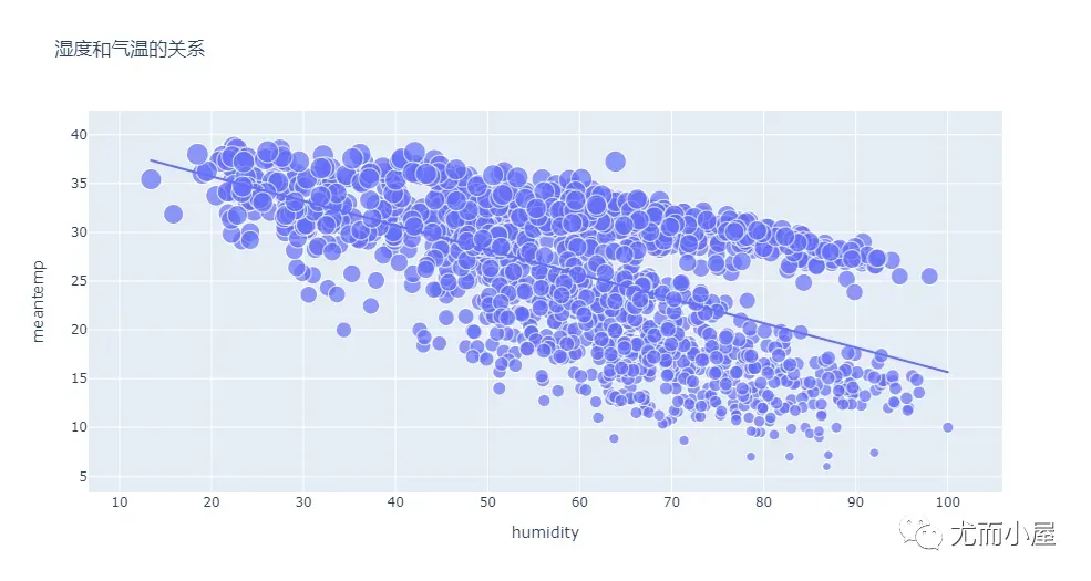
基于prophet的天气预测
特征间的关系:

预测效果: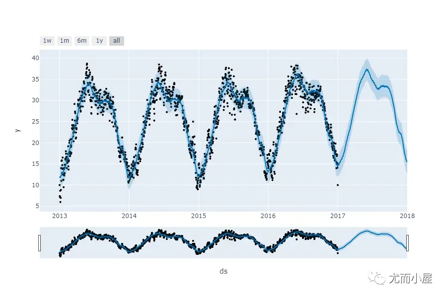
其他案例
python的6种实现99乘法表
提供2种:
for i in range(1, 10):
    for j in range(1, i+1):  # 例如3*3、4*4的情况,必须保证j能取到i值,所以i+1;range函数本身是不包含尾部数据
        print(f'{j}x{i}={i*j} ', end="")  # end默认是换行;需要改成空格
    print("\n")  # 末尾自动换空行
for i in range(1, 10):       # 外层循环
    j = 1      # 内层循环初始值
    while j <= i:      # 内层循环条件:从1开始循环
        print("{}x{}={}".format(i,j,(i*j)), end=' ')  # 输出格式
        j += 1  # j每循环一次加1,进入下次,直到j<=i的条件不满足,再进入下个i的循环中
    print("\n")
i = 1  # i初始值

while i <= 9:  # 循环终止条件
    j = 1  # j初始值
    while j <= i:    # j的大小由i来控制
        print(f'{i}x{j}={i*j} ', end='')
        j += 1   # j每循环一次都+1,直到j<=i不再满足,跳出这个while循环
    i += 1  # 跳出上面的while循环后i+1,只要i<9就换行进入下一轮的循环;否则结束整个循环
    print('\n')
python实现简易计算器(GUI界面)
提供部分代码:
import tkinter as tk

root = tk.Tk()
root.title("Standard Calculator")
root.resizable(0, 0)


e = tk.Entry(root,
             width=35,
             bg='#f0ffff',
             fg='black',
             borderwidth=5,
             justify='right',
             font='Calibri 15')

e.grid(row=0, column=0, columnspan=3, padx=12, pady=12)

# 点击按钮
def buttonClick(num):
    temp = e.get(
    )
    e.delete(0, tk.END)
    e.insert(0, temp + num)

# 清除按钮
def buttonClear():
    e.delete(0, tk.END)


def buttonGet(oper):
    global num1, math
    num1 = e.get()
    math = oper
    e.insert(tk.END, math)
    try:
        num1 = float(num1)
    except ValueError:
        buttonClear()
学习资源推荐
如果你也喜欢编程,想通过学习Python获取更高薪资,这里给大家分享一份Python学习资料。
😝朋友们如果有需要的话,可以点击下方链接免费领取或者V扫描下方二维码免费领取🆓
👉CSDN大礼包🎁:全网最全《Python学习资料》免费赠送🆓!(安全链接,放心点击)
学好 Python 不论是就业还是做副业赚钱都不错,但要学会 Python 还是要有一个学习规划。最后大家分享一份全套的 Python 学习资料,给那些想学习 Python 的小伙伴们一点帮助!

一、Python学习路线

二、Python基础学习
1. 开发工具

2. 学习笔记

3. 学习视频

三、Python小白必备手册

四、数据分析全套资源

五、Python面试集锦
1. 面试资料


2. 简历模板

因篇幅有限,仅展示部分资料,添加上方即可获取
文章出处登录后可见!