先来点简单的
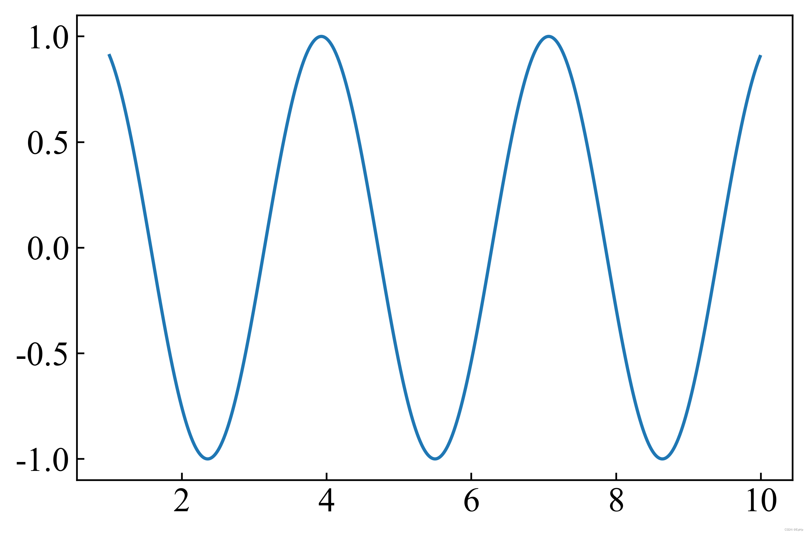
先来个最简单的画图,比如一个 曲线:
# -*- coding: utf-8 -*-
"""
Created on Tue Aug 30 12:01:46 2022

@author: EpH
"""

import numpy as np
import matplotlib.pyplot as plt

x = np.arange(1, 10, 0.01)
y = np.sin(2*x)

fig, ax = plt.subplots()
ax.plot(x, y)
plt.show()
fig, ax = plt.subplots()
ax.plot(x, y)
这个用法。
这里第一行我们先建立了一个画布 figure 并在画布上建立的一个轴群 Axes (分别对应代码中的 fig 和 ax,当然这两个名字也可以自己命名),称其为轴群的原因是它里面包含有[Top, bottom, left, right] 四个轴 Axis 。
第二行便是在轴群 Axes 上作图。这里可能有些人会懵一下,为啥不在轴 Axis 上作图?因为我们要画的数据是二维数据( 和
两个维度),需要两个轴来描述,故需要在轴群上作图。轴
Axis 只有在修改轴的性质,比如范围、颜色、标度的时候才会起作用。
非常不推荐在 和
赋值完之后直接写一句
plt.plot(x, y)
了事。虽然这样能得到相同的作图结果,但不了解matplotlib的 Axes 和 Axis 机制对以后更复杂的作图是无益的。
两个Y轴
现在我想画两个曲线, 和
, 而且我还想把他们画在同一个图上。我们可以先用最简单的方法试试
# -*- coding: utf-8 -*-
# -*- coding: utf-8 -*-
"""
Created on Tue Aug 30 12:01:46 2022

@author: EpH
"""

import numpy as np
import matplotlib.pyplot as plt

x = np.arange(1, 10, 0.01)
y = np.sin(2*x)
z = x**2

fig, ax = plt.subplots()
ax.plot(x, y)
ax.plot(x, z)
plt.show()
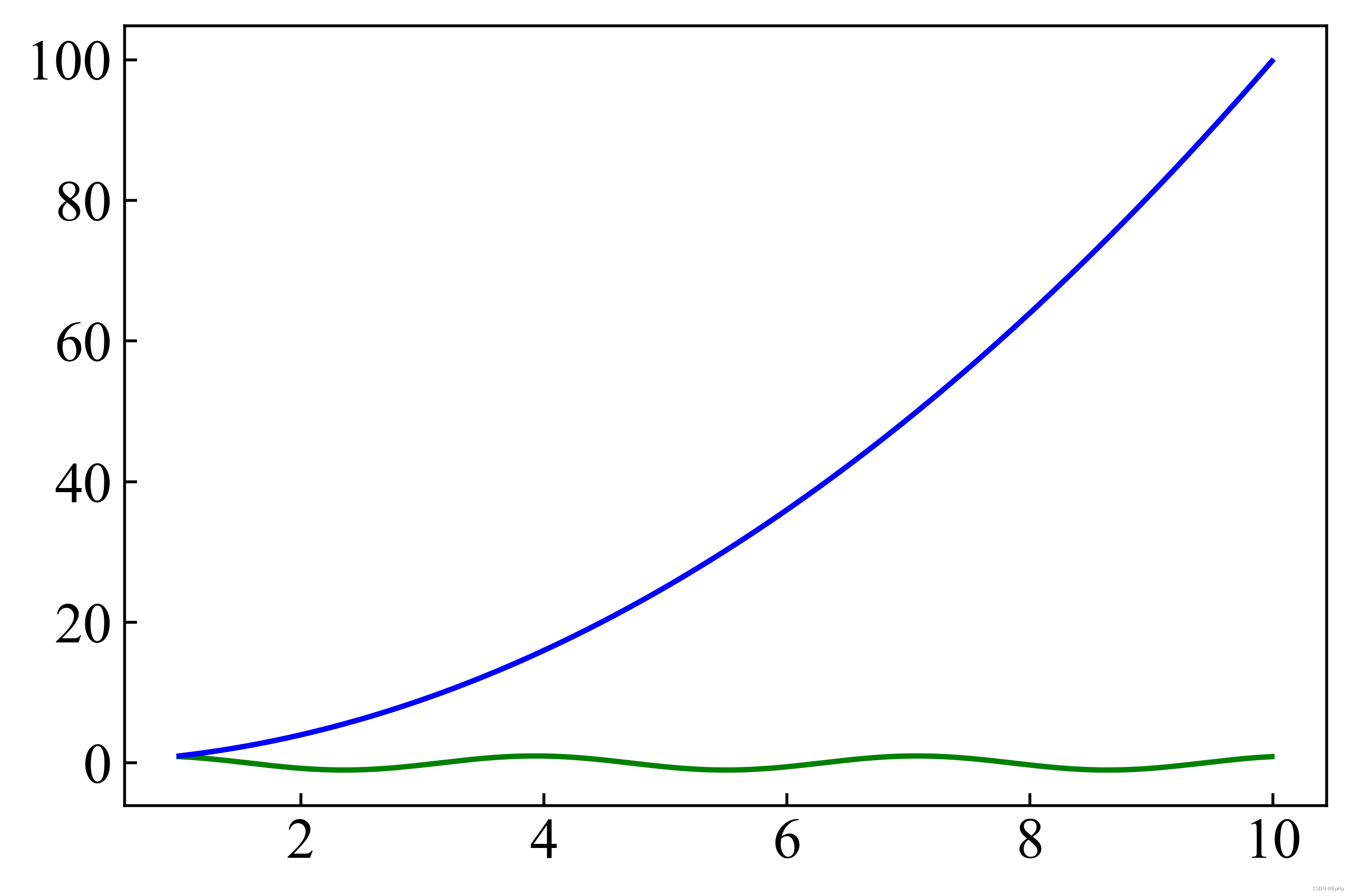
这时我们发现,由于 是数值太大,
失去了很多的细节,这个时候就需要用到双Y轴来解决。
# -*- coding: utf-8 -*-
"""
Created on Tue Aug 30 12:01:46 2022

@author: EpH
"""

import numpy as np
import matplotlib.pyplot as plt

x = np.arange(1, 10, 0.01)
y = np.sin(2*x)
z = x**2

fig, ax = plt.subplots()
ax.plot(x, y, color='green')
ax.set_ylabel('y')
ax.set_xlabel('x')
ax.spines['right'].set_visible(False) # ax右轴隐藏

z_ax = ax.twinx() # 创建与轴群ax共享x轴的轴群z_ax
z_ax.plot(x, z, color='blue')
z_ax.set_ylabel('z')

plt.show()
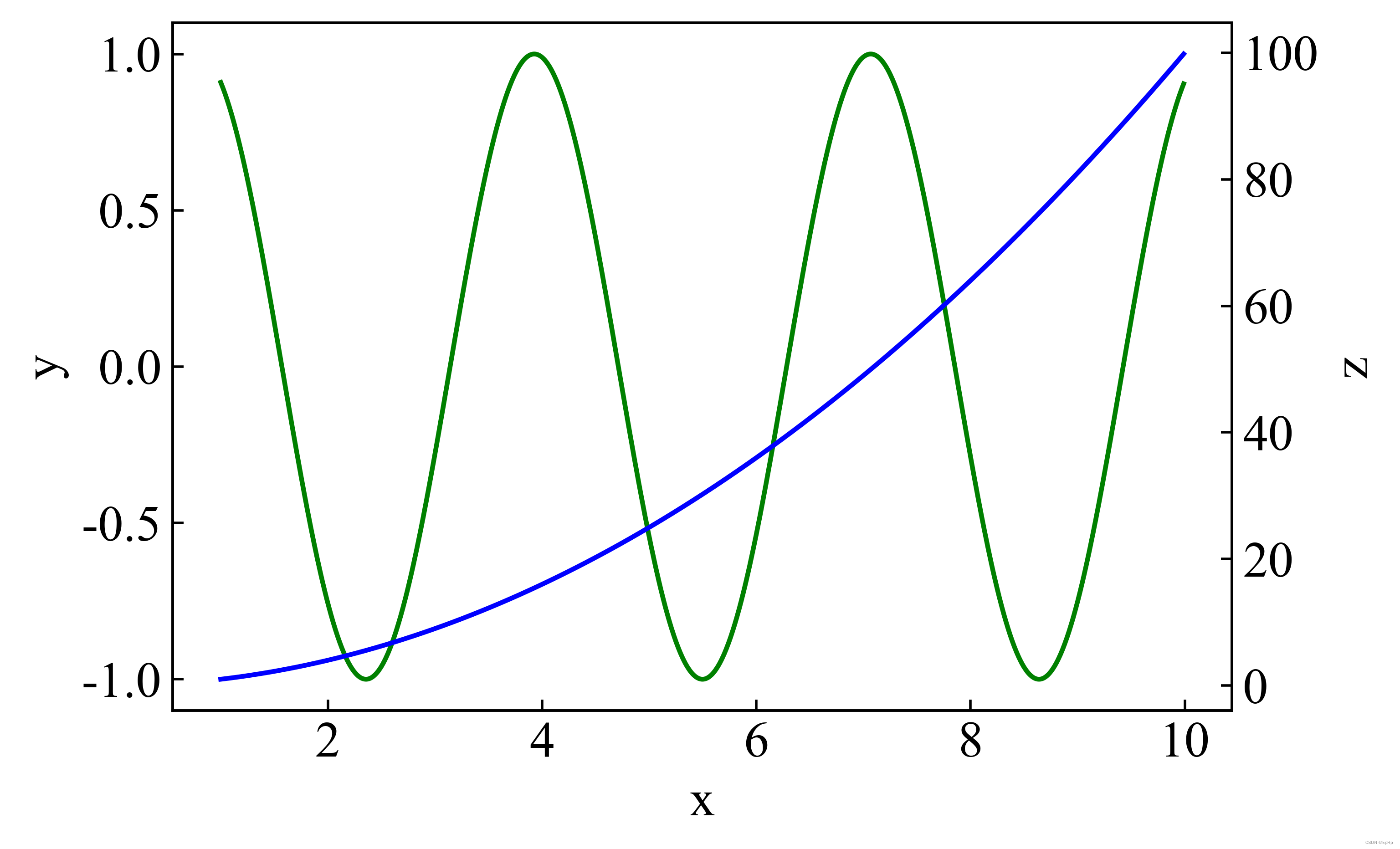
- 隐藏了 ax 轴群的右轴;
- 建立了一个与 ax 轴群共享
轴(也叫
bottom轴,轴群的四轴之一)的 z_ax 轴群,的曲线画在该轴群中,故不挤占
的空间。
这时 和
分别对应左、右两轴,没有相互挤占的情况,可以愉快的画在了一起了。
三个以及多个Y轴
这时候我又想在上图的基础上再加一个 , 可以预想,这个要是直接加上去,又会挤占
的空间了,因此我们还需要一个轴。
# -*- coding: utf-8 -*-
"""
Created on Tue Aug 30 12:01:46 2022

@author: EpH
"""

import numpy as np
import matplotlib.pyplot as plt

x = np.arange(1, 10, 0.01)
y = np.sin(2*x)
z = x**2
k = x**3

fig, ax = plt.subplots()
ax.plot(x, y, color='green')
ax.set_ylabel('y')
ax.set_xlabel('x')
ax.spines['right'].set_visible(False)

z_ax = ax.twinx()
z_ax.plot(x, z, color='blue')
z_ax.set_ylabel('z')

k_ax = ax.twinx()# 创建与轴群ax共享x轴的轴群k_ax
k_ax.spines['right'].set_position(('data', 12))# 确定k_ax轴群右边轴的位置在数值12
k_ax.plot(x, k, color='red')
k_ax.set_ylabel('k')

plt.show()
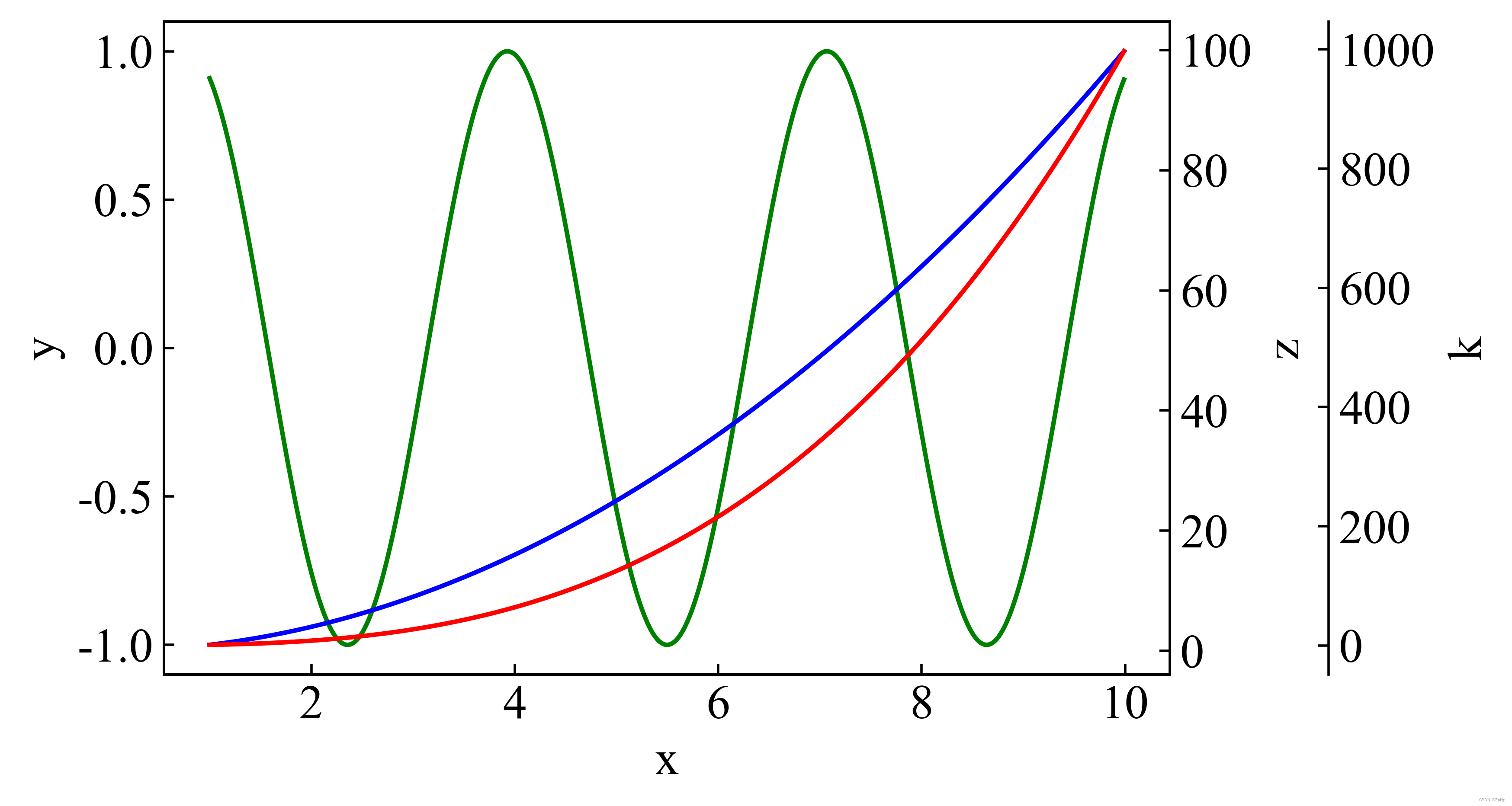
k_ax.spines['right'].set_position(('data', 12))
通过调节这个数值,能确定轴坐落的位置,这与 ax 轴群的x轴相关,数值比x轴的最大值要大(此处x轴最大值为10,轴位置取了12),具体是多少需要尝试。
来亿点点美化
这里 没有用到 类似于
from mpl_toolkits.axes_grid1 import host_subplot
这种主轴+寄生轴实现多y轴的方法,因为 matplotlib 里对这个方法的支持并不多,甚至连修改线宽难度也不小(可能是我不会……欢迎交流)。我上面提到的方法有很多的参数接口,既然这样,那就发挥这种方法的优势,来做一点点美化吧!
# -*- coding: utf-8 -*-
"""
Created on Mon Aug 22 20:01:38 2022
@author: Lenovo
"""
import numpy as np
import matplotlib.pyplot as plt
from matplotlib import rcParams
from matplotlib.pylab import mpl
#默认字体
config = {
"font.family":'Times New Roman',
"font.size": 16,
"mathtext.fontset":'stix',
"font.serif": ['Times New Roman'],
}
rcParams.update(config)
mpl.rcParams['font.sans-serif'] = ['SimHei'] #显示中文
mpl.rcParams['axes.unicode_minus']=False #显示负号
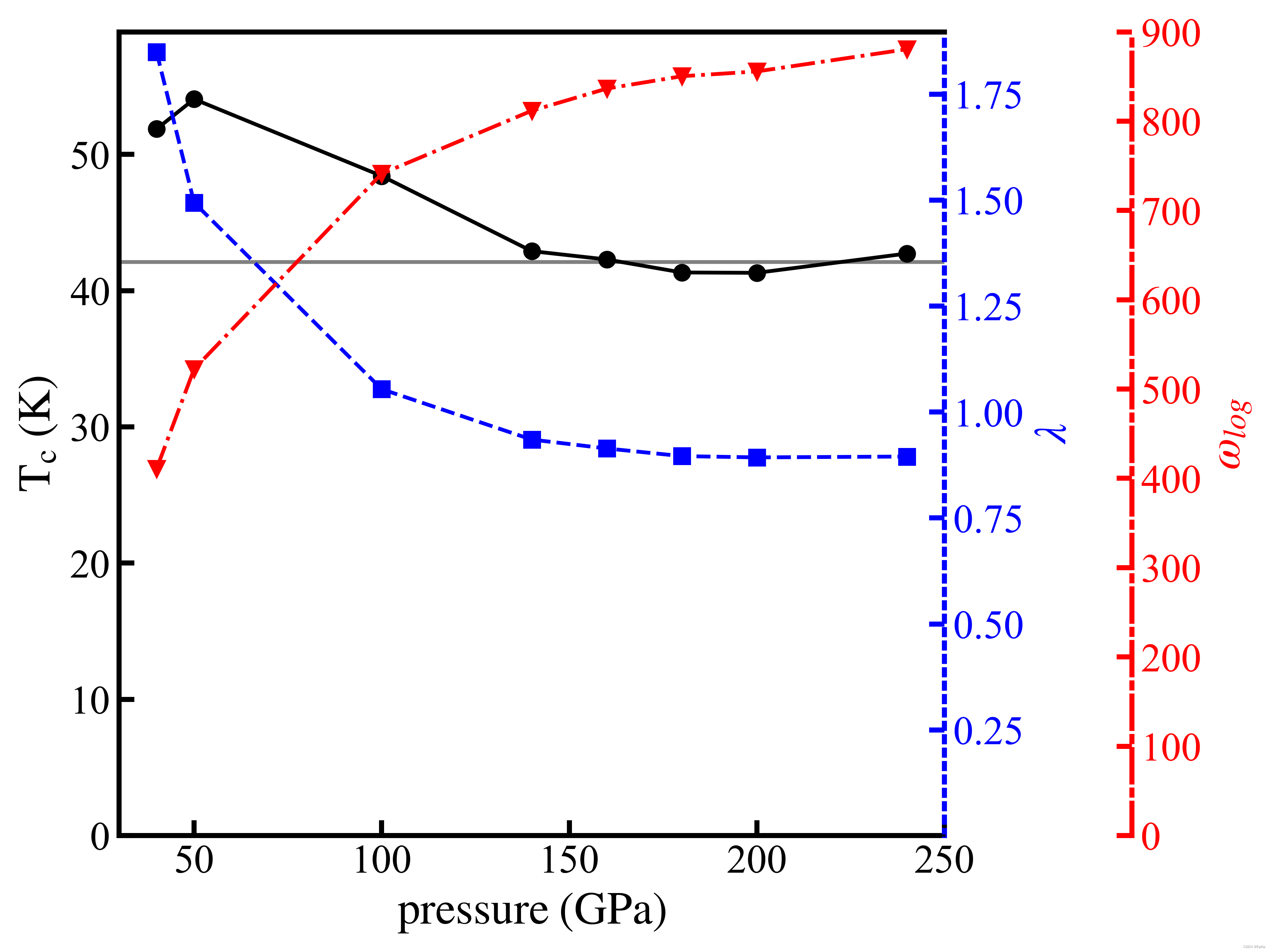
pressure = np.array([40, 50, 100, 140, 160, 180, 200, 240])
Tc = np.array([51.870, 54.062, 48.419, 42.902, 42.290, 41.336, 41.309, 42.725])
Lambda = np.array([1.849, 1.494, 1.054, 0.935, 0.914, 0.896, 0.893, 0.895])
Omiga_log = np.array([410.806, 522.407, 741.113, 811.674, 836.477, 850.304, 855.685, 880.548])
a = 0.45
fig, ax = plt.subplots(figsize=(13*a,13*a))
plt.subplots_adjust(left=None, bottom=None, right=None, top=None, wspace=0.3, hspace=0.3)
plt.rcParams['ytick.direction'] = 'in'# 刻度线显示在内部
plt.rcParams['xtick.direction'] = 'in'# 刻度线显示在内部
bwith = 2
ax.spines['bottom'].set_linewidth(bwith)
ax.spines['left'].set_linewidth(bwith)
ax.spines['top'].set_linewidth(bwith)
ax.spines['right'].set_linewidth(bwith)
ax.axhline(y=np.average(Tc[3:]), color='gray', ls='-', )
ax.plot(pressure, Tc, 'k-o')
ax.set_ylim(ymin=0, ymax=59)
ax.set_xlabel('$\mathrm{pressure \; (GPa)}$', fontsize=18)
ax.set_ylabel('$\mathrm{T_c \; (K)}$', fontsize=18)
ax.tick_params(length=6, width=2)
ax.spines['right'].set_visible(False)
lambda_color = 'blue'
labmda_ax = ax.twinx()
labmda_ax.plot(pressure, Lambda, 's--', color=lambda_color)
labmda_ax.set_ylim(ymin=0.001, )
labmda_ax.set_xlabel('$\mathrm{pressure \; (GPa)}$', fontsize=18)
labmda_ax.tick_params(length=6, width=2, color=lambda_color, labelcolor=lambda_color)
labmda_ax.set_ylabel('$\lambda$', fontsize=18, color=lambda_color)
labmda_ax.spines['right'].set(color=lambda_color, linewidth=2.0, linestyle=':')
omglog_color = 'red'
omglog_ax = ax.twinx()
omglog_ax.spines['right'].set_position(('data', 300))
omglog_ax.set_ylim(0, 900)
omglog_ax.plot(pressure, Omiga_log, 'o-.', color=omglog_color)
omglog_ax.set_ylabel('$\omega_{log}$', fontsize=18, color=omglog_color)
omglog_ax.tick_params(length=6, width=2, color=omglog_color, labelcolor=omglog_color)
omglog_ax.spines['right'].set(color=omglog_color, linewidth=2.0, linestyle='-.')
文章出处登录后可见!