系列文章目录
第一章 使用 matplotlib 绘制折线图
第二章 使用 matplotlib 绘制条形图
第三章 使用 matplotlib 绘制直方图
第四章 使用 matplotlib 绘制散点图
第五章 使用 matplotlib 绘制饼图
第六章 使用 matplotlib 绘制热力图
第七章 使用 matplotlib 绘制堆叠条形图
第八章 使用 matplotlib 在一个画布内绘制多个图
前言
上一章我们讲述了饼图的绘制,本章我们来讲述热力图的绘制。
一、什么是热力图?
热力图是一种通过对色块着色来显示数据的统计图表。绘图时,需指定颜色映射的规则。例如,较大的值由较深的颜色表示,较小的值由较浅的颜色表示;较大的值由偏暖的颜色表示,较小的值由较冷的颜色表示,等等。
从数据结构来划分,热力图一般分为两种。第一,表格型热力图,也称色块图。它需要 2 个分类字段和 1 个数值字段,分类字段确定 x、y 轴,将图表划分为规整的矩形块。数值字段决定了矩形块的颜色。第二,非表格型热力图,或曰平滑的热力图,它需要 3 个数值字段,可绘制在平行坐标系中(2个数值字段分别确定x、y轴,1个数值字段确定着色)。
热力图适合用于查看总体的情况、发现异常值、显示多个变量之间的差异,以及检测它们之间是否存在任何相关性。
二、热力图的绘制
下面我们就通过例子来讲述热力图的绘制,示例代码如下:
import matplotlib.pyplot as plt
import numpy as np

harvest = np.array([[0.8, 2.4, 2.5, 3.9, 0.0, 4.0, 0.0],
                    [2.4, 0.0, 4.0, 1.0, 2.7, 0.0, 0.0],
                    [1.1, 2.4, 0.8, 4.3, 1.9, 4.4, 0.0],
                    [0.6, 0.0, 0.3, 0.0, 3.1, 0.0, 0.0],
                    [0.7, 1.7, 0.6, 2.6, 2.2, 6.2, 0.0],
                    [1.3, 1.2, 0.0, 0.0, 0.0, 3.2, 5.1],
                    [0.1, 2.0, 0.0, 1.4, 0.0, 1.9, 6.3]])

plt.imshow(harvest)
plt.tight_layout()
plt.show()
在上面的代码中,将一个二维数组传入到 imshow 方法中便可以绘制一个热力图,每个色块的颜色代表数据的大小。代码执行后得到的图形如下图所示:

上面只是绘制了色块,并没有指明 x 轴 和 y 轴代表的含义,下面我们加上 x 轴和 y 轴的标签,并加上标题。示例代码如下:
import matplotlib.pyplot as plt
import numpy as np

vegetables = ["cucumber", "tomato", "lettuce", "asparagus",
              "potato", "wheat", "barley"]
farmers = ["Farmer Joe", "Upland Bros.", "Smith Gardening",
           "Agrifun", "Organiculture", "BioGoods Ltd.", "Cornylee Corp."]

harvest = np.array([[0.8, 2.4, 2.5, 3.9, 0.0, 4.0, 0.0],
                    [2.4, 0.0, 4.0, 1.0, 2.7, 0.0, 0.0],
                    [1.1, 2.4, 0.8, 4.3, 1.9, 4.4, 0.0],
                    [0.6, 0.0, 0.3, 0.0, 3.1, 0.0, 0.0],
                    [0.7, 1.7, 0.6, 2.6, 2.2, 6.2, 0.0],
                    [1.3, 1.2, 0.0, 0.0, 0.0, 3.2, 5.1],
                    [0.1, 2.0, 0.0, 1.4, 0.0, 1.9, 6.3]])

plt.xticks(np.arange(len(farmers)), labels=farmers,
                     rotation=45, rotation_mode="anchor", ha="right")
plt.yticks(np.arange(len(vegetables)), labels=vegetables)

plt.title("Harvest of local farmers (in tons/year)")

plt.imshow(harvest)
plt.tight_layout()
plt.show()
上面代码中,x 轴代表农场主的姓名,y 轴代表蔬菜的名称,二维数组中的数据代表某个农场主种的某类蔬菜的产量。代码执行后得到的图形如下图所示:

上图中,我们加上了 x 轴和 y 轴代表的含义以及整个图的标题,但是现在我们还不知道不同色块所对应的数值的大小,下面我们就来加上。示例代码如下:
import matplotlib.pyplot as plt
import numpy as np

vegetables = ["cucumber", "tomato", "lettuce", "asparagus",
              "potato", "wheat", "barley"]
farmers = ["Farmer Joe", "Upland Bros.", "Smith Gardening",
           "Agrifun", "Organiculture", "BioGoods Ltd.", "Cornylee Corp."]

harvest = np.array([[0.8, 2.4, 2.5, 3.9, 0.0, 4.0, 0.0],
                    [2.4, 0.0, 4.0, 1.0, 2.7, 0.0, 0.0],
                    [1.1, 2.4, 0.8, 4.3, 1.9, 4.4, 0.0],
                    [0.6, 0.0, 0.3, 0.0, 3.1, 0.0, 0.0],
                    [0.7, 1.7, 0.6, 2.6, 2.2, 6.2, 0.0],
                    [1.3, 1.2, 0.0, 0.0, 0.0, 3.2, 5.1],
                    [0.1, 2.0, 0.0, 1.4, 0.0, 1.9, 6.3]])

plt.xticks(np.arange(len(farmers)), labels=farmers,
                     rotation=45, rotation_mode="anchor", ha="right")
plt.yticks(np.arange(len(vegetables)), labels=vegetables)
plt.title("Harvest of local farmers (in tons/year)")

plt.imshow(harvest)
plt.colorbar()
plt.tight_layout()
plt.show()
上面的代码中,我们通过调用 colorbar 函数来加上数值和颜色的对应规则。代码执行后得到的图形如下图所示:
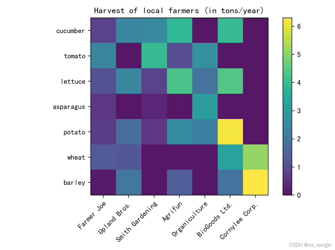
上图我们便加上了颜色和数值的对应规则。接下来我们再为每个色块加上所代表的数值。例如:
import matplotlib.pyplot as plt
import numpy as np

vegetables = ["cucumber", "tomato", "lettuce", "asparagus",
              "potato", "wheat", "barley"]
farmers = ["Farmer Joe", "Upland Bros.", "Smith Gardening",
           "Agrifun", "Organiculture", "BioGoods Ltd.", "Cornylee Corp."]

harvest = np.array([[0.8, 2.4, 2.5, 3.9, 0.0, 4.0, 0.0],
                    [2.4, 0.0, 4.0, 1.0, 2.7, 0.0, 0.0],
                    [1.1, 2.4, 0.8, 4.3, 1.9, 4.4, 0.0],
                    [0.6, 0.0, 0.3, 0.0, 3.1, 0.0, 0.0],
                    [0.7, 1.7, 0.6, 2.6, 2.2, 6.2, 0.0],
                    [1.3, 1.2, 0.0, 0.0, 0.0, 3.2, 5.1],
                    [0.1, 2.0, 0.0, 1.4, 0.0, 1.9, 6.3]])

plt.xticks(np.arange(len(farmers)), labels=farmers,
                     rotation=45, rotation_mode="anchor", ha="right")
plt.yticks(np.arange(len(vegetables)), labels=vegetables)
plt.title("Harvest of local farmers (in tons/year)")

for i in range(len(vegetables)):
    for j in range(len(farmers)):
        text = plt.text(j, i, harvest[i, j], ha="center", va="center", color="w")

plt.imshow(harvest)
plt.colorbar()
plt.tight_layout()
plt.show()
上面的代码中,我们通过一个循环来为每个色块加上对应的数值。代码执行后得到的图形如下图所示:

三、应用场景
1.适用场景
- 热力图的优势在于“空间利用率高”,可以容纳较为庞大的数据。热力图不仅有助于发现数据间的关系、找出极值,也常用于刻画数据的整体样貌,方便在数据集之间进行比较(例如将每个运动员的历年成绩都浓缩成一张热力图,再进行比较)。
- 如果将某行或某列设置为时间变量,热力图也可用于展示数据随时间的变化。例如,用热力图来反映一个城市一年中的温度变化,气候的冷暖走向,一目了然。
2.不适用场景
尽管热力图能够容纳较多的数据,但反过来说,人们很难将其中的色块转换为精确的数字。因此,当需要清楚知道数值的时候,可能需要额外的标注。
总结
本章我们讲述了热力图的绘制以及热力图的适用场景和不适用场景。
文章出处登录后可见!