这是机器未来的第55篇文章
原文首发:https://robotsfutures.blog.csdn.net/article/details/127002749

《Python数据科学快速入门系列》快速导航:
- 【Python数据科学快速入门系列 | 01】Numpy初窥——基础概念
- 【Python数据科学快速入门系列 | 02】创建ndarray对象的十多种方法
- 【Python数据科学快速入门系列 | 03】玩转数据摘取:Numpy的索引与切片
- 【Python数据科学快速入门系列 | 04】Numpy四则运算、矩阵运算和广播机制的爱恨情仇
- 【Python数据科学快速入门系列 | 05】常用科学计算函数
- 【Python数据科学快速入门系列 | 06】Matplotlib数据可视化基础入门(一)
- 【Python数据科学快速入门系列 | 07】Matplotlib数据可视化基础入门(二)
写在开始:
- 博客简介:专注AIoT领域,追逐未来时代的脉搏,记录路途中的技术成长!
- 博主社区:AIoT机器智能, 欢迎加入!
- 专栏简介:从0到1掌握数据科学常用库Numpy、Matploblib、Pandas。
- 面向人群:AI初级学习者
1. 概述
数据可视化是数据分析的重要手段,而不同的应用场景应选择不一样的图表。根据应用场景的不同,我们将图表分为6类:类别比较图表、数据关系图表、数据分布图表、时间序列图表、整体局部图表、地理空间图表。
- 类别比较图表
强调分类数据的规模对比

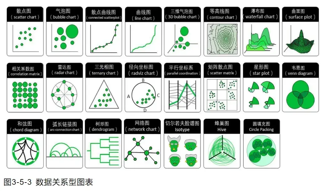
- 数据关系图表
强调2个或以上变量的相关性关系。
例如机器学习、深度学习时分析特征与标签的相关性分析。数据关系图表又分为数值关系、层次关系和网络关系三种。
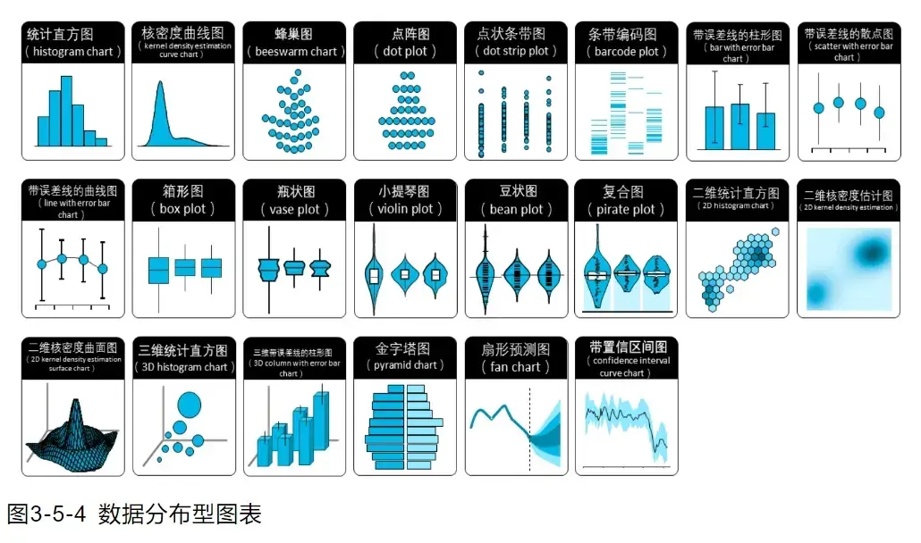
- 数据分布图表
强调数据集中的数值及其频率或分布规律
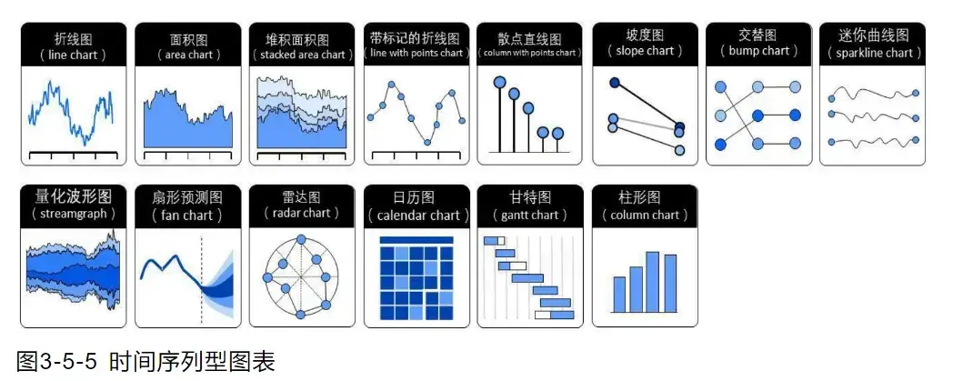
- 时间序列图表
强调数据随时间变化的规律或趋势,例如股票数据。
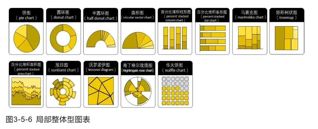
- 整体局部图表
强调局部组成部分与整体的占比。
- 地理空间图表
强调数据中的精确位置和地理分布规律
2. 类别比较图表详解
强调分类数据的规模对比

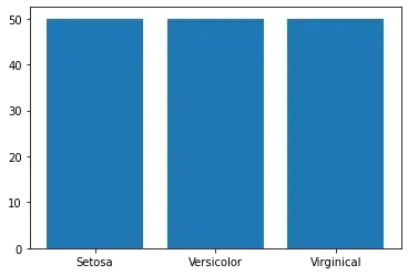
2.1 柱状图
在机器学习时我们一般会对数据进行预处理,其中有一项很重要的工作就是标签均衡,保证数据集的分布是均匀的。
以鸢尾花数据集为例,可以使用柱状图来查看鸢尾花数据集标签是否均衡。
plt.bar(x=range(len(label_count)), height=label_count, tick_label=label_class_name)
或
figure, ax = plt.subplots()
ax.bar(x=range(len(label_count)), height=label_count, tick_label=label_class_name)
import numpy as np

data = []
column_name = []
with open(file='iris.txt',mode='r') as f:
    # 过滤标题行
    line = f.readline()
    if line:
        column_name = np.array(line.strip().split(','))

    while True:
        line = f.readline()
        if line:
            data.append(line.strip().split(','))
        else:
            break

data = np.array(data,dtype=float)

# 使用切片提取前4列数据作为特征数据
X_data = data[:, :4]  # 或者 X_data = data[:, :-1]

# 使用切片提取最后1列数据作为标签数据
y_data = data[:, -1]

data.shape, X_data.shape, y_data.shape
((150, 5), (150, 4), (150,))
# 柱状图
# 查看数据集数据统计分布,分布是否均衡
label_count = np.bincount(y_data.astype(int))
from matplotlib import pyplot as plt

# 山鸢尾(Setosa)、变色鸢尾(Versicolor)、维吉尼亚鸢尾(Virginical)
label_class_name = np.array(['Setosa', 'Versicolor', 'Virginical'])

# x为柱状图横轴柱子的序号,首先确定柱子的数量,然后用range生成序列
# height为柱子的高度,对应的就是每类标签的数量统计
# tick_label为柱子的名称,对应标签分类名称
# plt.bar(x=range(len(label_count)), height=label_count, tick_label=label_class_name)
figure, ax = plt.subplots()
ax.bar(x=range(len(label_count)), height=label_count, tick_label=label_class_name)
<BarContainer object of 3 artists>
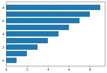
2.2 条形图
如果应用场景需要排序对比的话,条形图更加直观。
绘图接口和柱状图类似
ax.barh(y, width, tick_label)
import numpy as np
from matplotlib import pyplot as plt

val = np.arange(1, 10, 1)
figure, ax = plt.subplots()
ax.barh(y=range(len(val)), width=val)
<BarContainer object of 9 artists>
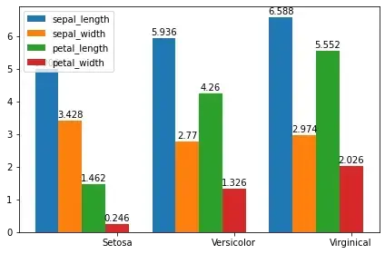
2.3 簇状柱状图
上面的柱状图更多反应分类的单个特征,而簇状柱状图反映的是多个特征。
以鸢尾花数据集为例,我们想观测一下鸢尾花每个分类的花萼长度、花萼宽度、花瓣长度、花瓣宽度的均值对比。
# 统计每个分类每个特征的均值
cate_avg = []

for feature_id in range(4):
    cate_avg_item = []
    for label_id in range(3):
        avg = X_data[y_data == label_id][:, feature_id].mean()
        cate_avg_item.append(avg)
    cate_avg.append(cate_avg_item)

len(cate_avg), cate_avg
(4,
 [[5.006, 5.936, 6.587999999999998],
  [3.428, 2.7700000000000005, 2.974],
  [1.4620000000000002, 4.26, 5.5520000000000005],
  [0.24599999999999997, 1.3259999999999998, 2.0260000000000002]])
fig,ax = plt.subplots()
width = 0.2  # the width of the bars

# ax.bar(x=range(len(cate_avg[0])), height=cate_avg[0])

for label_id in range(4):
    x =  np.arange(len(cate_avg[0]))
    rects = ax.bar((x+width*len(cate_avg[0]))+width*label_id, cate_avg[label_id], width, \
        tick_label=label_class_name, label=column_name[label_id])
    ax.bar_label(rects, padding=1)

ax.legend()

fig.tight_layout()
plt.show()
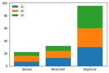
2.4 堆积柱状图
堆叠柱状图非常适合用来对比不同类别数据的数值大小,同时对比每一类别数据中,子类别的构成及大小。
举个简单的例子,我们将鸢尾花的数据集按照随机数量挑选成3堆,然后看一下这3堆小数据集各种鸢尾花类型的数量情况。
堆积柱状图和柱状图的区别在于bottom参数的配置,以前一个柱子的数据为底,后面增加新的柱子是将前面柱子加起来作为新的bottom
import numpy as np

# 加载数据集
data = []
column_name = []
with open(file='iris.txt',mode='r') as f:
    # 过滤标题行
    line = f.readline()
    if line:
        column_name = np.array(line.strip().split(','))

    while True:
        line = f.readline()
        if line:
            data.append(line.strip().split(','))
        else:
            break

data = np.array(data,dtype=float)

np.random.shuffle(data)

# 使用切片提取前4列数据作为特征数据
X_data = data[:, :4]  # 或者 X_data = data[:, :-1]

# 使用切片提取最后1列数据作为标签数据
y_data = data[:, -1]

data.shape, X_data.shape, y_data.shape

# 随机分为3堆
sub_datasets_counts = np.random.randint(10, 40, 2)
sub_datasets_counts = np.append(sub_datasets_counts, len(X_data) - sub_datasets_counts.sum())
print(sub_datasets_counts)

# 统计子数据集各种类的统计情况
stats_result = []
st = 0
et = np.sum(sub_datasets_counts[0])
for i in range(3):
    label_count = np.bincount(y_data[st:et].astype(int))
    stats_result.append(label_count)
    if i < 2:
        st = np.sum(sub_datasets_counts[:i+1])
        et = np.sum(sub_datasets_counts[:i+2])

stats_result = np.asarray(stats_result)
print(stats_result)

# 绘制图表
from matplotlib import pyplot as plt

# 山鸢尾(Setosa)、变色鸢尾(Versicolor)、维吉尼亚鸢尾(Virginical)
label_class_name = np.array(['Setosa', 'Versicolor', 'Virginical'])

figure, ax = plt.subplots()
# ax.bar(x=range(len(sub_datasets_counts)), height=sub_datasets_counts)
# print(stats_result[:, 0])
ax.bar(x=range(len(stats_result[:, 0])), height=stats_result[:, 0], label='s1',tick_label=label_class_name)
# print(stats_result[:, 1])
ax.bar(x=range(len(stats_result[:, 1])), height=stats_result[:, 1], bottom=stats_result[:, 0], label='s2')
# print(stats_result[:, 2])
ax.bar(x=range(len(stats_result[:, 2])), height=stats_result[:, 2], bottom=stats_result[:, 0]+stats_result[:, 1], label='s3')

ax.legend()
plt.show()
[22 32 96]
[[ 7  9  6]
 [13 11  8]
 [30 30 36]]
3. 总结
柱状图非常适合用于分类统计比较,柱状图、条形图、堆积柱状图的绘制方法也都大同小异,相对较为简单。
— 博主热门专栏推荐 —
- Python零基础快速入门系列
- 深入浅出i.MX8企业级开发实战系列
- MQTT从入门到提高系列
- 物体检测快速入门系列
- 自动驾驶模拟器AirSim快速入门
- 安全利器SELinux入门系列
- Python数据科学快速入门系列

文章出处登录后可见!