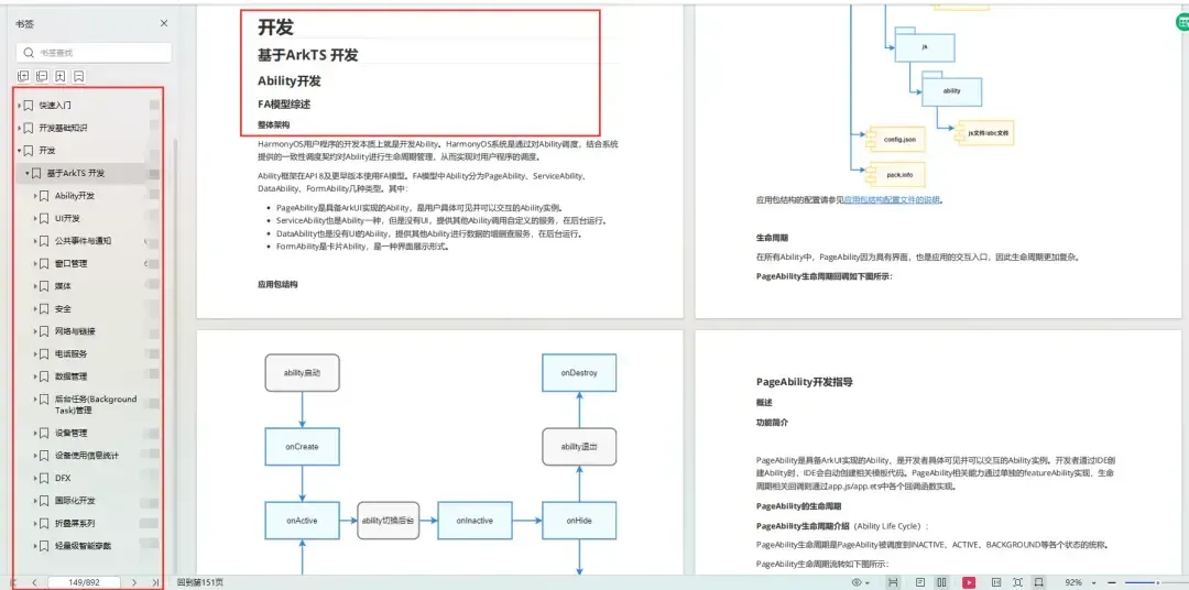
介绍
本示例主要介绍了TabBar中间页面如何实现有一圈圆弧外轮廓以及TabBar页签被点击之后会改变图标显示,并有一小段动画效果。
效果图预览

使用说明:
- 依次点击tabBar页面,除了社区图标之外,其它图标往上移动一小段距离。
实现思路
场景1:TabBar中间页面实现有一圈圆弧外轮廓
将Image组件外层包裹一层容器组件,通过设置borderRadius以及margin的top值实现圆弧外轮廓效果。 这里borderRadius的值设置为容器组件宽度的一半,margin的top值根据开发者的ux效果设置合适的值即可。 具体代码可参考TabView.ets
Column() {
   Image(this.selectedIndex === this.tabBarIndex ? TABINFO[this.tabBarIndex].selectedIcon : TABINFO[this.tabBarIndex].defaultIcon)
     .size({ width: $r('app.integer.community_image_size'), height: $r('app.integer.community_image_size') })
}
.width($r('app.integer.community_image_container_size'))
.height($r('app.integer.community_image_container_size'))
// TODO:知识点:通过设置borderRadius以及margin的top值实现圆弧外轮廓效果。
.borderRadius(this.tabBarIndex === COMMUNITY_TAB_BAR_INDEX ? $r('app.integer.community_image_container_border_radius_size') : $r('app.integer.common_size_0'))
.margin({ top: this.tabBarIndex === COMMUNITY_TAB_BAR_INDEX ? -15 : $r('app.integer.common_size_0') })
.backgroundColor(Color.White)
.justifyContent(FlexAlign.Center)
场景2:TabBar页签点击之后会改变图标显示,并有一小段动画效果
改变图标显示功能可以先声明一个变量selectedIndex,此变量代表被选定的tabBar下标,点击的时候将当前tabBar的下标值进行赋值。 通过当前被选中的tabBar下标值和tabBar自己的下标值进行判断来达到点击之后改变图标显示的效果。 动画效果可以将Image添加一个offset属性和animation属性, offset属性可以控制组件的横向和纵向偏移量; animation在组件的某些通用 属性变化时,可以通过属性动画animation实现过 渡效果。 点击TabBar页签,改变offset的属性值,自动触发animation属性动画。 具体代码可参考TabView.ets
Column() {
   // 通过被选中的tabBar下标值和tabBar的默认下标值来改变图片显示
   Image(this.selectedIndex === this.tabBarIndex ? TABINFO[this.tabBarIndex].selectedIcon : TABINFO[this.tabBarIndex].defaultIcon)
     .size(this.selectedIndex === HOME_TAB_BAR_INDEX && this.selectedIndex === this.tabBarIndex ?
        { width: $r('app.integer.community_image_size'), height: $r('app.integer.community_image_size') } :
        { width: $r('app.integer.tab_bar_image_size'), height: $r('app.integer.tab_bar_image_size') })
     // TODO:知识点:通过offset控制图片的纵向偏移。
     .offset({ y: (this.selectedIndex === this.tabBarIndex && this.selectedIndex !== COMMUNITY_TAB_BAR_INDEX) ?
                   this.iconOffset : $r('app.integer.common_size_0') })
      // TODO:知识点:组件的某些通用属性变化时,可以通过属性动画animation实现过渡效果。本示例的动画效果是tabBar的图片向上偏移一小段距离
      .animation({
         duration: 400,
         curve: Curve.Linear,
         iterations: 1,
         playMode: PlayMode.Normal
      })
}
.width(this.selectedIndex === HOME_TAB_BAR_INDEX && this.selectedIndex === this.tabBarIndex ?
$r('app.integer.community_image_size') : $r('app.integer.tab_bar_image_container_size'))
.height(this.selectedIndex === HOME_TAB_BAR_INDEX && this.selectedIndex === this.tabBarIndex ?
$r('app.integer.community_image_size') : $r('app.integer.tab_bar_image_container_size'))
.justifyContent(FlexAlign.Center)
高性能知识点
不涉及。
工程结构&模块类型
customtabbar                                    // har类型
|---model
|   |---DataType.ets                            // 模型层-Tabbar数据类型
|   |---TabBarData.ets                          // 数据模型层-TabBar数据
|---view
|   |---TabView.ets                             // 视图层-自定义TabBar页面
模块依赖
不涉及。
参考资料
属性动画(animation)
Tabs组件
为了能让大家更好的学习鸿蒙(HarmonyOS NEXT)开发技术,这边特意整理了《鸿蒙开发学习手册》(共计890页),希望对大家有所帮助:https://qr21.cn/FV7h05
《鸿蒙开发学习手册》:https://qr21.cn/FV7h05
入门必看:https://qr21.cn/FV7h05
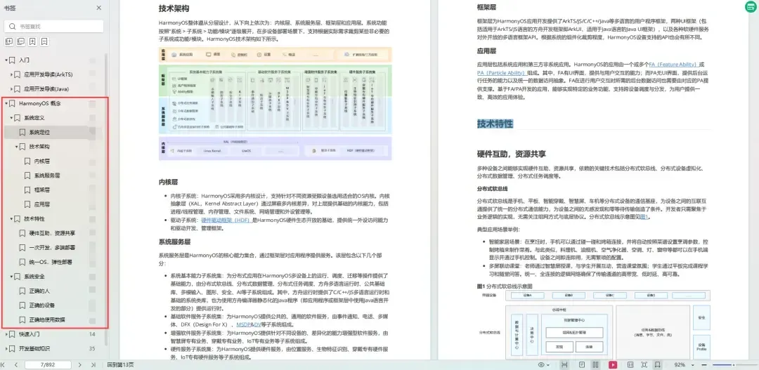
1. 应用开发导读(ArkTS)
2. ……
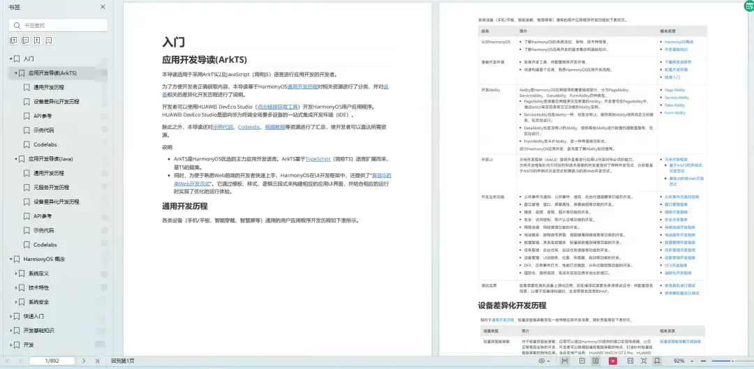
HarmonyOS 概念:https://qr21.cn/FV7h05
- 系统定义
- 技术架构
- 技术特性
- 系统安全
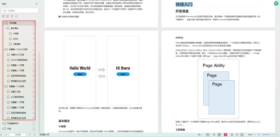
如何快速入门:https://qr21.cn/FV7h05
1. 基本概念
2. 构建第一个ArkTS应用
3. 构建第一个JS应用
4. ……
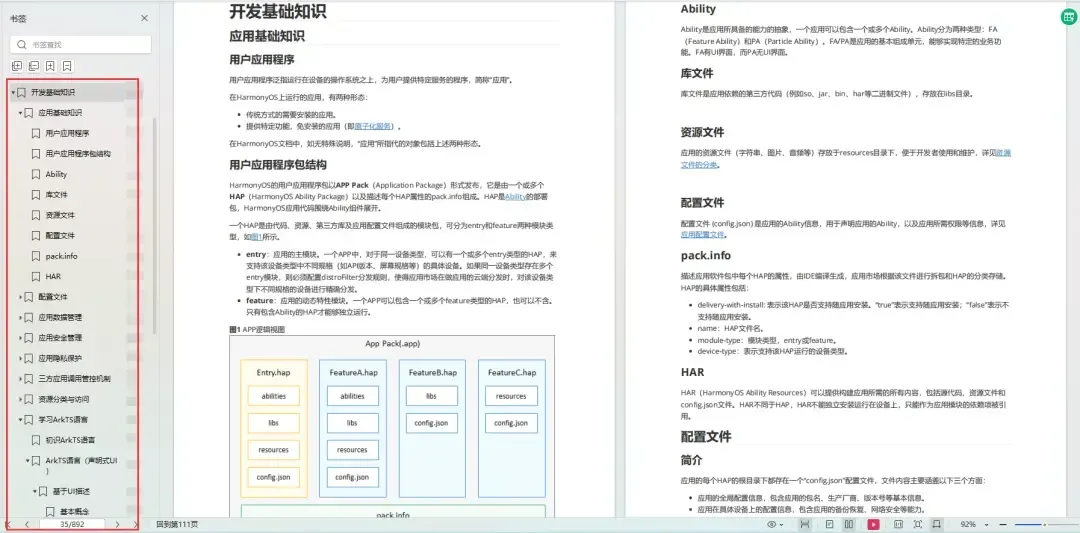
开发基础知识:https://qr21.cn/FV7h05
1. 应用基础知识
2. 配置文件
3. 应用数据管理
4. 应用安全管理
5. 应用隐私保护
6. 三方应用调用管控机制
7. 资源分类与访问
8. 学习ArkTS语言
9. ……
基于ArkTS 开发:https://qr21.cn/FV7h05
1. Ability开发
2. UI开发
3. 公共事件与通知
4. 窗口管理
5. 媒体
6. 安全
7. 网络与链接
8. 电话服务
9. 数据管理
10. 后台任务(Background Task)管理
11. 设备管理
12. 设备使用信息统计
13. DFX
14. 国际化开发
15. 折叠屏系列
16. ……
鸿蒙开发面试真题(含参考答案):https://qr21.cn/FV7h05
版权声明:本文为博主作者:码中之牛原创文章,版权归属原作者,如果侵权,请联系我们删除!
原文链接:https://blog.csdn.net/weixin_61845324/article/details/136560816