论文图片绘制 Python绘制duofenlei 混淆矩阵及可视化(颜色随正确率渐变)
需求
- 论文中对多分类评价需要
- 混淆矩阵已获得,需要可视化
给出数据
混淆矩阵的定义以及如何读图不再描述,这里仅给出绘制方法
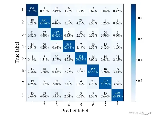
给出数据:8分类任务
	[451, 1,  12,  6,  1,   3,   5,  2],
     [18, 451, 25,  19, 24,  14,  7,  2],
     [41, 27,  487, 2,  15,  2,   24, 3],
     [14, 20,  4,   395, 7,   16,  15, 5],
     [1,  8,   30,  25, 421, 16,  14, 14],
     [13, 18,  1,   15, 13,  455, 18, 19],
     [19, 7,   12,  17, 4,   21,  352,15],
     [15, 23,  31,  15, 3,   9,   15, 458]
实验代码
- 给出所需的包
numpy和matplotlib
import numpy as np
import matplotlib.pyplot as plt
from matplotlib import rcParams
- 定义分类标签
classes = ['1', '2', '3', '4', '5', '6', '7', '8']
这里可以修改为自己所需的标签以及分类任务,如二分类只需要两个标签,若标签为“花、草、鱼……”自行进行修改即可
- 将混淆矩阵数据放到矩阵中,如
confusion_matrix = np.array(
    [[451, 1,  12,  6,  1,   3,   5,  2],
     [18, 451, 25,  19, 24,  14,  7,  2],
     [41, 27,  487, 2,  15,  2,   24, 3],
     [14, 20,  4,   395, 7,   16,  15, 5],
     [1,  8,   30,  25, 421, 16,  14, 14],
     [13, 18,  1,   15, 13,  455, 18, 19],
     [19, 7,   12,  17, 4,   21,  352,15],
     [15, 23,  31,  15, 3,   9,   15, 458]
     ], dtype=np.int)  # 输入特征矩阵
- 矩阵初始化
proportion = []
length = len(confusion_matrix)
print(length)
for i in confusion_matrix:
    for j in i:
        temp = j / (np.sum(i))
        proportion.append(temp)
# print(np.sum(confusion_matrix[0]))
# print(proportion)
pshow = []
for i in proportion:
    pt = "%.2f%%" % (i * 100)
    pshow.append(pt)
proportion = np.array(proportion).reshape(length, length)  # reshape(列的长度,行的长度)
pshow = np.array(pshow).reshape(length, length)
- 设置混淆矩阵图片样式
# print(pshow)
config = {
    "font.family": 'Times New Roman',  # 设置字体类型
}
rcParams.update(config)
plt.imshow(proportion, interpolation='nearest', cmap=plt.cm.Blues)  # 按照像素显示出矩阵
# (改变颜色:'Greys', 'Purples', 'Blues', 'Greens', 'Oranges', 'Reds','YlOrBr', 'YlOrRd',
# 'OrRd', 'PuRd', 'RdPu', 'BuPu','GnBu', 'PuBu', 'YlGnBu', 'PuBuGn', 'BuGn', 'YlGn')
# plt.title('confusion_matrix')
plt.colorbar()
tick_marks = np.arange(len(classes))
plt.xticks(tick_marks, classes, fontsize=12)
plt.yticks(tick_marks, classes, fontsize=12)
- 计算准确率数值及颜色渐变设置
iters = np.reshape([[[i, j] for j in range(length)] for i in range(length)], (confusion_matrix.size, 2))
for i, j in iters:
    if (i == j):
        plt.text(j, i - 0.12, format(confusion_matrix[i, j]), va='center', ha='center', fontsize=10, color='white',
                 weight=5)  # 显示对应的数字
        plt.text(j, i + 0.12, pshow[i, j], va='center', ha='center', fontsize=10, color='white')
    else:
        plt.text(j, i - 0.12, format(confusion_matrix[i, j]), va='center', ha='center', fontsize=10)  # 显示对应的数字
        plt.text(j, i + 0.12, pshow[i, j], va='center', ha='center', fontsize=10)

plt.ylabel('True label', fontsize=16)
plt.xlabel('Predict label', fontsize=16)
plt.tight_layout()
plt.show()
# plt.savefig('混淆矩阵.png')
展示
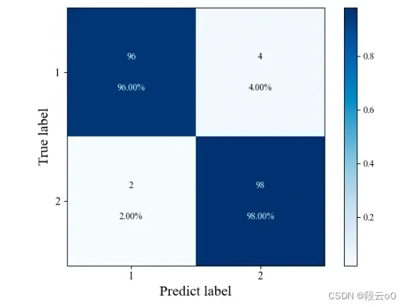
需要n分类如何修改?
- 以二分类为例,只需要修改两个地方
classes = ['1', '2']confusion_matrix = np.array( [ [96, 4], [2, 98] ], dtype=np.int) # 输入特征矩阵
大功告成
完整代码
# confusion_matrix
import numpy as np
import matplotlib.pyplot as plt
from matplotlib import rcParams

classes = ['1', '2', '3', '4', '5', '6', '7', '8']
confusion_matrix = np.array(
    [[451, 1,  12,  6,  1,   3,   5,  2],
     [18, 451, 25,  19, 24,  14,  7,  2],
     [41, 27,  487, 2,  15,  2,   24, 3],
     [14, 20,  4,   395, 7,   16,  15, 5],
     [1,  8,   30,  25, 421, 16,  14, 14],
     [13, 18,  1,   15, 13,  455, 18, 19],
     [19, 7,   12,  17, 4,   21,  352,15],
     [15, 23,  31,  15, 3,   9,   15, 458]
     ], dtype=np.int)  # 输入特征矩阵
proportion = []
length = len(confusion_matrix)
print(length)
for i in confusion_matrix:
    for j in i:
        temp = j / (np.sum(i))
        proportion.append(temp)
# print(np.sum(confusion_matrix[0]))
# print(proportion)
pshow = []
for i in proportion:
    pt = "%.2f%%" % (i * 100)
    pshow.append(pt)
proportion = np.array(proportion).reshape(length, length)  # reshape(列的长度,行的长度)
pshow = np.array(pshow).reshape(length, length)
# print(pshow)
config = {
    "font.family": 'Times New Roman',  # 设置字体类型
}
rcParams.update(config)
plt.imshow(proportion, interpolation='nearest', cmap=plt.cm.Blues)  # 按照像素显示出矩阵
# (改变颜色:'Greys', 'Purples', 'Blues', 'Greens', 'Oranges', 'Reds','YlOrBr', 'YlOrRd',
# 'OrRd', 'PuRd', 'RdPu', 'BuPu','GnBu', 'PuBu', 'YlGnBu', 'PuBuGn', 'BuGn', 'YlGn')
# plt.title('confusion_matrix')
plt.colorbar()
tick_marks = np.arange(len(classes))
plt.xticks(tick_marks, classes, fontsize=12)
plt.yticks(tick_marks, classes, fontsize=12)

thresh = confusion_matrix.max() / 2.
# iters = [[i,j] for i in range(len(classes)) for j in range((classes))]

iters = np.reshape([[[i, j] for j in range(length)] for i in range(length)], (confusion_matrix.size, 2))
for i, j in iters:
    if (i == j):
        plt.text(j, i - 0.12, format(confusion_matrix[i, j]), va='center', ha='center', fontsize=10, color='white',
                 weight=5)  # 显示对应的数字
        plt.text(j, i + 0.12, pshow[i, j], va='center', ha='center', fontsize=10, color='white')
    else:
        plt.text(j, i - 0.12, format(confusion_matrix[i, j]), va='center', ha='center', fontsize=10)  # 显示对应的数字
        plt.text(j, i + 0.12, pshow[i, j], va='center', ha='center', fontsize=10)

plt.ylabel('True label', fontsize=16)
plt.xlabel('Predict label', fontsize=16)
plt.tight_layout()
plt.show()
# plt.savefig('混淆矩阵.png')
版权声明:本文为博主作者:弃码从文原创文章,版权归属原作者,如果侵权,请联系我们删除!
原文链接:https://blog.csdn.net/qq_43411654/article/details/125451887