Latex绘制一些图形的代码,可复制到overleaf中直接展示
\documentclass{article}
\usepackage{graphicx} % Required for inserting images
\usepackage{pgfplots}
\usepackage{tikz}
%中文包
\usepackage{CJKutf8}
\pgfplotsset{width=12cm,compat=1.9} %compat制定latex版本为1.9
\begin{document}
%设置使用中文包显示中文
\begin{CJK}{UTF8}{gbsn}
\maketitle
\section{Introduction}
%并列柱状图
\begin{figure}
\centering
\begin{tikzpicture}
\begin{axis}
[ybar , %柱状图 xbar 条形图
grid=major,major grid style={dashed}, %显示背景网格
ymin=50, %Y轴刻度最小值
ylabel=F1-score(\%), %Y轴标签
title={我的支出}, %图片标题
bar width=.5cm, %柱子宽度
width=14cm,
height=6cm, %图片的长和宽
symbolic x coords={QI-F1, HI-F1, KBI-F1, Overall Acc}, %将x轴刻度设置为指定符号
x=2.5cm, %设置x轴每个单元格的长度
xtick=data, %根据数据设置x轴刻度
% axis y line=left, %只显示左边y轴,即只显示左边框线,不显示右边框线
% axis x line=bottom, %只显示底部的x轴
nodes near coords, %柱子上显示数字
nodes near coords style={font=\fontsize{8}{12}\selectfont}, %数字大小为8pt,行距为12pt
enlarge x limits=0.2, %将x轴范围增加20%
legend style={at={(0.5,-0.2)},anchor=north,legend columns=-1}, %将标签放在{(0.5,-0.2)}表示图例的中心,anchor=north表示图例的顶部与底部对齐,legend columns=-1表示图例横排
]
%添加数据
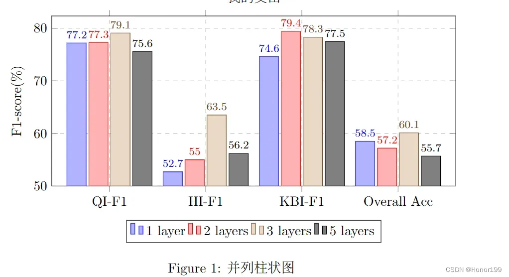
\addplot+ coordinates {(QI-F1, 77.2 ) (HI-F1, 52.7) (KBI-F1, 74.6) (Overall Acc, 58.5)};
\addplot+ coordinates {(QI-F1, 77.3) (HI-F1, 55.0) (KBI-F1, 79.4) (Overall Acc, 57.2)};
\addplot+ coordinates {(QI-F1, 79.1) (HI-F1, 63.5) (KBI-F1, 78.3) (Overall Acc, 60.1)};
\addplot+ coordinates {(QI-F1, 75.6) (HI-F1, 56.2) (KBI-F1, 77.5) (Overall Acc, 55.7)};
\legend{1 layer, 2 layers, 3 layers, 5 layers}; %标签
\end{axis}
\end{tikzpicture}
\caption{并列柱状图}
\label{fig:my_label}
\end{figure}
%折线图
\begin{figure}[ht]
\centering
\begin{tikzpicture}
\begin{axis}
[width=12cm, height=7.5cm,
line width=0.09pt , %设置折线宽度
xlabel={},
ylabel={F1-score(\%)}, %x轴、Y轴标签
xmin=1,
xmax=5, %x轴最大最小刻度
ymin=0.2,
ymax=1, %y轴最大最小刻度
xtick={1,2,3,4,5}, %x轴刻度
xticklabels={100\%, 50\%, 25\%, 10\%, 5\%}, %x轴标签
ytick={0,0.2,0.4,0.6,0.8,1},
legend pos=north east, %将标签放在北东(右上角)
ymajorgrids=true, %y轴表格线
grid style=dashed, %表格线格式
legend style={font=\fontsize{6}{12}\selectfont}, %标签字体设置
enlarge x limits=0.05, %增加x轴范围
]
%添加折线
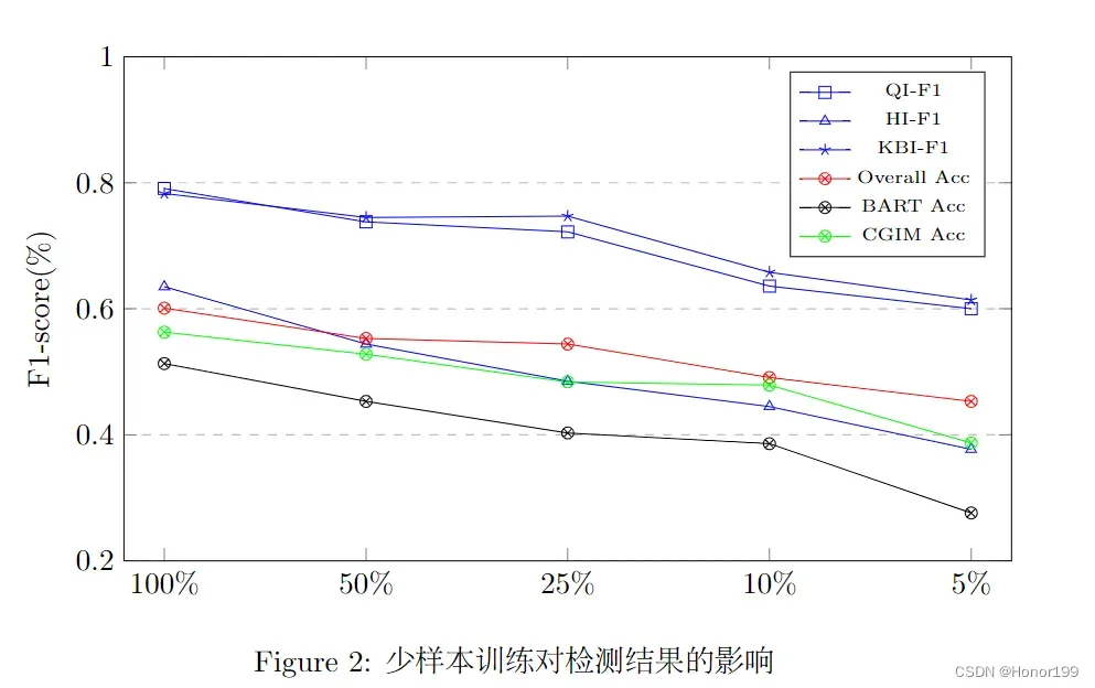
\addplot[color=blue, mark=square, sharp plot] %设置折线颜色和点的形状,sharp plot折线图,smooth曲线图
coordinates {
(1,0.791)(2,0.738)(3,0.722)(4,0.636)(5,0.600)
};
\addplot[color=blue, mark=triangle, ]
coordinates {
(1,0.635)(2,0.544)(3,0.485)(4,0.445)(5,0.377)
};
\addplot[color=blue, mark=star, ]
coordinates {
(1,0.783)(2,0.745)(3,0.747)(4,0.658)(5,0.614)
};
\addplot[color=red, mark=otimes, ]
coordinates {
(1,0.601)(2,0.553)(3,0.544)(4,0.491)(5,0.453)
};
\addplot [color=black, mark=otimes, ]
coordinates {
(1,0.513)(2,0.453)(3,0.403)(4,0.386)(5,0.276)
};
\addplot [ color=green, mark=otimes,]
coordinates {
(1,0.563)(2,0.528)(3,0.484)(4,0.479)(5,0.387)
};
\legend{QI-F1, HI-F1, KBI-F1, Overall Acc, BART Acc, CGIM Acc} %标签
\end{axis}
\end{tikzpicture}
\caption{少样本训练对检测结果的影响}
\label{fig:result3}
\end{figure}
%曲线图
\begin{figure}
\centering
\begin{tikzpicture}
\begin{axis}
%坐标系配置,只显示左边坐标轴
[axis lines = left, xlabel = $x$, ylabel = {$f(x)$}]
%绘制曲线-1
\addplot [domain = -10:10, samples=100, color=red]{x^2 - 2*x -1};
% \addlegendentry{$x^2 - 2x - 1$}; %绘制标注
%绘制曲线-2
\addplot[domain = -10:10, samples=100, color=blue]{x^2 + 2*x + 1};
% \addlegendentry{$x^2 + 2x + 1$}; %绘制标注
\legend{$x^2 - 2x - 1$, $x^2 + 2x + 1$}
\end{axis}
\end{tikzpicture}
\caption{曲线图}
\label{fig:my_label}
\end{figure}
%散点图
\begin{figure}
\centering
\begin{tikzpicture}
\begin{axis}
\addplot+[scatter,only marks,mark size=2.9pt]
coordinates
{
(1,4) (2,2) (3,5) (4,6) (5,1)
};
\end{axis}
\end{tikzpicture}
\caption{散点图}
\label{fig:my_label}
\end{figure}
%3D图形
\begin{figure}
\centering
\begin{tikzpicture}
\begin{axis}
[title=Exmple using the mesh parameter,
hide axis,
colormap/cool,]
\addplot3[mesh, samples=50, domain=-8:8,] %addplot3用于绘制三维图
{sin(deg(sqrt(x^2+y^2)))/sqrt(x^2+y^2)};
\addlegendentry{$\frac{sin(r)}{r}$}
\end{axis}
\end{tikzpicture}
\caption{3D图形}
\label{fig:my_label}
\end{figure}
\end{CJK}
\end{document}
文章出处登录后可见!
已经登录?立即刷新