Python版本为:3.7.1;图表绘制包matplotlib、Seaborn、plotnine的版本分别为:2.2.3、0.9.0、0.5.1;数据处理包NumPy和Pandas的版本分别为:1.15.4和0.23.4。
1、matplotlib
from matplotlib import cm,colors
from matplotlib import pyplot as plt
from matplotlib.pyplot import figure, show, rc
import numpy as np
import pandas as pd
#%matplotlib inline
plt.rcParams["font.sans-serif"]='SimHei'   #解决中文乱码问题
plt.rcParams['axes.unicode_minus']=False   #解决负号无法显示的问题
plt.rc('axes',axisbelow=True)
#-----------------------(a) 单数剧系列柱形图--------------------------------------------
mydata=pd.DataFrame({'Cut':["Fair","Good","Very Good","Premium","Ideal"],
                     'Price':[4300,3800,3950,4700,3500]})

Sort_data=mydata.sort_values(by='Price', ascending=False)


fig=plt.figure(figsize=(6,7),dpi=70)
plt.subplots_adjust(left=0.1, right=0.9, top=0.9, bottom=0.1)
plt.grid(axis="y",c=(217/256,217/256,217/256))         #设置网格线

ax = plt.gca()#获取边框
ax.spines['top'].set_color('none')  # 设置上‘脊梁’为红色
ax.spines['right'].set_color('none')  # 设置上‘脊梁’为无色
ax.spines['left'].set_color('none')  # 设置上‘脊梁’为无色

plt.bar(Sort_data['Cut'],Sort_data['Price'],width=0.6,align="center",label="Cut")

plt.ylim(0,6000) #设定x轴范围
plt.xlabel('Cut')
plt.ylabel('Price')

#-------------------------(b)双数剧系列柱形图-------------------------------------------
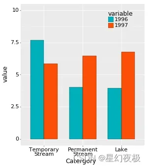
df=pd.read_csv('MultiColumn_Data.csv')
df=df.sort_values(by='1996', ascending=False)
print(df.head())
x_label=np.array(df["Catergory"])
x=np.arange(len(x_label))
y1=np.array(df["1996"])
y2=np.array(df["1997"])
fig=plt.figure(figsize=(5,5))
plt.subplots_adjust(left=0.1, right=0.9, top=0.9, bottom=0.1) #设置绘图区域大小位置
plt.bar(x,y1,width=0.3,color='#00AFBB',label='1996',edgecolor='k', linewidth=0.25) #调整y1轴位置,颜色,label为图例名称,与下方legend结合使用
plt.bar(x+0.3,y2,width=0.3,color='#FC4E07',label='1997',edgecolor='k', linewidth=0.25) #调整y2轴位置,颜色,label为图例名称,与下方legend结合使用
plt.xticks(x+0.15,x_label,size=12) #设置x轴刻度,位置,大小
plt.legend(loc=(1,0.5),ncol=1,frameon=False) #显示图例,loc图例显示位置(可以用坐标方法显示),ncol图例显示几列,默认为1列,frameon设置图形边框
plt.yticks(size=12) #设置y轴刻度,位置,大小
plt.grid(axis="y",c=(217/256,217/256,217/256)) #设置网格线
#将y轴网格线置于底层
#plt.xlabel("Quarter",labelpad=10,size=18,) #设置x轴标签,labelpad设置标签距离x轴的位置
#plt.ylabel("Amount",labelpad=10,size=18,) #设置y轴标签,labelpad设置标签距离y轴的位置
ax = plt.gca() #获取整个表格边框
ax.spines['top'].set_color('none') # 设置上‘脊梁’为无色
ax.spines['right'].set_color('none') # 设置右‘脊梁’为无色
ax.spines['left'].set_color('none') # 设置左‘脊梁’为无色

#----------------------------------(c)堆积柱形图---------------------------------------------
df=pd.read_csv('StackedColumn_Data.csv')
df=df.set_index("Clarity")
print(df.head())

Sum_df=df.apply(lambda x: x.sum(), axis=0).sort_values(ascending=False)
df=df.loc[:,Sum_df.index]

meanRow_df=df.apply(lambda x: x.mean(), axis=1)
Sing_df=meanRow_df.sort_values(ascending=False).index

n_row,n_col=df.shape
#x_label=np.array(df.columns)
x_value=np.arange(n_col)

cmap=cm.get_cmap('YlOrRd_r',n_row)
color=[colors.rgb2hex(cmap(i)[:3]) for i in range(cmap.N) ]

bottom_y=np.zeros(n_col)

fig=plt.figure(figsize=(5,5))
#plt.subplots_adjust(left=0.1, right=0.9, top=0.7, bottom=0.1)

for i in range(n_row):
    label=Sing_df[i]
    plt.bar(x_value,df.loc[label,:],bottom=bottom_y,width=0.5,color=color[i],label=label,edgecolor='k', linewidth=0.25)
    bottom_y=bottom_y+df.loc[label,:].values

plt.xticks(x_value,df.columns,size=10)  #设置x轴刻度
#plt.tick_params(axis="x",width=5)

plt.legend(loc=(1,0.3),ncol=1,frameon=False)

plt.grid(axis="y",c=(166/256,166/256,166/256))

ax = plt.gca()                         #获取整个表格边框
ax.spines['top'].set_color('none')  # 设置上‘脊梁’为无色
ax.spines['right'].set_color('none')  # 设置右‘脊梁’为无色
ax.spines['left'].set_color('none')  # 设置左‘脊梁’为无色

#---------------------------------(d) 百分比堆积柱形图------------------------------------------------
df=pd.read_csv('StackedColumn_Data.csv')
df=df.set_index("Clarity")
print(df.head())

SumCol_df=df.apply(lambda x: x.sum(), axis=0)
df=df.apply(lambda x: x/SumCol_df, axis=1)

meanRow_df=df.apply(lambda x: x.mean(), axis=1)
Per_df=df.loc[meanRow_df.idxmax(),:].sort_values(ascending=False)
Sing_df=meanRow_df.sort_values(ascending=False).index

df=df.loc[:,Per_df.index]
n_row,n_col=df.shape
x_value=np.arange(n_col)

cmap=cm.get_cmap('YlOrRd_r',n_row)
color=[colors.rgb2hex(cmap(i)[:3]) for i in range(cmap.N) ]

bottom_y=np.zeros(n_col)

fig=plt.figure(figsize=(5,5))
#plt.subplots_adjust(left=0.1, right=0.9, top=0.7, bottom=0.1)

for i in range(n_row):
    label=Sing_df[i]
    plt.bar(x_value,df.loc[label,:],bottom=bottom_y,width=0.5,color=color[i],label=label,edgecolor='k', linewidth=0.25)
    bottom_y=bottom_y+df.loc[label,:].values

plt.xticks(x_value,df.columns,size=10)  #设置x轴刻度
plt.gca().set_yticklabels(['{:.0f}%'.format(x*100) for x in plt.gca().get_yticks()])

plt.legend(loc=(1,0.3),ncol=1,frameon=False)

plt.grid(axis="y",c=(166/256,166/256,166/256))

ax = plt.gca()                         #获取整个表格边框
ax.spines['top'].set_color('none')  # 设置上‘脊梁’为无色
ax.spines['right'].set_color('none')  # 设置右‘脊梁’为无色
ax.spines['left'].set_color('none')  # 设置左‘脊梁’为无色

2、plotnine
import pandas as pd
import numpy as np
from plotnine import *
#from plotnine.data import *
#import matplotlib.pyplot as plt

#-----------------------(a)单数剧系列柱形图--------------------------------------------
mydata=pd.DataFrame({'Cut':["Fair","Good","Very Good","Premium","Ideal"],
                     'Price':[4300,3800,3950,4700,3500]})

Sort_data=mydata.sort_values(by='Price', ascending=False)

#Sort_data['Cut']=Sort_data['Cut'].astype("category",categories=Sort_data['Cut'],ordered=True)

Sort_data['Cut']=pd.Categorical(Sort_data['Cut'],ordered=True, categories=Sort_data['Cut'])

base_plot=(ggplot(Sort_data,aes('Cut','Price'))
+geom_bar(stat = "identity", width = 0.8,colour="black",size=0.25,fill="#FC4E07",alpha=1)
+ylim(0, 6000)
+theme(
       axis_title=element_text(size=18,face="plain",color="black"),
       axis_text = element_text(size=16,face="plain",color="black"),
       aspect_ratio =1.15,
       figure_size = (6.5, 6.5),
       dpi = 50
       )
)
print(base_plot)
#base_plot.save('Bar_Plot.pdf')

#------------------------(b)双数剧系列柱形图---------------------------------------------

df=pd.read_csv('MultiColumn_Data.csv')
df=df.sort_values(by='1996', ascending=False)
mydata=pd.melt(df, id_vars='Catergory')

mydata['Catergory']=pd.Categorical(mydata['Catergory'],ordered=True, categories=df['Catergory'])


base_plot=(ggplot(mydata,aes(x='Catergory',y='value',fill='variable'))
+geom_bar(stat="identity", color="black", position='dodge',width=0.7,size=0.25)
+scale_fill_manual(values=["#00AFBB", "#FC4E07", "#E7B800"])
+ylim(0, 10)
+theme(legend_title=element_text(size=18,face="plain",color="black"),
       legend_text=element_text(size=16,face="plain",color="black"),
       axis_title=element_text(size=18,face="plain",color="black"),
       axis_text = element_text(size=16,face="plain",color="black"),
       legend_background=element_blank(),
       legend_position=(0.75,0.80),
       aspect_ratio =1.15,
       figure_size = (6.5, 6.5),
       dpi = 50
       )
)
print(base_plot)
#base_plot.save('Bar_Plot2.pdf')
#------------------------(c)堆积柱形图---------------------------------------------
df=pd.read_csv('StackedColumn_Data.csv')

Sum_df=df.iloc[:,1:].apply(lambda x: x.sum(), axis=0).sort_values(ascending=False)

meanRow_df=df.iloc[:,1:].apply(lambda x: x.mean(), axis=1)

Sing_df=df['Clarity'][meanRow_df.sort_values(ascending=True).index]

mydata=pd.melt(df,id_vars='Clarity')

from pandas.api.types import CategoricalDtype
mydata['variable']=mydata['variable'].astype("category",CategoricalDtype(categories= Sum_df.index,ordered=True))
mydata['Clarity']=mydata['Clarity'].astype("category",CategoricalDtype(categories= Sing_df,ordered=True))

base_plot=(ggplot(mydata,aes(x='variable',y='value',fill='Clarity'))
+geom_bar(stat="identity", color="black", position='stack',width=0.7,size=0.25)
+scale_fill_brewer(palette="YlOrRd")
+ylim(0, 15000)
+theme(
       legend_title=element_text(size=18,face="plain",color="black"),
       legend_text=element_text(size=16,face="plain",color="black"),
       axis_title=element_text(size=18,face="plain",color="black"),
       axis_text = element_text(size=16,face="plain",color="black"),
       legend_background=element_blank(),
       legend_position=(0.75,0.75),
       aspect_ratio =1.15,
       figure_size = (6.5, 6.5),
       dpi = 50
       )
)
print(base_plot)
#base_plot.save('Bar_Plot3.pdf')

#---------------------------------(d)百分比堆积柱形图------------------------------------------------
df=pd.read_csv('StackedColumn_Data.csv')

SumCol_df=df.iloc[:,1:].apply(lambda x: x.sum(), axis=0)

df.iloc[:,1:]=df.iloc[:,1:].apply(lambda x: x/SumCol_df, axis=1)

meanRow_df=df.iloc[:,1:].apply(lambda x: x.mean(), axis=1)

Per_df=df.iloc[meanRow_df.idxmax(),1:].sort_values(ascending=False)

Sing_df=df['Clarity'][meanRow_df.sort_values(ascending=True).index]

from pandas.api.types import CategoricalDtype
mydata=pd.melt(df,id_vars='Clarity')
mydata['Clarity']=mydata['Clarity'].astype("category",CategoricalDtype(categories=Sing_df,ordered=True))
mydata['variable']=mydata['variable'].astype("category",CategoricalDtype(categories= Per_df.index,ordered=True))


base_plot=(ggplot(mydata,aes(x='variable',y='value',fill='Clarity'))
+geom_bar(stat="identity", color="black", position='fill',width=0.7,size=0.25)
+scale_fill_brewer(palette="GnBu")
#+ylim(0, 10)
+theme(
       #text=element_text(size=15,face="plain",color="black"),
       legend_title=element_text(size=18,face="plain",color="black"),
       legend_text=element_text(size=16,face="plain",color="black"),
       axis_title=element_text(size=18,face="plain",color="black"),
       axis_text = element_text(size=16,face="plain",color="black"),
       aspect_ratio =1.15,
       figure_size = (6.5, 6.5),
       dpi = 50
       )
)
print(base_plot)
#base_plot.save('Bar_Plot4.pdf')

文章出处登录后可见!
已经登录?立即刷新