常用方法
fig, ax = plt.subplots()
等价于:
fig=plt.figure()
ax=fig.add_subplot(1, 1, 1)
参考网站
ax.get_legend()
用法:Axes.get_legend()参数:此方法不接受任何参数。
返回:此函数返回图例实例,如果未定义图例,则返回None。
参考网站
ax.set_title()
用法:Axes.set_title(self, label, fontdict=None, loc=’center’, pad=None, **kwargs)参数:此方法接受以下参数。
label:此参数是用于标题的文本。
fontdict:此参数是控制标题文本外观的字典。
eg. fontdict={“size”:”xx-large”, “color”:”r”, “family”:”Times New Roman”}
loc:此参数用于设置标题{‘center’,’left’,’right’}的位置。
pad:此参数是标题距轴顶部的偏移量(以磅为单位)。
返回值:此方法返回代表标题的matplotlib文本实例。
参考网站
axis.grid() 网格线
用法:Axis.grid(self, b=None, which=’major’, **kwargs) 参数:此方法接受以下参数。
b:此参数是可选参数,是否显示网格线。(mpt>3.5 版本中,’b’更改为 ‘visible’)
which:此参数也是可选参数,是应用更改的网格线。
返回值:此方法不返回任何值。
ax.annotate() 添加注解
用法: ax.annotate(s=,xy=,xycoords=,xytext=,textcoords=,weight=,color=,arrowprops=)参数:此方法接受以下参数。
s:注解的内容
xy:被解释内容的位置
xycoords:xy 的坐标系统,参数值 data 表示与折线图使用相同的坐标系统
xytext:注释内容所在的位置
textcoords:xytext 的坐标系统
weight:注解内容的显示风格
color:注解内容的颜色
arrowprops:指示箭头的属性,包括箭头风格、颜色等
返回值:此方法不返回任何值。
ax.text(x,y,s,kw) 添加文字参数:**此方法接受以下描述的参数:
s:此参数是要添加的文本。
xy:此参数是放置文本的点(x,y)。
fontdict:此参数是一个可选参数,并且是一个覆盖默认文本属性的字典。
withdash:此参数也是可选参数,它创建TextWithDash实例而不是Text实例。
返回值:此方法返回作为创建的文本实例的文本。
Eg.
# Implementation of matplotlib function
import matplotlib.pyplot as plt
fig, ax=plt.subplots()
ax.text(3, 4, 'GeeksforGeeks', style='italic', fontsize=0,color="green")
ax.set(xlim=(0, 8), ylim=(0, 8)) ax.set_title('matplotlib.axes.Axes.text() Example',fontsize=14,fontweight='bold')
plt.show()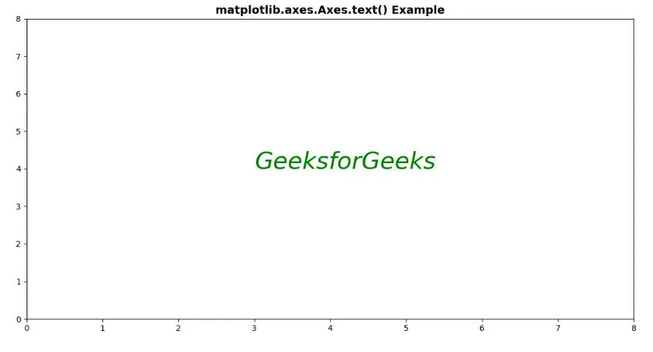
刻度
ax.xaxis.set_major_locator() 设置主刻度线
用法: Axis.set_major_locator(self, locator)参数:此方法接受以下参数。
locator:此参数是定位器。
返回值:此方法不返回任何值。
ax.xaxis.set_minor_locator() 设置次要刻度线
用法:Axis.set_minor_locator(self, locator)参数:此方法接受以下参数。
formatter:此参数是定位器。
返回值:此方法不返回任何值。
ax.tick_params() 主刻度样式设置方法
用法:ax.tick_params(which="major",length=15,width=2.0,colors="r")参数:此方法接受以下参数。
which:设置主刻度的样式。
length:设置主刻度线的长度。
width:设置主刻度线的宽度。
colors:设置主刻度线和主刻度标签的颜色。
axis.set_minor_formatter() 设置次要标签的格式
用法:Axis.set_minor_formatter(self, formatter)参数:此方法接受以下参数。
formatter:此参数是格式化程序。
返回值:此方法不返回任何值。
Eg.
ax.set_title('function: Mercator')
ax.grid(True)
ax.set_xlim([0, 180])
ax.yaxis.set_minor_formatter(NullFormatter())
ax.yaxis.set_major_locator(FixedLocator(np.arange(0, 90, 10)))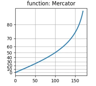
axis.set_major_formatter() 设置主要标签的格式
用法:Axis.set_major_formatter(self, formatter)参数:此方法接受以下参数。
formatter:此参数是格式化程序。
返回值:此方法不返回任何值。
Eg.
# Implementation of matplotlib function
import numpy as np
from matplotlib.axis import Axis
import matplotlib.pyplot as plt
import matplotlib.ticker as ticker

np.random.seed(19680801)

fig, ax=plt.subplots()
ax.plot(100*np.random.rand(20))

formatter=ticker.FormatStrFormatter('?%1.2f')
Axis.set_major_formatter(ax.yaxis, formatter)

fortickinax.yaxis.get_major_ticks():
    tick.label1.set_color('green')

plt.title("Matplotlib.axis.Axis.set_major_formatter()\n\
Function Example", fontsize=12, fontweight='bold')

plt.show()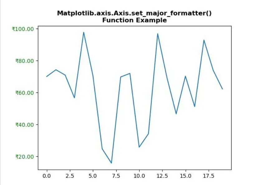
ax.tick_params() 次要刻度样式设置方法
用法:ax.tick_params(which='minor', length=5,width=1.0,labelsize=10, labelcolor='0.25')参数:此方法接受以下参数。
which:设置主刻度的样式。
length:设置主刻度线的长度。
width:设置主刻度线的宽度。
labelsize:设置次要刻度标签的大小。
labelcolor:设置次要刻度标签的颜色。
ax.set_xlim() 设置x轴显示刻度的范围
用法:Axes.set_xlim(self, left=None, right=None, emit=True, auto=False, *, xmin=None, xmax=None)参数:此方法接受以下参数。
left:此参数是数据坐标中的左侧xlim
right:此参数是数据坐标中正确的xlim
emit:此参数用于将限制更改通知观察者。
auto:此参数用于打开x轴的自动缩放。
xmin, xmax:这些参数等效于left和right,同时传递xmin和left或xmax和right都是错误的。
返回值:此方法返回以下内容
左右:这将返回数据坐标中的新x轴限制。
ax.set_ylim() 设置y轴显示刻度的范围
用法:Axes.set_ylim(self, bottom=None, top=None, emit=True, auto=False, *, ymin=None, ymax=None)参数:此方法接受以下参数。
bottom:此参数是数据坐标中的底部ylim
top:此参数是数据坐标中的最高ylim
emit:此参数用于将限制更改通知观察者。
auto:此参数用于打开x轴的自动缩放。
ymin, ymax:该参数等效于bottom和top,同时传递ymin和bottom或ymax和top会报错。
返回值:此方法返回以下内容
底部,顶部:这将返回数据坐标中的新y轴限制。
ax.set_xlabel() 设置x轴的标签
用法:Axes.set_xlabel(self, xlabel, fontdict=None, labelpad=None, **kwargs)参数:此方法接受以下参数。
xlabel:此参数是标签文本。
labelpad:此参数是距轴边界框的点距,包括刻度和刻度标签。
返回值:此方法不返回任何值。
ax.set_ylabel() 设置y轴的标签
用法:Axes.set_ylabel(self, xlabel, fontdict=None, labelpad=None, **kwargs)参数:此方法接受以下参数。
ylabel:此参数是标签文本。
labelpad:此参数是距轴边界框的点距,包括刻度和刻度标签。
返回值:此方法不返回任何值。
ax.set_xticks() 设置刻度
用法:Axes.set_xticks(self, ticks, minor=False)参数:此方法接受以下参数。
ticks:此参数是x轴刻度位置的列表。
minor:此参数用于设置主要刻度线还是设置次要刻度线
返回值:此方法不返回任何值
Eg.
ticks=ax.set_xticks([0,20,40,60]) # 设置刻度
ax.set_xticklabels() 设置刻度标签
用法:Axes.set_xticklabels(self, labels, fontdict=None, minor=False, **kwargs)参数:此方法接受以下参数。
labels:此参数是字符串标签的列表。
fontdict:此参数是控制刻度标签外观的字典。
minor:此参数用于设置主要刻度线还是设置次要刻度线
返回值:此方法返回Text实例列表。
Eg.
ticks=ax.set_xticks([0,20,40,60]) # 设置刻度
labels=ax.set_xticklabels(['one','two','three','four'],rotation=30,fontsize='small') # 设置刻度标签
使用案例
from matplotlib.ticker import MultipleLocator, FormatStrFormatter
fig=plt.figure(figsize=(8,8))
ax=fig.add_subplot(111)
等价于
fig, ax=plt.subplots(nrows=1, ncols=1, figsize=(8,8))
# set x y-major_tick_locator
ax.xaxis.set_major_locator(MultipleLocator(1.0))
ax.yaxis.set_major_locator(MultipleLocator(1.0))
# set x,y-minor_tick_locator
ax.xaxis.set_minor_locator(AutoMinorLocator(4))
ax.yaxis.set_minor_locator(AutoMinorLocator(4))
# set x-minor_tick_formatter
defminor_tick(x, pos): # n % n = 0; m % n = m(m<n)
ifnotx%1.0:
return""
return"%.2f"%x
ax.xaxis.set_minor_formatter(FuncFormatter(minor_tick))
# change the appearance of ticks and tick labels
ax.tick_params("y",which='major',
length=15,width=2.0,
colors="r")
ax.tick_params(which='minor',
length=5,width=1.0,
labelsize=10, labelcolor='0.25')
# set x,y_axis_limit
ax.set_xlim(0,4)
ax.set_ylim(0,2) 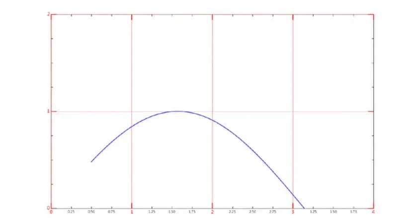
解释:
构 建一个 Figure 画布对象,向画布中添加一个 1 行 1 列的子区,从而生成一个 Axes 实例 ax
ax.xaxis 和 ax.yaxis 分别获得 x 轴实例和 y 轴实例
设置 x 轴和 y 轴的主刻度线的位置
“ax.xaxis.set_major_locator (MultipleLocator(1.0))” 语句会 在 x 轴的 1 倍处分别设置主刻度线,参数 MultipleLocator(1.0)就是设置主刻度线的显示位置。
设置次要刻度线的显示位置。
以 x 轴为例,通过使用“ ax.xaxis.set_minor_ locator(AutoMinorLocator(4))”语句来设置次要刻度线的显示位置,其中参数 AutoMinorLocator(4)表 示将每一份主刻度线区间等分 4 份。
设置次要刻度线显示位置的精度
通过实例方法 set_minor_formatter()完成,其中参数 FuncFormatter()控制位置精度。
代码规范标准框架
import matplotlib.pyplot as plt
from configuration import config
#构建画布对象,添加子区
fig, ax=plt.subplots(nrows=config['nrows'], ncols=config['ncols'],dpi=config['dpi'])
#绘图
ax.scatter(x, y, s=config['pic_size'], c=congfig['pic_color'], marker=config['pic_marker'], cmap=config['pic_cmap'], alpha=config['pic_alpha'])
#组成元素调整(根据需要)
ax.set_xlim()
ax.set_ylim()
ax.set_xlabel()
ax.set_ylabel()
ax.set_xticks()
ax.set_yticks()
ax.set_xtickslabel()
ax.set_ytickslabel()
ax.tick_parames(which=congfig['tick_param_which', length=config['tick_param_length', width=config['tick_param_width'], colors=congfig['tick_param_colors'])
ax.xaxis.grid(visible=congfig['xgrid_visible'], which=congfig['xgrid_which'])
ax.yaxis.grid(visible=congfig['ygrid_visible'], which=congfig['ygrid_which']) ax.xaxis.set_major_locator()
ax.xaxis.set_minor_locator()
ax.axis.set_major_formatter()
ax.get_legend()
ax.text(x=config['xtext'], y=congfig['ytext'], s=congfig['textsize'])
ax.annotate()
**ax.set_title(label=config['title_label'], fontdict={"size":config['title_size'], "color":config['title_color'], "family":config['title_family']}, loc=config['title_location'], pad=config['title_pad'])
#保存
plt.savefig(config['save_name']) 参考案例
dbscan.py
import pandas as pd
import matplotlib.pyplot as plt
from sklearn.cluster import DBSCAN
import numpy as np
from configuration import config
defdbscan_result_plot(data: pd.DataFrame, trained_model: any) ->None:
labels=trained_model.labels_
core_samples_mask=np.zeros_like(trained_model.labels_, dtype=bool)
core_samples_mask[trained_model.core_sample_indices_] =True
n_clusters_=len(set(labels)) - (1if-1inlabelselse0)
print("Estimated number of clusters: %d\n"%n_clusters_)
unique_labels=set(labels)
print("unique的值为", unique_labels)
fig, ax=plt.subplots(nrows=config['nrows'], ncols=config['ncols'], dpi=config['dpi'])
colors= [plt.cm.Spectral(each) foreachinnp.linspace(0, 1, len(unique_labels))]
print("colors的值为:", colors)
fork, colinzip(unique_labels, colors):
ifk==-1:
col= [0, 0, 0, 1]
class_member_mask=labels==k
xy=data[class_member_mask&core_samples_mask]
ax.plot(xy.iloc[:, 0], xy.iloc[:, 1], config['marker1'], markerfacecolor=tuple(col),
markeredgecolor=config['markeredgecolor'], markersize=config['markersize1'], alpha=config['alpha1'])
xy=data[class_member_mask&~core_samples_mask]
ax.plot(xy.iloc[:, 0], xy.iloc[:, 1], config['marker2'], markerfacecolor=tuple(col),
markeredgecolor=config['markeredgecolor'], markersize=config['markersize2'], alpha=config['alpha2'])
ax.axis([xmin-x_adjustment, xmax+x_adjustment, ymin-y_adjustment, ymax+y_adjustment])
ax.set_title(label=config['title_label'], fontdict={"size":config['title_size'], "color":config['title_color'], "family":config['title_family']}, loc=config['title_location'], pad=config['title_pad'])
configration.py
config= {
    'nrows' : 1,
    'ncols' : 1,
    'dpi' : 360,
    'marker1' : '^',
    'marker2' : 'o',
    'markeredgecolor': 'w',
    'markersize1' : 18,
    'markersize2' : 6,
    'alpha1' : 0.4,
    'alpha2' : 0.95,
    'title_label' : 'DBSCAN ',
    'title_size' : 15,
    'title_color': 'k',
    'title_location' : 'center',
    'title_family' : "Times New Roman",
    'title_pad' : 15
}
文章出处登录后可见!
已经登录?立即刷新