Matplotlib 介绍
-
Matplotlib 是一个 Python 的 2D绘图库,它以各种硬拷贝格式和跨平台的交互式环境生成出版质量级别的图形。Matplotlib作图风格很接近MATLAB,所以称为matplotlib。
-
如果某天你发现自己要学习 Matplotlib, 很可能是因为: 1、Matplotlib 是一个非常强大的 Python 画图工具;2、手中有很多数据, 可是不知道该怎么呈现这些数据。
-
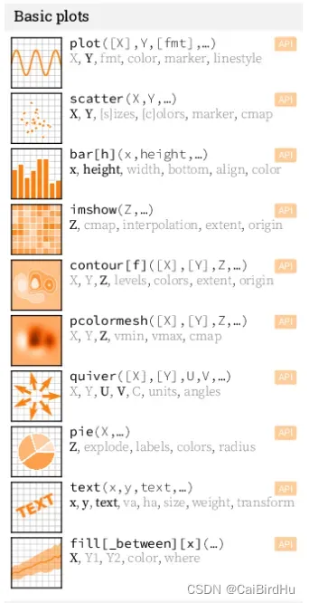
绘制线图、散点图、等高线图、条形图、柱状图、3D 图形、甚至是图形动画等等。
基本概念
-
我们对matplotlib操作时,是从Figure开始的,通常称为画布,类似于现实中绘图时的画板。在画板上,我们可以绘制一幅和多幅图形,这些图形就是axes。
-
所有的图形元素,如坐标轴,刻度线,标签,线条,标记等都是在图形实例之上的。
-
在只有一个axes实例时,我们可以使用matplotlib.pyplot来操作这些图形元素,“组成”一幅完整的图。
基本绘图
在绘图之前,我们需要导入相应的包:pyplot用于操作图表元素,numpy用于生成绘图需要的基础数据。
import numpy as np
import matplotlib.pyplot as plt
python 一些常见的画图元素,通过plt的函数完成。
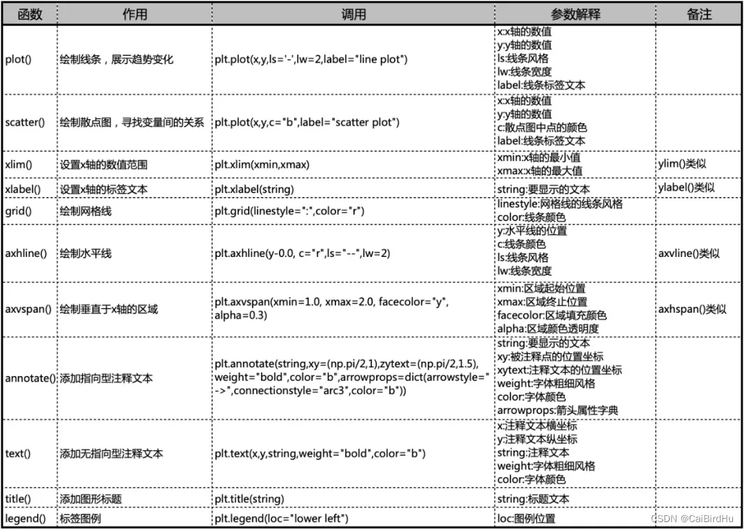
基本的绘图也可看这些:
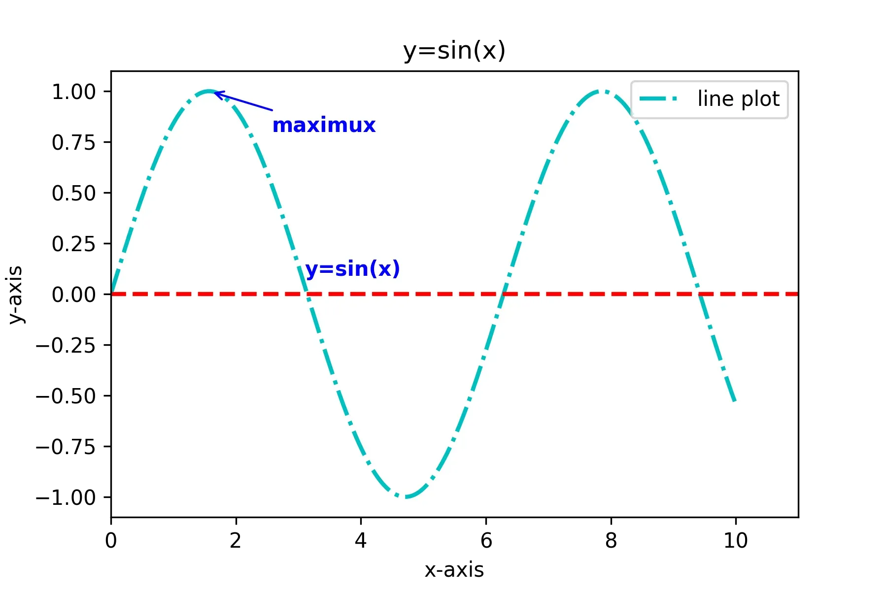
x = np.linspace(0.0, 10, 1000)
y = np.sin(x)
plt.plot(x, y, ls="-.", lw=2, c="c", label="line plot")
plt.annotate("maximux", xy=(np.pi/2, 1), xytext=((np.pi/2)+1.0, 0.8), weight="bold", color="b",
            arrowprops=dict(arrowstyle="->", connectionstyle="arc3", color="b"))
plt.text(3.10, 0.09, "y=sin(x)", weight="bold", color="b")
plt.axhline(y=0.0, c="r", ls="--", lw=2)
plt.xlabel("x-axis")
plt.ylabel("y-axis")
plt.xlim(0, 11)
plt.title("y=sin(x)")
plt.legend(loc="upper right")
plt.show()
该代码串基本用到了以上的大部分函数。
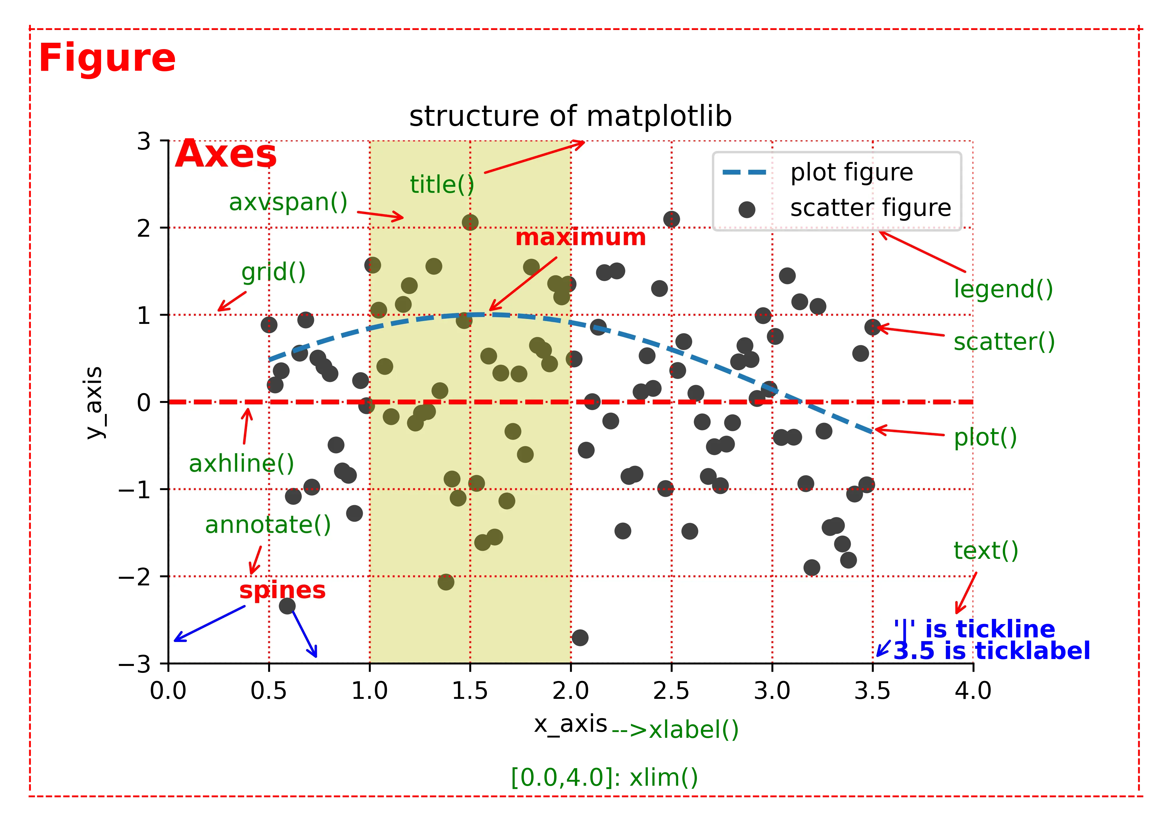
绘图总览
这里有2种画法,一种是利用plt
这里涉及到图片保存输出不完整,可借鉴:图片保存输出不完整解决方案
图像设置大小:参考链接
最终所以代码
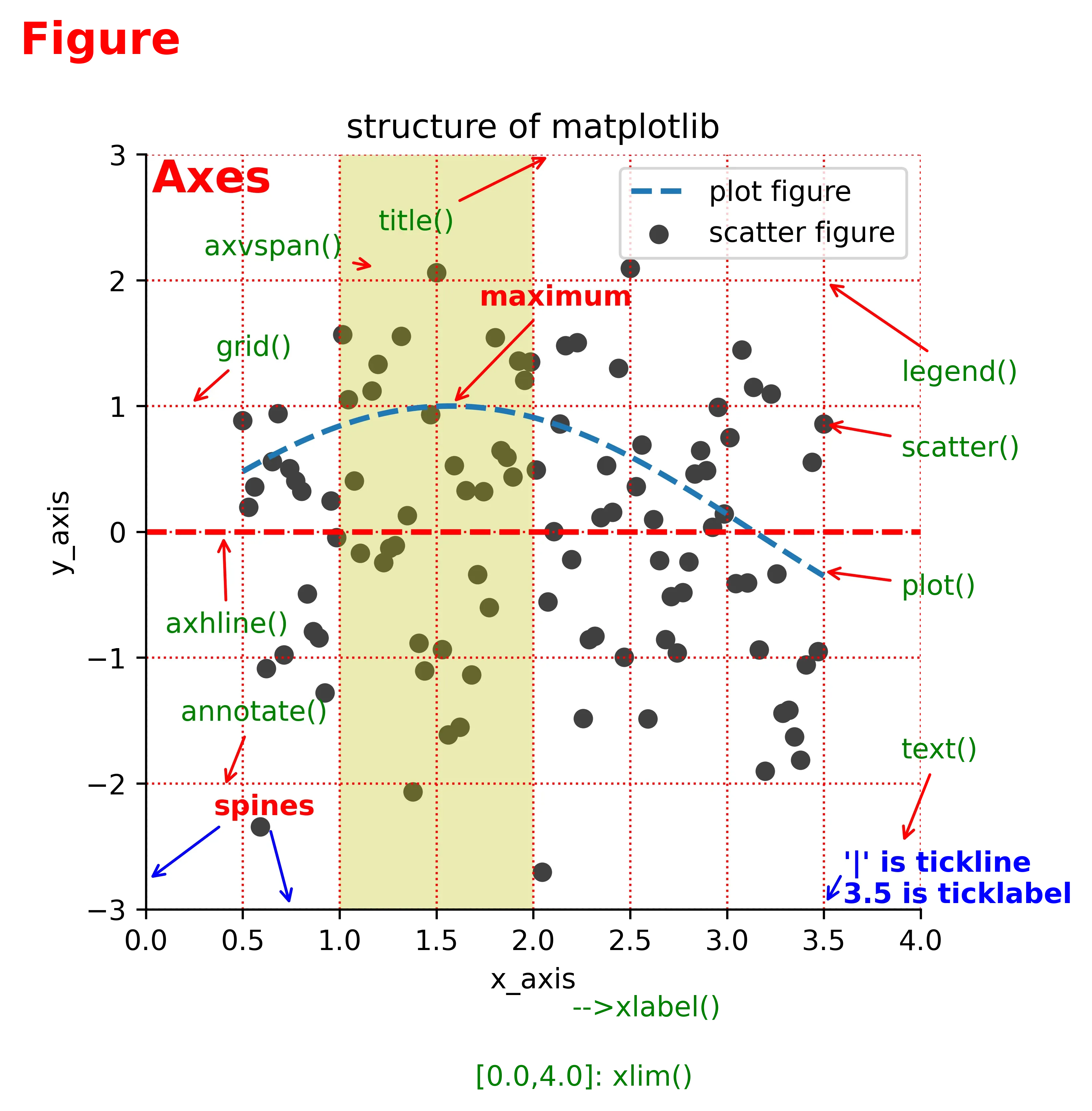
#数据准备
x = np.linspace(0.5, 3.5, 100)
y = np.sin(x)
np.random.seed(20)
y1 = np.random.randn(100)

#散点图
plt.scatter(x, y1, c="0.25", label="scatter figure")

#线条图
plt.plot(x, y, ls='--', lw=2, label="plot figure")

#隐藏顶部和右侧的坐标轴
for spine in plt.gca().spines.keys():
    if spine == "top" or spine == "right":
        plt.gca().spines[spine].set_color("none")

#隐藏顶部和右侧的坐标轴刻度
plt.gca().xaxis.set_ticks_position("bottom")
plt.gca().yaxis.set_ticks_position("left")

#横纵坐标范围
plt.xlim(0.0, 4.0)
plt.ylim(-3.0, 3.0)

#设置坐标轴标签
plt.xlabel("x_axis")
plt.ylabel("y_axis")

#设置横纵坐标网格
plt.grid(True, ls=":", color="r")

#添加水平线
plt.axhline(y=0.0, c="r", ls="--", lw=2)
#添加垂直区域
plt.axvspan(xmin=1.0, xmax=2.0, facecolor="y", alpha=.3)

#设置注释信息

#最高点注释
plt.annotate("maximum", xy=(np.pi/2, 1.0), xytext=((np.pi/2)+0.15, 1.8), weight="bold", color="r",
             arrowprops=dict(arrowstyle="->", connectionstyle="arc3", color="r"))

#spines注释右箭头
plt.annotate("spines", xy=(0.75, -3), xytext=(0.35, -2.25), weight="bold", color="r",
            arrowprops=dict(arrowstyle="->", connectionstyle="arc3", color="b"))

#spines注释左箭头
plt.annotate("", xy=(0, -2.78), xytext=(0.4, -2.32),
            arrowprops=dict(arrowstyle="->", connectionstyle="arc3", color="b"))

#tickline注释箭头
plt.annotate("", xy=(3.5, -2.98), xytext=(3.6, -2.70),
            arrowprops=dict(arrowstyle="->", connectionstyle="arc3", color="b"))

#tickline注释文字
plt.text(3.6, -2.70,"'|' is tickline", weight="bold", color="b")
plt.text(3.6, -2.95,"3.5 is ticklabel", weight="bold", color="b")

#设置标题
plt.title("structure of matplotlib")

#grid注释
plt.annotate("grid()", xy=(0.22, 1), xytext=(0.36, 1.4), color='g',
            arrowprops=dict(arrowstyle="->", connectionstyle="arc3", color="r"))

#标题注释
plt.annotate("title()", xy=(2.1, 3.0), xytext=(1.2, 2.4), color='g',
            arrowprops=dict(arrowstyle="->", connectionstyle="arc3", color="r"))

#水平线注释
plt.annotate("axhline()", xy=(0.4, 0), xytext=(0.1, -0.8), color='g',
            arrowprops=dict(arrowstyle="->", connectionstyle="arc3", color="r"))

#图例注释
plt.annotate("legend()", xy=(3.5, 2), xytext=(3.9, 1.2), color='g',
            arrowprops=dict(arrowstyle="->", connectionstyle="arc3", color="r"))

#散点图注释
plt.annotate("scatter()", xy=(3.49, 0.86), xytext=(3.9, 0.6), color='g',
            arrowprops=dict(arrowstyle="->", connectionstyle="arc3", color="r"))

#线条图注释
plt.annotate("plot()", xy=(3.48, -0.31), xytext=(3.9, -0.5), color='g',
            arrowprops=dict(arrowstyle="->", connectionstyle="arc3", color="r"))

#文本注释
plt.annotate("text()", xy=(3.9, -2.5), xytext=(3.9, -1.8), color='g',
            arrowprops=dict(arrowstyle="->", connectionstyle="arc3", color="r"))

#垂直区域注释
plt.annotate("axvspan()", xy=(1.2, 2.1), xytext=(0.3, 2.2), color='g',
            arrowprops=dict(arrowstyle="->", connectionstyle="arc3", color="r"))

#带箭头注释的注释
plt.annotate("annotate()", xy=(0.4, -2.05), xytext=(0.18, -1.5), color='g',
            arrowprops=dict(arrowstyle="->", connectionstyle="arc3", color="r"))

#横坐标文字注释
plt.text(2.2, -3.85, "-->xlabel()",color='g')

#横坐标范围注释
plt.text(1.7, -4.4, "[0.0,4.0]: xlim()",color='g')

#外框底部
plt.text(-0.7, -4.6, "----------------"*8, color="r")

#外框顶部
plt.text(-0.7, 4.2, "----------------"*8, color="r")

#外框左侧
plt.text(-0.75, -4.4, '-----------'*8,color='r', rotation='vertical')

#外框右侧
plt.text(4.76, -4.4, '-----------'*8,color='r', rotation='vertical')

#Figure注释
plt.text(-0.65, 3.8, 'Figure', fontsize=16, color='r', weight='bold')

#axes注释
plt.text(0.03, 2.7, 'Axes', fontsize=16, color='r', weight='bold')

#设置图例
plt.legend(loc="upper right")

plt.savefig(fname="./test_chao_2.png", dpi=300)
plt.show()
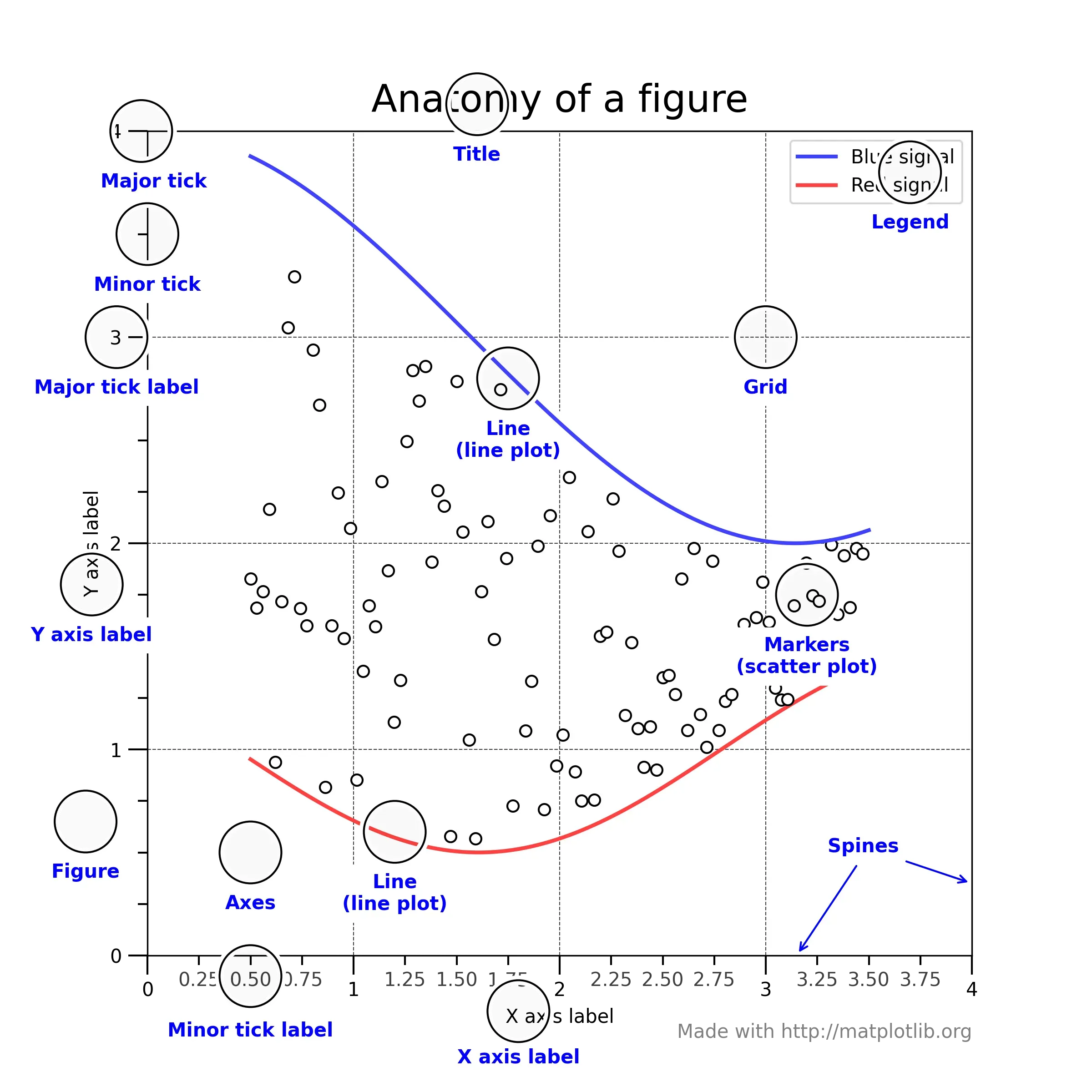
另一种画法是利用Axes
import numpy as np
import matplotlib.pyplot as plt
from matplotlib.ticker import AutoMinorLocator, MultipleLocator, FuncFormatter

np.random.seed(19680801)
# 如果使用相同的seed()值,则每次生成的随机数都相同。如果不设置这个值,那么每次生成的随机数不同。

X = np.linspace(0.5, 3.5, 100)  # 生成x
Y1 = 3+np.cos(X)                # y1
Y2 = 1+np.cos(1+X/0.75)/2       # y2
Y3 = np.random.uniform(Y1, Y2, len(X))
# 从一个均匀分布[low,high)中随机采样,注意定义域是左闭右开,即包含low,不包含high.

fig = plt.figure(figsize=(8, 8))   # 图大小
ax = fig.add_subplot(1, 1, 1, aspect=1)  # 多子图

def minor_tick(x, pos):  # 定义 小的tick
    if not x % 1.0:
        return ""
    return "%.2f" % x

ax.xaxis.set_major_locator(MultipleLocator(1.000))
ax.xaxis.set_minor_locator(AutoMinorLocator(4))
ax.yaxis.set_major_locator(MultipleLocator(1.000))
ax.yaxis.set_minor_locator(AutoMinorLocator(4))  # 设置长短 tick 的
ax.xaxis.set_minor_formatter(FuncFormatter(minor_tick))  # 格式
# ax.xaxis.set_major_locator的方法设定刻度位置

ax.set_xlim(0, 4)  # x显示范围
ax.set_ylim(0, 4)  # y显示范围

ax.tick_params(which='major', width=1.0)   # tick
ax.tick_params(which='major', length=10)
ax.tick_params(which='minor', width=1.0, labelsize=10)
ax.tick_params(which='minor', length=5, labelsize=10, labelcolor='0.25')

ax.grid(linestyle="--", linewidth=0.5, color='.25', zorder=-10)  # 网格虚线

ax.plot(X, Y1, c=(0.25, 0.25, 1.00), lw=2, label="Blue signal", zorder=10)
ax.plot(X, Y2, c=(1.00, 0.25, 0.25), lw=2, label="Red signal")
ax.plot(X, Y3, linewidth=0,
        marker='o', markerfacecolor='w', markeredgecolor='k')

ax.set_title("Anatomy of a figure", fontsize=20, verticalalignment='bottom')
ax.set_xlabel("X axis label")
ax.set_ylabel("Y axis label")  # y名称

ax.legend()

def circle(x, y, radius=0.15):  # 定义函数
    from matplotlib.patches import Circle
    from matplotlib.patheffects import withStroke
    circle = Circle((x, y), radius, clip_on=False, zorder=10, linewidth=1,
                    edgecolor='black', facecolor=(0, 0, 0, .0125),
                    path_effects=[withStroke(linewidth=5, foreground='w')])
    ax.add_artist(circle)

def text(x, y, text):
    ax.text(x, y, text, backgroundcolor="white",
            ha='center', va='top', weight='bold', color='blue')

# Minor tick
circle(0.50, -0.10)
text(0.50, -0.32, "Minor tick label")

# Major tick
circle(-0.03, 4.00)
text(0.03, 3.80, "Major tick")

# Minor tick
circle(0.00, 3.50)
text(0.00, 3.30, "Minor tick")

# Major tick label
circle(-0.15, 3.00)
text(-0.15, 2.80, "Major tick label")

# X Label
circle(1.80, -0.27)
text(1.80, -0.45, "X axis label")

# Y Label
circle(-0.27, 1.80)
text(-0.27, 1.6, "Y axis label")

# Title
circle(1.60, 4.13)
text(1.60, 3.93, "Title")

# Blue plot
circle(1.75, 2.80)
text(1.75, 2.60, "Line\n(line plot)")

# Red plot
circle(1.20, 0.60)
text(1.20, 0.40, "Line\n(line plot)")

# Scatter plot
circle(3.20, 1.75)
text(3.20, 1.55, "Markers\n(scatter plot)")

# Grid
circle(3.00, 3.00)
text(3.00, 2.80, "Grid")

# Legend
circle(3.70, 3.80)
text(3.70, 3.60, "Legend")

# Axes
circle(0.5, 0.5)
text(0.5, 0.3, "Axes")

# Figure
circle(-0.3, 0.65)
text(-0.3, 0.45, "Figure")

# 箭头,字体标注
color = 'blue'
ax.annotate('Spines', xy=(4.0, 0.35), xycoords='data',
            xytext=(3.3, 0.5), textcoords='data',
            weight='bold', color=color,
            arrowprops=dict(arrowstyle='->',
                            connectionstyle="arc3",
                            color=color))

ax.annotate('', xy=(3.15, 0.0), xycoords='data',
            xytext=(3.45, 0.45), textcoords='data',
            weight='bold', color=color,
            arrowprops=dict(arrowstyle='->',
                            connectionstyle="arc3",
                            color=color))

ax.text(4.0, -0.4, "Made with http://matplotlib.org",    # text
        fontsize=10, ha="right", color='.5')

plt.savefig(fname="./test.png", dpi=300)
plt.show()
References
文章出处登录后可见!
已经登录?立即刷新