目录
中文官网:Matplotlib 中文
英文官网:Matplotlib
Matplotlib 是一个 Python 的 2D 绘图库,它以各种硬拷贝格式和跨平台的交互式环境生成出版质量级别的图形。可以绘制线图、散点图、等高线图、条形图、柱状图、3D 图形,甚至是图形动画等等。
一、快速绘图
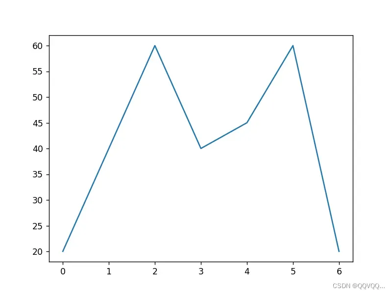
1. 折线图
import matplotlib.pyplot as plt
# 方式一
y = [20, 40, 60, 40, 45, 60, 20]
plt.plot(y)
plt.show()
# 方式二
# x = [1, 2, 3, 4, 5, 6]
# y = [20, 40, 60, 40, 45, 60, 20]
# plt.plot(x, y)
#
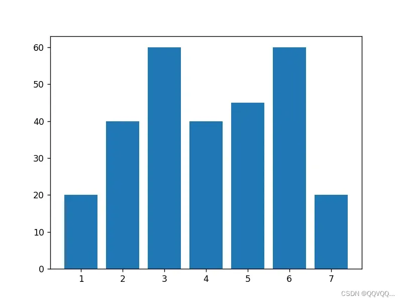
# plt.show()2. 柱状图
import matplotlib.pyplot as plt

x = [1, 2, 3, 4, 5, 6, 7]
y = [20, 40, 60, 40, 45, 60, 20]
plt.bar(x, y)

plt.show()
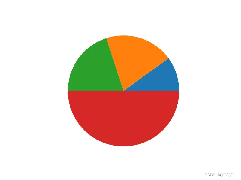
3. 饼状图
import matplotlib.pyplot as plt

y = [1, 2, 2, 5]
plt.pie(y)

plt.show()
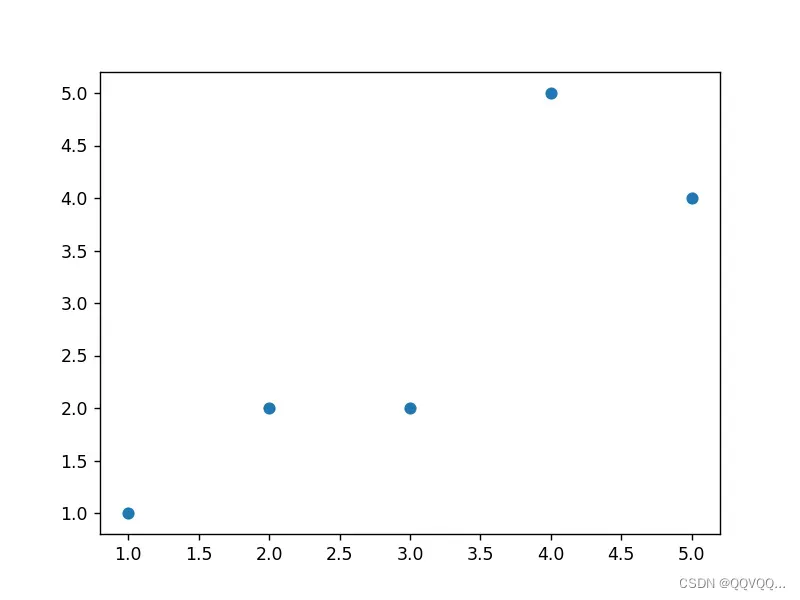
4. 散点图
import matplotlib.pyplot as plt

x = [1, 2, 3, 4, 5]
y = [1, 2, 2, 5, 4]
plt.scatter(x, y)

plt.show()
5. 图片保存
plt.savefig("figure.jpg")
plt.savefig("figure.png")
plt.savefig("figure.svg")
二、基本设置
1. 图片
plt.figure(figsize=(10,5)) # 设置图片大小| 参数 | 取值 | 说明 |
|---|---|---|
| num | int,str,Figure,SubFigure | 指定图片 |
| figsize | (float, float),默认[6.4,4.8] | 图片大小 |
| dpi | float,默认100.0 | 分辨率 |
| facecolor | color,默认’white’ | 背景色 |
| edgecolor | color,默认’white’ | 边缘色 |
| frameon | bool,默认True | 是否显示边框 |
| clear | bool,默认False | 是否清除图片 |
2. 坐标轴
plt.xlabel('time (s)')  # 设置x轴标签
plt.ylabel('Undamped')  # 设置y轴标签

plt.xlim(0,10)  # 设置x轴范围
plt.ylim(0,99)  # 设置y轴范围

plt.axis([0,8,0,100]) # 同时设置x轴与y轴的范围
3. 刻度
plt.xticks([0, 1, 2], ['January', 'February', 'March'])  # 设置x轴刻度值
plt.yticks([0, 1, 2], ['A', 'B', 'C'], rotation=45)  # 设置y轴刻度值

plt.xscale("linear") # 设置x轴刻度类型,"linear", "log", "symlog", "logit", ...
plt.yscale("linear") # 设置y轴刻度类型
4. 边距
plt.margins(0.2)  # 同时设置xy边距比例

plt.margins(x=0.2)  # 同时设置x边距比例

plt.margins(y=0.2)  # 同时设置y边距比例
5. 图例
# 方法一
plt.plot([1, 2, 3], label='Inline label')
plt.legend()

# 方法二
line = ax.plot([1, 2, 3])
line.set_label('Label via method')
ax.legend()

# 多个图例
plt.plot([1, 2, 3])
plt.plot([5, 6, 7])
plt.legend(['First line', 'Second line'])
plt.legend(loc='best') # 设置图例位置为最佳位置
plt.legend(loc='upper right') # 设置图例位置为右上方
plt.legend(loc='upper left') # 设置图例位置为左上方
plt.legend(loc='lower left') # 设置图例位置为左下方
plt.legend(loc='lower right') # 设置图例位置为右下方
plt.legend(loc='right') # 设置图例位置为右边
plt.legend(loc='center left') # 设置图例位置为中间偏左
plt.legend(loc='center right') # 设置图例位置为中间偏右
plt.legend(loc='lower center') # 设置图例位置为底部偏中
plt.legend(loc='upper center') # 设置图例位置为顶部偏中
plt.legend(loc='center') # 设置图例位置为中间| 参数 | 取值 | 说明 |
|---|---|---|
| fontsize | int or {‘xx-small’, ‘x-small’, ‘small’, ‘medium’, ‘large’, ‘x-large’, ‘xx-large’} | 图例字体大小 |
| prop | {‘size’:8} | 设置字体大小 |
| labelcolor | str or list | 标签颜色 |
| ncol | int,默认为1 | 图例的列数 |
| markerscale | float,默认为1.0 | 图例标记的相对大小 |
6. 网格
plt.grid(True, 'major', 'both')

plt.grid(color='r', linestyle='-', linewidth=2) # 设置网格颜色、线样式、线宽| 参数 | 取值 | 说明 |
|---|---|---|
| visible | bool or None, optional | 是否可见 |
| which | ‘major’, ‘minor’, ‘both’} | 需要更改的网格线 |
| axis | ‘both’, ‘x’, ‘y’ | 应用的轴 |
7. 标题
plt.title(label, fontdict=None, loc=None, pad=None, *, y=None,**kwargs) # 显示标题| 参数 | 取值 | 说明 |
|---|---|---|
| label | str | 显示的文本 |
| fontdict | {‘fontsize’: rcParams[‘axes.titlesize’], ‘fontweight’: rcParams[‘axes.titleweight’], ‘color’: rcParams[‘axes.titlecolor’], ‘verticalalignment’: ‘baseline’, ‘horizontalalignment’: loc} | 控制标题文本的字体的字典 |
| loc | ‘center’, ‘left’, ‘right’ | 放置位置 |
| y | float | 标题的垂直轴位置(1.0为顶部)。 |
| pad | float | 标题距轴顶部的偏移量,以磅为单位。 |
8. 文本
pyplot.text(x, y, s, fontdict=None, **kwargs) # 绘制文本9. 注释文本
plt.annotate(text, xy, xytext=None) # 绘制注释文本| 参数 | 取值 | 说明 |
|---|---|---|
| text | str | 注释文本字符串 |
| xy | (float,float) | 注释点的位置 |
| xytext | (float,float),默认xy | 文本的位置 |
10. 主题设置
import matplotlib.pyplot as plt

# 设置显示的样式(主题)
plt.style.use('bmh')
# plt.style.use('ggplot')
# plt.style.use('grayscale')
# plt.style.context('Solarize_Light2')

x = [1, 2, 3, 4, 5, 6, 7]
y = [20, 40, 60, 40, 45, 60, 20]
plt.bar(x, y)

plt.show()
11. 颜色
| 符号 | 说明 |
|---|---|
| ‘b’ | 蓝色 |
| ‘g’ | 绿色 |
| ‘r’ | 红色 |
| ‘c’ | 青色 |
| ‘m’ | 品红 |
| ‘y’ | 黄色 |
| ‘k’ | 黑色 |
| ‘w’ | 白色 |
| 格式名称 | 取值类型 | 示例 |
|---|---|---|
| RGB | 闭区间[0,1] | (0.1,0.2,0.5) |
| RGBA | 闭区间[0,1] | (0.1,0.2,0.5,0.3) |
| 十六进制 RGB | 0-9, a-f | ‘#0f0f0f’ |
| 十六进制 RGBA | 0-9, a-f | ‘#0f0f0f80’ |
| 灰度值 | 闭区间[0,1] | ‘0’ |
12. 字体
matplotlib 中使用的字体来源于三个途径:
- matplotlib 自带的字体
- windows 系统字体
- 用户提供的第三方字体
通过以下代码可查看支持的字体
from matplotlib import font_manager

for font in font_manager.fontManager.ttflist:
print(font.name, '-', font.fname)| 字体名 | 说明 |
|---|---|
| SimSun | 宋体 |
| SimHei | 黑体 |
| Microsoft YaHei | 微软雅黑 |
| Microsoft JhengHei | 微软正黑体 |
| NSimSun | 新宋体 |
| Times New Roman | 新罗马体 |
13. 线条样式
linestyle
| 符号 | 说明 |
|---|---|
|
| 实线 |
|
| 虚线 |
|
| 点划线 |
|
| 虚线 |
|
| 空白 |
14. 标记形状
marker
| 字符 | 说明 | 字符 | 说明 | |
|---|---|---|---|---|
| ‘.’ | 点标记 | ‘s’ | 矩形标记 | |
| ‘,’ | 像素标记 | ‘p’ | 五边形标记 | |
| ‘o’ | 圆标记 | ‘P’ | 填充加号标记 ➕ | |
| ‘v’ | 下三角标记 | ‘*’ | 五角星标记i | |
| ‘^’ | 上三角标记 | ‘h’ | 垂直六边形标记 | |
| ‘<‘ | 左三角标记 | ‘H’ | 水平六边形标记 | |
| ‘>’ | 右三角标记 | ‘+’ | 加号标记 + | |
| ‘1’ | tri_down 标记 | ‘x’ | 乘号标记 x | |
| ‘2’ | tri_up 标记 | ‘X’ | 填充乘号标记 ✖ | |
| ‘3’ | tri_left 标记 | ‘D’ | 宽菱形标记 | |
| ‘4’ | tri_right 标记 | ‘d’ | 窄菱形标记 | |
| ‘8’ | 八边形标记 | ‘|’ | 竖线标记 | |
| ‘_’ | 横线标记 |
| 属性名称 | 取值类型 | 说明 |
|---|---|---|
| markeredgecolor 或 mec | str | 标记边界颜色 |
| markeredgewidth 或 mew | float | 标记宽度 |
| markfacecorlor 或 mfc | str | 标记填充色 |
| markersize 或 ms | float | 标记大小 |
三、绘图进阶
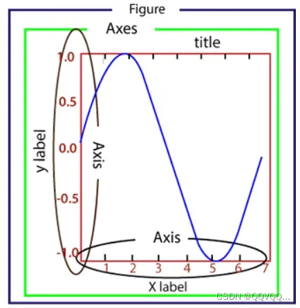
- Figure:指整个图形,您可以把它理解成一张画布,它包括了所有的元素,比如标题、轴线等;
- Axes:绘制 2D 图像的实际区域,也称为轴域区,或者绘图区;
- Axis:指坐标系中的垂直轴与水平轴,包含轴的长度大小(图中轴长为 7)、轴标签(指 x 轴,y轴)和刻度标签;
- Artist:您在画布上看到的所有元素都属于 Artist 对象,比如文本对象(title、xlabel、ylabel)、Line2D 对象(用于绘制2D图像)等。
1. 折线图
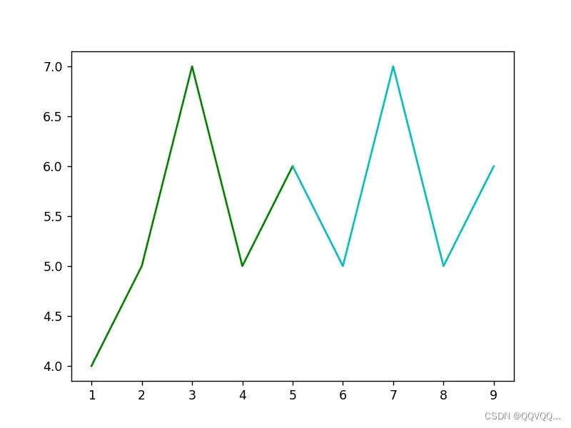
import matplotlib.pyplot as plt

x1 = [1, 2, 3, 4, 5]
y1 = [4, 5, 7, 5, 6]
plt.plot(x1, y1, color='g')


x1 = [5, 6, 7, 8, 9]
y1 = [6, 5, 7, 5, 6]
plt.plot(x1, y1, color='c')

plt.show()
import matplotlib.pyplot as plt

x1 = [1, 2, 3, 4, 5]
y1 = [4, 5, 7, 5, 6]
x2 = [5, 6, 7, 8, 9]
y2 = [6, 5, 7, 5, 6]

plt.plot(x1, y1, x2, y2)

plt.show()
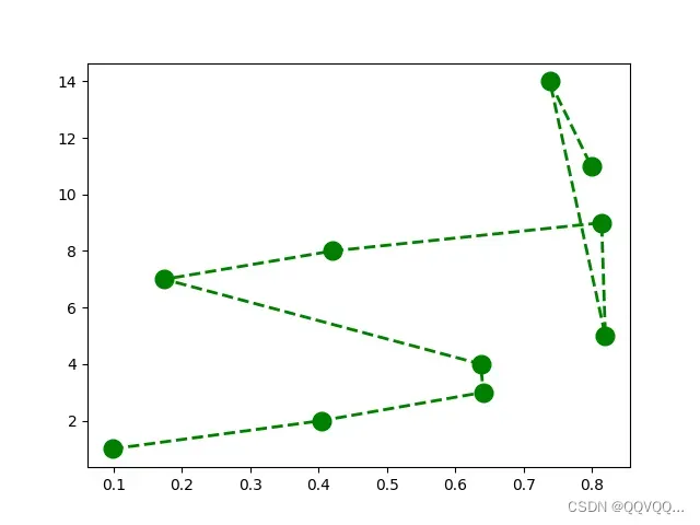
import matplotlib.pyplot as plt
import numpy as np

x = np.random.rand(10)
y = [1,2,3,4,7,8,9,5,14,11]

plt.plot(x, y, 'go--', linewidth=2, markersize=12)

plt.show()
2. 条形图
2.1 堆积条形图
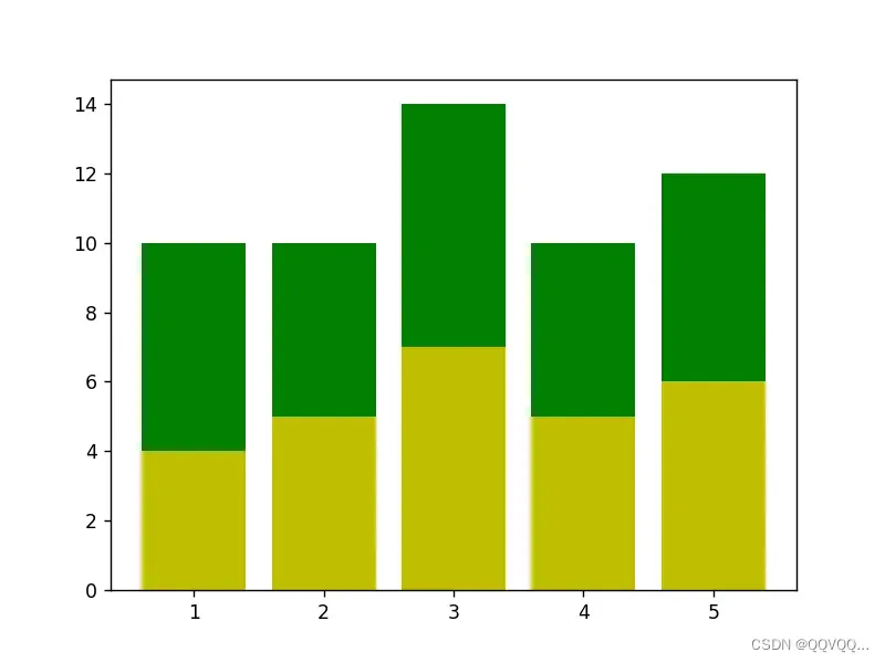
import matplotlib.pyplot as plt

x = [1, 2, 3, 4, 5]
y1 = [4, 5, 7, 5, 6]
y2 = [6, 5, 7, 5, 6]

plt.bar(x, y1, fc='y', label='A')
plt.bar(x, y2, fc='g', label='B', bottom=y1)

plt.show()
import matplotlib.pyplot as plt
x = [1, 2, 3, 4, 5]
y1 = [6, 10, 4, 5, 1]
y2 = [2, 12, 4, 7, 8]
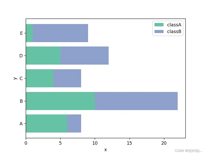
plt.barh(x, y1, align='center', color='#66c2a5', tick_label=['A', 'B', 'C', 'D', 'E'], label='classA')
plt.barh(x, y2, align='center', color='#8da0cb', left=y1, label='classB')
plt.legend()
plt.xlabel('x')
plt.ylabel('y')
plt.show()
2.2 并列条形图
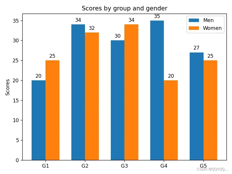
import matplotlib.pyplot as plt
import numpy as np


labels = ['G1', 'G2', 'G3', 'G4', 'G5']
men_means = [20, 34, 30, 35, 27]
women_means = [25, 32, 34, 20, 25]

x = np.arange(len(labels))  # 标签的位置
width = 0.35  # 条形的宽度

fig, ax = plt.subplots()
rects1 = ax.bar(x - width/2, men_means, width, label='Men')
rects2 = ax.bar(x + width/2, women_means, width, label='Women')

ax.set_ylabel('Scores')  # y轴标题
ax.set_title('Scores by group and gender')  # 图形标题
ax.set_xticks(x, labels)  # 修改x轴刻度值
ax.legend()  # 显示图例

# 显示条形上方数值
ax.bar_label(rects1, padding=3)
ax.bar_label(rects2, padding=3)

# 布局设置
fig.tight_layout()

plt.show()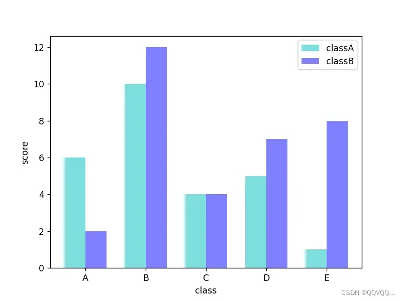
import matplotlib.pyplot as plt
import numpy as np

x = np.arange(5)
y1 = [6, 10, 4, 5, 1]
y2 = [2, 12, 4, 7, 8]

bar_width = 0.35
tick_label = ['A', 'B', 'C', 'D', 'E']

plt.bar(x, y1, bar_width, color='c', align='center', label='classA', alpha=0.5)
plt.bar(x+bar_width, y2, bar_width, color='b', align='center', label='classB', alpha=0.5)

plt.xlabel('class')
plt.ylabel('score')

# 设置x轴刻度标签
plt.xticks(x+bar_width/2, tick_label)

# 显示图例
plt.legend()

plt.show()
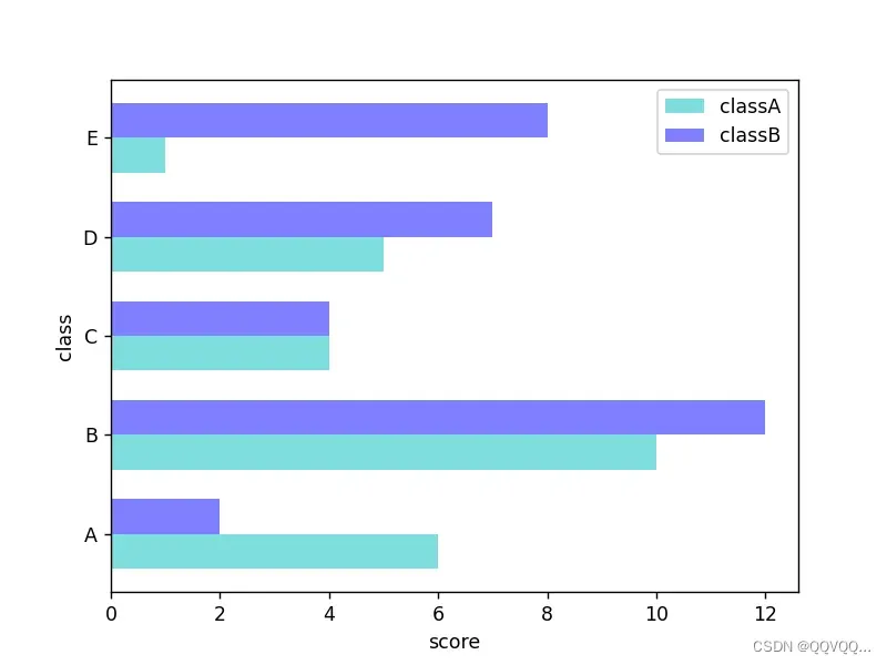
import matplotlib.pyplot as plt
import numpy as np
x = np.arange(5)
y1 = [6, 10, 4, 5, 1]
y2 = [2, 12, 4, 7, 8]
bar_width = 0.35
tick_label = ['A', 'B', 'C', 'D', 'E']
plt.barh(x, y1, bar_width, color='c', align='center', label='classA', alpha=0.5)
plt.barh(x+bar_width, y2, bar_width, color='b', align='center', label='classB', alpha=0.5)
plt.ylabel('class')
plt.xlabel('score')
# 设置y轴刻度标签
plt.yticks(x+bar_width/2, tick_label)
plt.legend()
plt.show()
3. 散点图
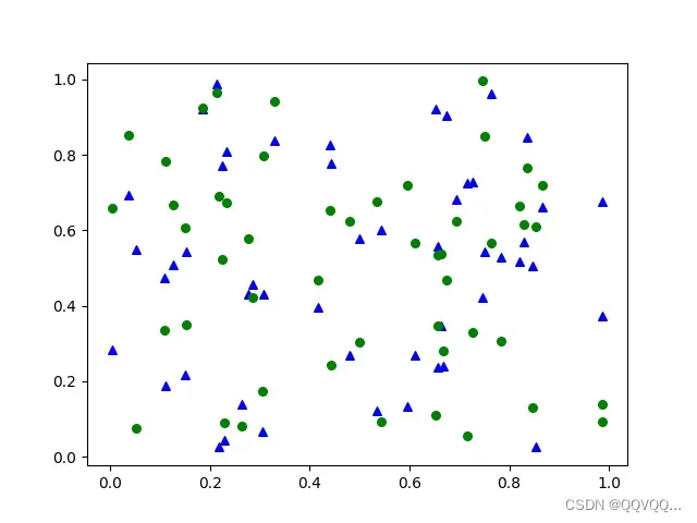
import matplotlib.pyplot as plt
import numpy as np

x = np.random.rand(50)
y1 = np.random.rand(50)
y2 = np.random.rand(50)

plt.scatter(x, y1, s=30, marker='^', c='b', label="A")
plt.scatter(x, y2, s=30, marker='o', c='g', label="B")

plt.legend()

plt.show()
4. 饼状图
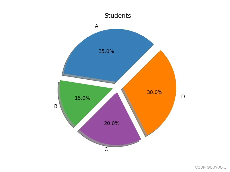
import matplotlib.pyplot as plt

labels = 'A', 'B', 'C', 'D'

students = [0.35, 0.15, 0.20, 0.30]

colors = ['#377eb8', '#4daf4a', '#984ea3', '#ff7f00']

explode = (0.1, 0.1, 0.1, 0.1)

plt.pie(students, explode=explode, labels=labels, colors=colors, autopct='%3.1f%%', shadow=True, startangle=45)

plt.title('Students')

plt.show()
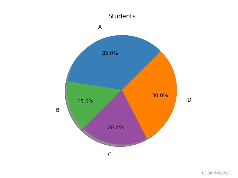
import matplotlib.pyplot as plt
labels = 'A', 'B', 'C', 'D'
students = [0.35, 0.15, 0.20, 0.30]
colors = ['#377eb8', '#4daf4a', '#984ea3', '#ff7f00']
plt.pie(students, labels=labels, colors=colors,
pctdistance=0.7, labeldistance=1.2, autopct='%3.1f%%', shadow=True, startangle=45)
plt.title('Students')
plt.show()
5. 多图并列
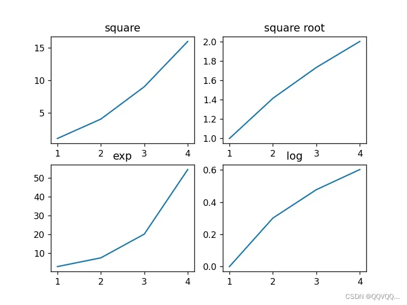
import matplotlib.pyplot as plt
import numpy as np

# 创建2x2个绘图区域
fig, a = plt.subplots(2, 2)

x = np.arange(1, 5)
# 绘制平方函数
a[0][0].plot(x, x * x)
a[0][0].set_title('square')
# 绘制平方根图像
a[0][1].plot(x, np.sqrt(x))
a[0][1].set_title('square root')
# 绘制指数函数
a[1][0].plot(x, np.exp(x))
a[1][0].set_title('exp')
# 绘制对数函数
a[1][1].plot(x, np.log10(x))
a[1][1].set_title('log')

plt.show()
import matplotlib as mpl
import matplotlib.pyplot as plt

# 数据源
t=np.arange(0.0,2.0,0.1)
s=np.sin(t*np.pi)

# 第一个图
plt.subplot(2,2,1) #要生成两行两列,这是第一个图
plt.plot(t,s,'b*')
plt.ylabel('y1')

# 第二个图
plt.subplot(2,2,2) #两行两列,这是第二个图
plt.plot(2*t,s,'r--')
plt.ylabel('y2')

# 第三个图
plt.subplot(2,2,3)#两行两列,这是第三个图
plt.plot(3*t,s,'m--')
plt.ylabel('y3')

# 第四个图
plt.subplot(2,2,4)#两行两列,这是第四个图
plt.plot(4*t,s,'k*')
plt.ylabel('y4')

# 显示图形
plt.show()
四、pyplot模块
Matplotlib 中的 pyplot 模块是一个类似命令风格的函数集合,这使得 Matplotlib 的工作模式和 MATLAB 相似。
pyplot 模块提供了可以用来绘图的各种函数,比如创建一个画布,在画布中创建一个绘图区域,或是在绘图区域添加一些线、标签等。
0. 常用绘图函数
| 函数名称 | 描述 |
|---|---|
| bar | 绘制条形图 |
| barh | 绘制水平条形图 |
| boxplot | 绘制箱型图 |
| hist | 绘制直方图 |
| his2d | 绘制2D直方图 |
| pie | 绘制饼状图 |
| plot | 在坐标轴上画线或者标记 |
| polar | 绘制极坐标图 |
| scatter | 绘制x与y的散点图 |
| stackplot | 绘制堆叠图 |
| stem | 用来绘制二维离散数据绘制(又称为“火柴图”) |
| step | 绘制阶梯图 |
| quiver | 绘制一个二维按箭头 |
| 函数名称 | 描述 |
|---|---|
| figtext | 在画布上添加文本 |
| figure | 创建一个新画布 |
| show | 显示数字 |
| savefig | 保存当前画布 |
| close | 关闭画布窗口 |
| clf | 清除绘图 |
| cla | 清除坐标轴 |
1. plot()
matplotlib.pyplot.plot(*args, scalex=True, scaley=True, data=None, **kwargs)plot函数可直接用于绘制折线图,这是 axes 类的基本方法,它将一个数组的值与另一个数组的值绘制成线或标记,plot() 方法具有可选格式的字符串参数,用来指定线型、标记颜色、样式以及大小。其基本参数如下:
| 参数 | 类型 | 说明 |
|---|---|---|
| x | 列表,默认range(len(y)) | x轴坐标数据 |
| y | 列表 | y轴坐标数据 |
| fmt | str | 描述线条样式,为颜色、标记、线型的组合 |
| 参数 | 说明 |
|---|---|
| linewidth | 线的宽度 |
| color | 线的颜色 |
| linestyle | 线的风格 |
| maker | 点的形状 |
| label | 图例名称 |
五、综合案例
1. 基本设置
import matplotlib.pyplot as plt

y = [1, 3, 4, 2, 6, 5, 7]
plt.plot(y,
         label='a',  # 图例名称
         linewidth=5,  # 线的宽度
         )

plt.grid(axis='x',  # 显示网格线的轴
         linestyle=':',  # 网格线的样式
         c='gray',  # 网格线的颜色
         linewidth=2,  # 网格线的宽度
         )
plt.axis([0, 8, 0, 10])  # x轴和y轴的取值范围
font = {'family': 'serif',
        'color': 'darkred',
        'weight': 'normal',
        'size': 16,
        }
plt.xlabel('X', fontdict=font)  # x轴的标题
plt.ylabel('Y')  # y轴的标题
plt.tick_params(labelcolor='r', labelsize='medium', width=2)  # 设置轴刻度样式
plt.legend()  # 显示图例
plt.show()

# 如何更改坐标轴边框颜色
2. 颜色设置
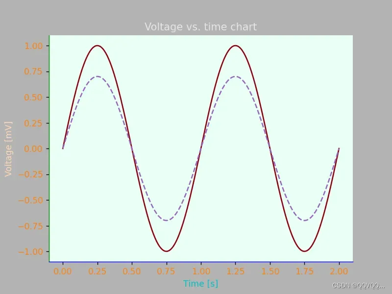
import matplotlib.pyplot as plt
import numpy as np

t = np.linspace(0.0, 2.0, 201)
s = np.sin(2 * np.pi * t)

# 1) RGB tuple:图形背景色
fig, ax = plt.subplots(facecolor=(.7, .7, .7))
# 2) hex string: 坐标系背景色
ax.set_facecolor('#eafff5')
# 3) gray level string: 标题颜色
ax.set_title('Voltage vs. time chart', color='0.9')
# 4) single letter color string:x轴标题颜色
ax.set_xlabel('Time [s]', color='c')
# 5) a named color:y轴标题颜色
ax.set_ylabel('Voltage [mV]', color='peachpuff')
# 6) a named xkcd color: 折线颜色
ax.plot(t, s, 'xkcd:crimson')
# 7) Cn notation: 折线颜色
ax.plot(t, .7 * s, color='C4', linestyle='--')
# 8) tab notation: 刻度颜色
ax.tick_params(labelcolor='tab:orange')
# 坐标轴颜色
ax.spines['right'].set_color('None')  # 右框不显示
ax.spines['top'].set_color('None')  # 上框不显示
ax.spines['left'].set_color('g')  # 左框绿色
ax.spines['bottom'].set_color('b')  # 下框蓝色

plt.show()
其它资料:
Matplotlib – 知乎
python如何使用Matplotlib画图(基础篇)_鲟曦研习社
matplotlib绘图的核心原理讲解
Matplotlib.pyplot接口汇总
matplotlib.pyplot的使用总结大全(入门加进阶) – 知乎
matplotlib字体设置看这一篇就够了-技术圈
matplotlib字体设置 – 知乎
将matplotlib更改字体为 宋体、TimesNewRoman
文章出处登录后可见!