用python寻找卫星图像时间序列中的模式
使用开放 python 库处理时变图像的快速指南

不久前,我在这里写了一篇文章,介绍了一些使用 python 进行遥感的基础知识。上次我们介绍了 geopandas、rasterio 和谷歌地球引擎的基础知识来处理卫星图像和地理空间数据。[0]
这一次,我们将扩展计算植被指数 (NDVI) 的概念,了解这些指数随时间的变化以及我们可以用它进行的可视化。我们将以类似的方式开始,使用包含我们感兴趣的地块的矢量图层。
几个农村包裹开始
在这里,我们看到了位于巴西最南端的 Capivari do Sul,这是一个以稻米出口而闻名的城市。我们从巴西的 CAR(一个国家环境和农业登记处)获得了一个包含所有地块的 shapefile,我们将依次使用 geopandas 读取该文件。
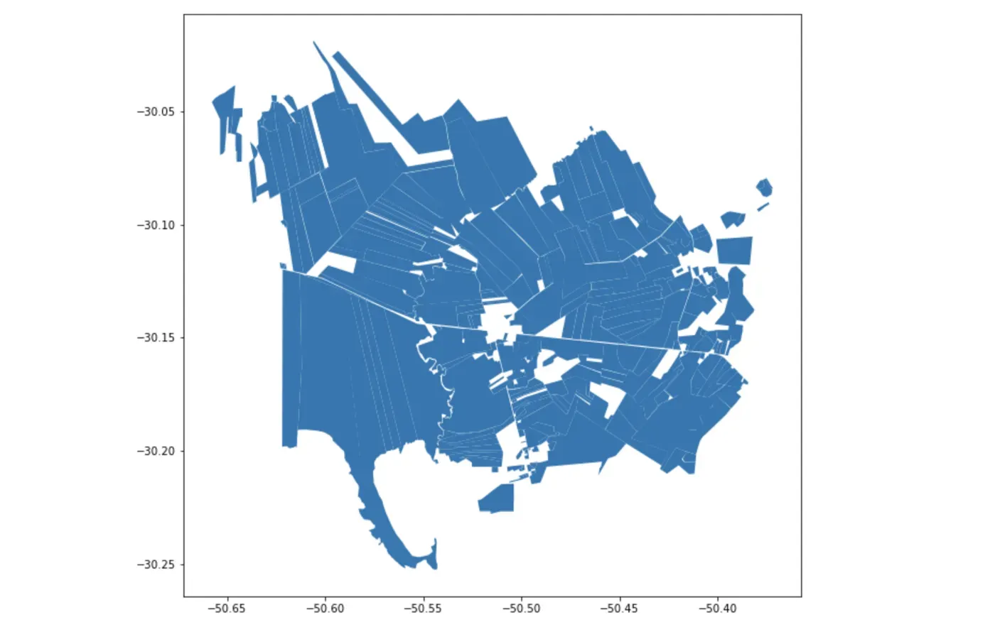
在我们真正去获取卫星图像之前,我们需要细化这个矢量数据集。这样做的原因是,虽然这些地块只反映了该市的乡村景观,但每个乡村地块实际上不仅仅是农作物:每个地块内都有保护区(由于实施了环境立法),还有用于种植的房屋。人们生活,所以我们不想为这些计算 NDVI。
从云端访问土地覆盖数据
为了过滤掉所有不是农田的东西,我们将使用令人惊叹的 MapBiomas 项目。 MapBiomas 是一个基于谷歌地球引擎的项目,除其他外,它提供从整个巴西的 Landsat 图像中得出的土地覆盖分类。这意味着我们可以只使用 Earth Engine 的 python API 访问这些文件![0]
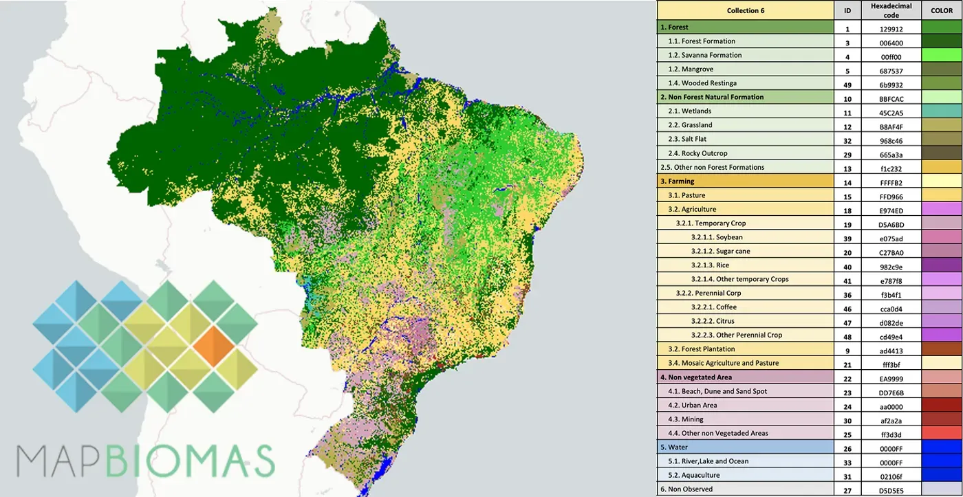
这里棘手的部分是找到文档并意识到 MapBiomas 项目在他们存储图像的方式上采取了一些自由。每次项目团队修改土地覆盖分类算法时,都会提供一个新的集合(我们目前处于集合 6)。反过来,该系列只有一个图像,有几个乐队,每年一个。因此,我们需要使用带滤波器才能获得 2020 年的图像(可用的最新图像)。[0]
使用光栅从光栅到矢量
一旦我们将图像导出到我们的本地环境(参见上一篇文章的代码片段),我们需要使用光栅特征将它们转换为向量,并隔离属于农业类别的所有类,如多年生作物和一年生作物庄稼。接下来,我们将要使用 geopanda 的叠加功能找到这些新获得的形状与地块之间的交集。[0][1][2]
#Import the libraries
import pprint
import rasterio
from rasterio import features
from shapely.geometry import shape

#Open the MapBiomas export
with rasterio.open('/Volumes/GoogleDrive/My Drive/GEE_export/mapbiomas_capivari.tif') as src:
    lulc = src.read(1)

#Create a rasterio feature object by ingesting the land-cover raster
shapes = features.shapes(lulc,transform=src.transform)

#Create empty lists to store the values
agriculture = []
geometry = []

#Populate the lists with the geometries and values from the feature object
for shapedict, value in shapes:
    agriculture.append(value)
    geometry.append(shape(shapedict))

#Create a geodataframe with the values from the lists
gdf = gpd.GeoDataFrame(
    {'lulc': agriculture, 'geometry': geometry },
    crs="EPSG:4326")

#Filter the features that don't correspond to the agriculture category
classes = [18,19,39,20,40,41,36,46,47,48]
agriculture = agriculture[agriculture["lulc"].isin(classes)]

#Remove the portions of the land parcels that are not agriculture
agro_parcels = gpd.overlay(polygons.to_crs({'init':'epsg:4326'}), agriculture, how='intersection')

#Plot the results
agro_parcels.plot()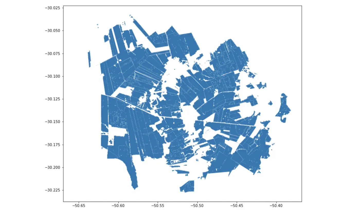
访问多个时间戳的原始图像
伟大的。现在我们已经过滤掉了仅用于农田的包裹,我们可以开始研究实际的遥感位。我们将首先编写一个函数,用于根据日历范围通过元数据过滤图像,该函数又将与 Landsat 8 集合一起使用。这样做的好处是该功能可以与任何其他传感器一起使用,例如 Sentinel 2。该函数基本上按年过滤,然后按月过滤,最后计算每个时间戳中每个像素的中值。一旦我们获得图像集合,我们就可以获取图像列表并将它们导出到我们的驱动器。这样我们就可以在本地继续工作。
#Define our time range of interest
years = range(2021,2022)
months = range(1,13)

#Create a function for establishing the pixel median for each month
def calcMonthlyMean(imageCollection):
    mylist = ee.List([])
    for y in years:
        for m in months:
            collection_month = imageCollection.filter(ee.Filter.calendarRange(y, y, 'year')).filter(ee.Filter.calendarRange(m, m, 'month')).median()
            mylist = mylist.add(collection_month.set('year', y).set('month', m).set('date', ee.Date.fromYMD(y,m,1).format('YYYY-MM-dd')).set('system:time_start',ee.Date.fromYMD(y,m,1)))
    return ee.ImageCollection.fromImages(mylist)

#Run the function on the Landsat8 collection
l8 = ee.ImageCollection('LANDSAT/LC08/C02/T1_L2').filterBounds(aoi).filterDate('2021-01-01','2021-12-31')
monthlyl8 = ee.ImageCollection(calcMonthlyMean(l8))

#Export all images to our Drive
collectionSize = monthlyl8.size().getInfo()
collectionList = monthlyl8.toList(monthlyl8.size())
for i in range(collectionSize):
    ee.batch.Export.image.toDrive(
            image = ee.Image(collectionList.get(i)).clip(aoi),
            folder = 'GEE_export',
            fileNamePrefix = 'L8_'+str(i),
            scale=30
        ).start()
栅格到阵列并再次返回
有了手头的所有图像,我们终于可以计算植被指数或 NDVI。上次我们使用 Earth Engine 这样做——这肯定更简单——但在这里我们将使用 rasterio 和 numpy。
我们将使用一个函数,该函数使用 rasterio 来隔离我们需要的波段——4 个用于红色,5 个用于 NIR——然后将整个事物转换为一个 numpy 数组。归一化差异(NIR-Red/NIR+Red)的计算是使用 numpy 内置函数执行的,并将结果写回到新的 geoTiff 中。
#Import numpy so we can manipulate our rasters as multidimensional arrays
import numpy as np

#Create a function for calculating NDVI and saving it to a new raster
def CalculateNDVI(imgpath, name):
    #Access the right bands for red and near-infrared
    with rasterio.open(imgpath) as r:
        red = r.read(4)
        nir = r.read(5)
        affine = r.transform
    #Numpy mambo-jambo so it can actually process the values
    np.seterr(divide='ignore', invalid='ignore')
    nir16 = nir.astype(np.int16)
    red16 = red.astype(np.int16)
    #Create an empty numpy array
    ndvi = np.empty(red.shape, dtype=rasterio.float32)
    #Calculate NDVI only where values are available in the original array (ignoring NaNs)
    check = np.logical_or ( red16 > 0, nir16 > 0 )
    #Calculate NDVI using numpy functions to get the normalized difference (NIR - Red) / (NIR + Red)
    ndvi = np.where(check, np.divide((np.subtract(nir16,red16)),(np.add(nir16,red16))), 0)
    #Save the array as a new raster using the info from the original raster
    ndviImage = rasterio.open(name+'_ndvi.tif', 'w', driver='GTiff',
                             width=r.width, height=r.height,
                             count=1,
                             crs=r.crs,
                             transform=r.transform,
                             dtype='float64')
    ndviImage.write(ndvi,1)
    ndviImage.close()
然后可以通过使用超级简单的循环将该功能应用于地球引擎将它们导出到的文件夹中的所有图像。
#Get a list with all the images in the folder to which GEE exported
import os
images = os.listdir('/Volumes/GoogleDrive/My Drive/GEE_export/L8')

#Run the NDVI function on all of them
for i in range(0, len(imagens)):
    with rasterio.open('/Volumes/GoogleDrive/My Drive/GEE_export/L8/L8_%s.tif'%str(i)) as f:
        path = '/Volumes/GoogleDrive/My Drive/GEE_export/L8/L8_%s.tif'%str(i)
        CalculateNDVI(path, 'L8_NDVI_%s'%str(i))
全年区域统计数据
美丽的。接下来,我们将只使用 rasterstats(与上次非常相似)来计算每个宗地的区域统计数据。我们最感兴趣的是地块上的植被指数的平均值,因此我们能够单独和统计地查看它们。[0]
#Import rasterstats
from rasterstats import zonal_stats

def getFeatures(gdf):
    """Function to parse features from GeoDataFrame in such a manner that rasterio wants them"""
    import json
    return [json.loads(gdf.to_json())['features'][0]['geometry']]

#Function to get zonal statistics for each parcel and update the geodataframe with the parcels with the values
def ZonalStats(imgpath, plots, name):
    #Identify the vector features
    coords = getFeatures(plots)
    #Open the NDVI raw image and access the values in the single band
    ndvix=rasterio.open(imgpath)
    array = ndvix.read(1)
    #Run the zonal stats function from rasterstats
    affine = ndvix.transform
    zs_ndvix = zonal_stats(plots, array, affine=affine, stats=['mean', 'min', 'max', 'std'])
    #Create a dataframe for the results and join them into the parcel's geodataframe
    ndviframe = pd.DataFrame(zs_ndvix)
    plots = plots.join(ndviframe, rsuffix="_"+str(i))

#Check results
agro_parcels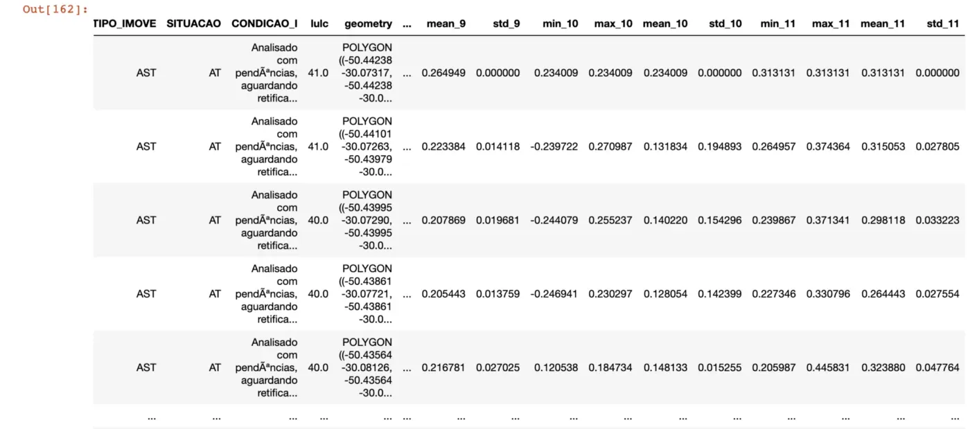
这些新列现在可以像以前一样用于绘制地理数据框,但颜色渐变范围从 0 到 1。让我们更进一步,使用 imageio 将所有图放在一个 gif 中。
#A loop for creating a map plot for each mean NDVI column in the dataframe
for i in range(0,12):
    lotes_agro.plot(column='mean_%s'%str(i), cmap ='RdYlGn', figsize=(15,9), legend=True, vmin=0, vmax=1);
    plt.title(i+1)
    #Save it as a png file
    plt.savefig('./plots/%s.png'%str(i+1))

#Import imageio to write an animated gif with the resulting images
import imageio
# Set up a loop to read every image in the folder
parcelplots = os.listdir('/plots')
with imageio.get_writer('plots_gif.gif', mode='I') as writer:
    for filename in range(1, len(parcelplots)+1):
        image = imageio.imread('/plots/'+str(filename)+'.png')
        writer.append_data(image)
这些情节当然很有趣,但可能不是了解这些农田动态的最佳方式。因此,让我们利用将数据存储在数据框中的优势,并为每个月制作一个箱线图。
#Set up variables for the boxplot
fig = plt.figure(figsize=(15,15))
ax = plt.subplot(111)
#Remove the null values from the dataframe
lotes_agro = lotes_agro.dropna()
#Initiate an empty list to store the multiple series
all_data = []
#Run a loop to append values from each column to the list
for i in range(0,12):
    all_data.append(teste['mean_%s'%str(i)])
#Call the boxplot using the list we just created
ax.boxplot(all_data, vert=True, patch_artist=True, showmeans = True, meanline=True)
#Set up the ticks and labels and show the boxplot
plt.xticks([1,2,3,4,5,6,7,8,9,10,11,12],['Jan','Feb','Mar','Apr','May','Jun','Jul','Aug','Sep','Oct','Nov','Dec'])
plt.ylabel('NDVI', fontsize=14)
plt.show()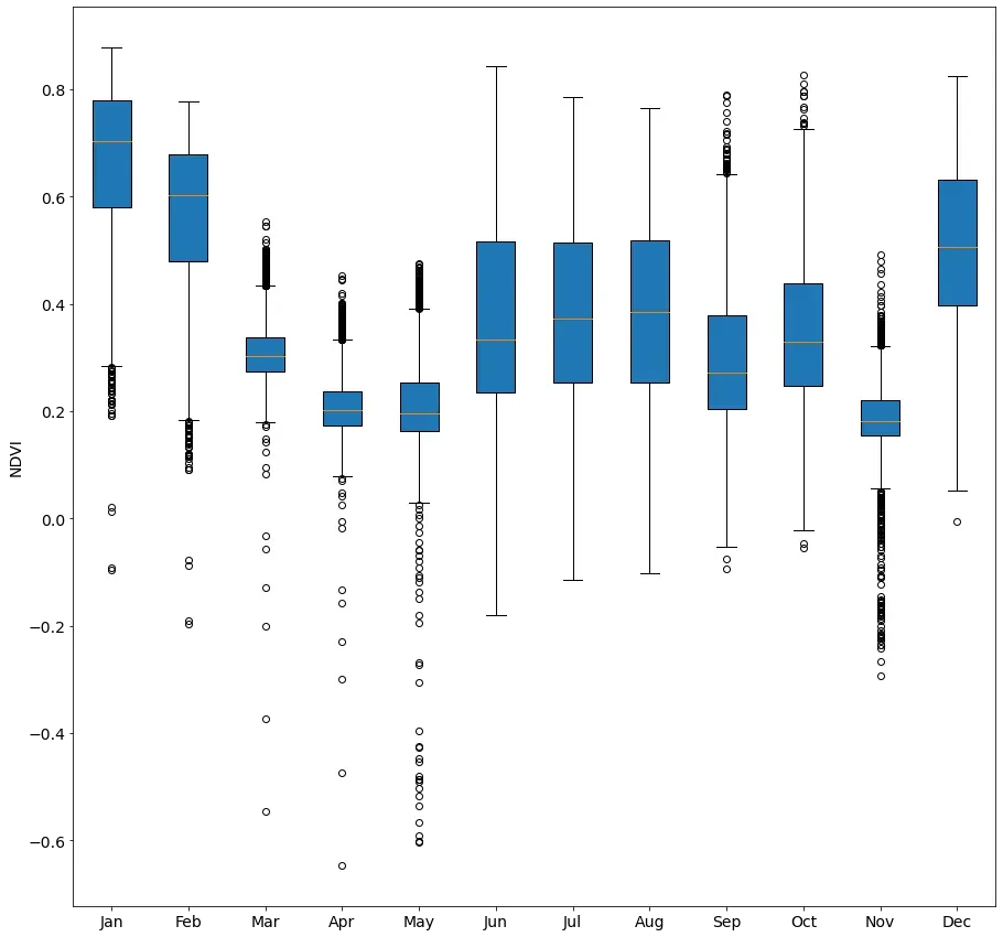
现在我们可以更清楚地看到正在发生的事情。由于水稻作物每 150 天可以收获一次,因此我们会在一年内看到两个“山谷”,此时大部分生机勃勃的绿色植被都被从田间移走以便与谷物分离。 .
这是一个包装
就是这个!我们设法从一堆包裹变成了一些非常整洁的时间图表。
当然,这里可以包含一些东西——但不是为了简单起见——比如遮住云层或选择不止一个传感器,但这是干净的版本。至今!
如果您有任何问题或建议,请随时给我留言。如果您喜欢这篇文章,请考虑给我买杯咖啡,这样我就可以继续写更多![0]
文章出处登录后可见!